Living

The One Room Challenge 2016: Week Five

DIY Fabric Covered Bulletin Boards Are an Easy, Must-Have in any office space
Filed Under > Get The Look

Fabric bulletin boards via Waiting on Martha
DIY fabric bulletin boards, Waiting on Martha
Fabric bulletin boards, Waiting on Martha

What’s a truly functional office without its bulletin boards?  I’ve always had a love affair with bulletin boards, especially when they’re covered in a beautiful fabric and pinned full of everything you need to inspire; inspiration seems to literally just ooze off of them!  DIY fabric covered bulletin boards are an effortless way to edit and organize ideas, inspiring pages torn out from magazines, paint and fabric swatches…you name it.  And in turn, they end up looking as beautiful as they are helpful. 

I knew I wanted to have these bulletin boards front and center in the new WOM office, serving as a nice focal point behind the “sitting area.” I settled on three large boards, and I’ve designated them as following: one for current projects, one to keep track of our editorial calendar and ideas (because I’ve always preferred literally writing things down and mapping them out), and the other to serve as an inspiration mood board.  The boards are covered in a lovely, warm neutral fabric (similar HERE), which was just a match made in heaven for our Taylor Burke Home Settee and Lacefield pillows. The brass “library” light fixtures from Barbara Cosgrove serve as the “jewelry” for this vignette; offering not only practical lighting over a large expanse of wall, but also anchoring the boards for the eye. 

These DIY fabric covered bulletin boards make for an incredibly easy project; simply pull your favorite fabric taut over the boards, stapling it securely in the back. I’ve also used my ever-popular Thibaut Tanzania wallpaper in the past (get the easy DIY bulletin board tutorial here), and absolutely adored the finished product.  Tell me friends, what’s your favorite approach to the bulletin board?  Truly, MKR

P.S. Our final reveal goes live NEXT WEEK! Be sure to tune in as we share the entire space, designed in six short, crazy weeks thanks to The One Room Challenge.  xo

SHOP THE STORY / CLICK LEFT & RIGHT ARROWS TO EXPLORE


Photography, Rustic White for Waiting on Martha 

CLAIRE BRODY | THE CURATED HOUSE | DESIGN MANIFEST | DRIVEN BY DECOR | HONEY WE’RE HOME | HUNTED INTERIOR | THE MAKERISTA | MAKING IT LOVELY | MY SWEET SAVANNAH | PENCIL AND PAPER CO. | THE PINK CLUTCH | SAVVY HOME | SIMPLIFIED BEE | SKETCH 42 | JILL SORENSEN | ORLANDO SORIA | THOU SWELL | THE VAULT FILES | WAITING ON MARTHA | THE ZHUSH 

MEDIA PARTNER HOUSE BEAUTIFUL | TM BY CIH 

5 Things to Consider When Starting an Art Collection for Your Home

Chassity Evans of Look Linger Love Shares 5 Quick Tips to Starting a Collection You'll Cherish
Filed Under > 5 Things
Chassity Evans of Look Linger Love shares her 5 tips to consider when starting an art collection
lll_artChassity Evans with Look Linger Love shares 5 things to consider when starting an art collection for your home
Propped art against the wall | waitingonmartha.com
lll
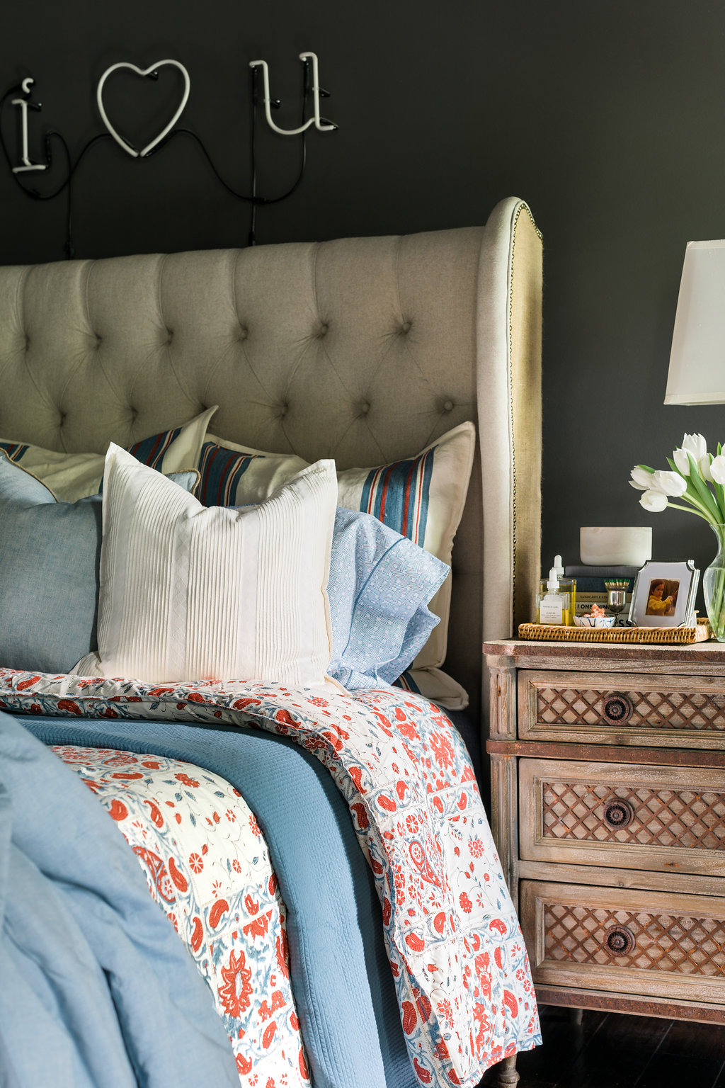
Bedroom vignette with affordable art from Etsy | waitingonmartha.comI’ve started to develop a love affair with art.  With a Gray Malin piece and my first piece of original abstract art to my name, my interest in an art collection has only grown. But with my enthusiasm to purchase new art, I’ve also come to realize that an art collection can quickly become expensive (maybe an understatement) and the whole process can be a bit intimidating. 

So many stunning interiors make a case for great art, and my favorite part is that many show us how easily you can balance the high-and-low when it comes to original pieces and prints.  Thanks to my favorite bloggers and of course Pinterest, I’ve discovered new artists near and far, and many on affordable sites like Minted and Etsy.  A great source of art inspiration for me personally is Chassity Evans.  She’s the voice behind the popular lifestyle blog Look Linger Love (and one of my favorite daily reads). I knew Chassity would be a great person to tap for a little insight on what to consider when starting your own art collection in the home.  Catch her easy tips below, and tell me your favorite sources for great art!  Cheers, Kat 

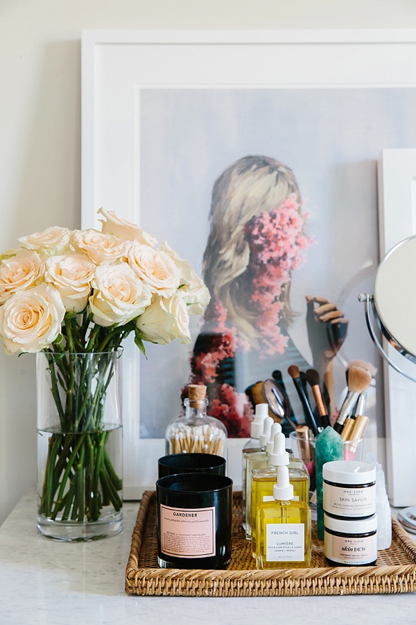
1. Collect what you love. I’ve always been drawn to drawings of the female body and my collection shows it.

2. Get your kids interested in art! Last summer I was looking for a large piece for my son Fletcher’s bedroom. I narrowed down a few favorite pieces and then let him choose the one he liked best. He feels pride in this piece now and knows that his opinion matters.

3. Think outside the box (or canvas) for your collection. I own a scarf by my friend and artist Raven Roxanne. It’s a print of one of her nude ladies paintings. Great to wear now and frame later.

4. Find a framer you love and trust and aim for a diverse collection of frames for a “collected over time” look. My favorite source is Framebridge.

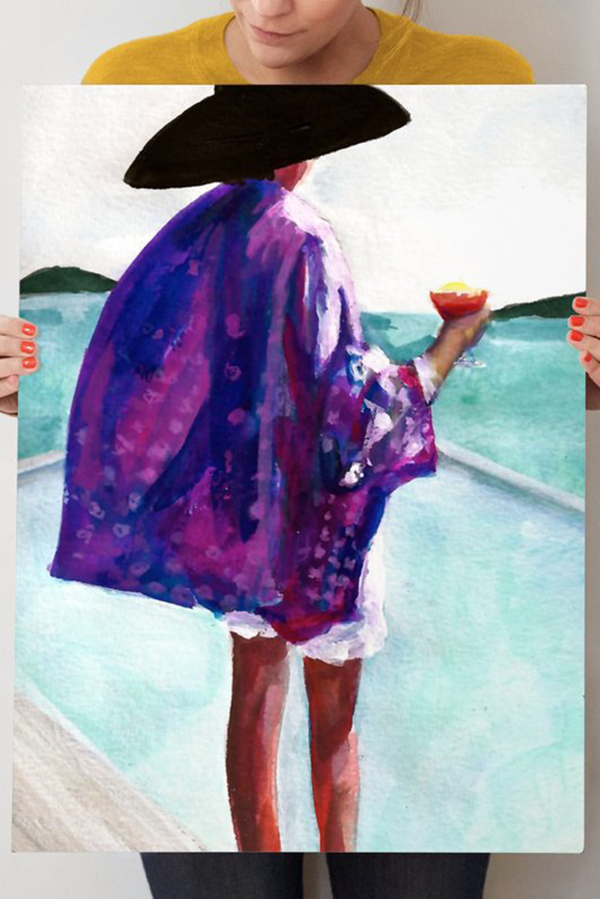
5. Check Etsy for art finds! I have found a lot of pieces there like this one at reasonable prices.

SHOP THE STORY / CLICK LEFT & RIGHT ARROWS TO EXPLORE


Photography, Gray Benko and Charlotte Elizabeth Photo for Look Linger Love 

As pictured: Print in Photo 1 | Print in Photo 2 | Print in Photo 3 | Scarf in Photo 5 | Print in Photo 6

The One Room Challenge 2016: Week Four

The Office's Entryway Styling Welcomes A Mixture of Textures
Filed Under > Ideas & Inspiration

Foyer styling by Waiting on Martha in The One Room Challenge 2016 Upholstered x benches in the entryway, Waiting on MarthaWhite pagoda mirror and blue stone lamp, Waiting on Martha #interiors #styling

This week’s peek at our progress in the ever-exciting 6-week One Room Challenge of designing the WOM office is, as promised in Week 2, another styled vignette.  If you remember, last week I shared scenes from my desk (with a killer light box that I think every person should find a spot for #justsaying) but this week’s vignette it’s all about our newly styled entryway.

When styling an entryway that is functional, but truly makes a statement—which you know I had to do because it’s the WOM office we’re talking about here—I’m a big proponent of variety.  Variety in height, variety in textures, and variety in pieces that are as functional as they are beautiful.  So when deciding on pieces and decorative accents for the entry I went with a less is more attitude (so not like me) and aimed to keep the coloring fairly neutral with a pop of the bluest of blues and a thorough mixture of textures. 

Now when I say textures, I mean rich, intricately detailed textures that bring a little intrigue to a space.  To accomplish that in our entry I chose a faux cowhide rug (we used the golden brown in the entryway and you’ll see the white layered atop a sisal rug in the conference room soon!), a faux ostrich and gold nailhead console table, a very interesting, and just a tad crazy, horse skull to add that hint of masculinity I love and a jagged stone turquoise lamp to add that hint of femininity I crave.  And if that wasn’t enough mixing of textures to top it all off I hung a giant, statement making white bamboo mirror.   I know just like with patterns y’all tend to get a little nervous.  But when mixing textures, don’t hesitate to incorporate pattern and color as well; a single pop of color and any pattern along your original color palette will allow the mixing to work every time.  And can we just stop for a minute and talk about these faux cowhide rugs from Lulu & Georgia.  They look incredibly “real,” but with no guilt or eeew feeling that it was once a living creature, plus the cost is extremely reasonable!  Win win!!

Lastly, I mentioned functionality, which is always key for me in any space.  A few things that are a MUST HAVE for me in any entry way are: a mirror for any last minute zhushing, a trinket tray, in the case the gold hamsa hand, allowing a place for keys, and some sort of bench or ottoman to put on or take off your shoes.   I especially love when the ottomans can easily slide under the console table since many entry ways are narrow and don’t provide a lot of room.  These particular ottomans were designed by yours truly in a gorgeous chinoiserie patterned fabric from Lacefield and brought to life by some of the most skilled workmen in the trade, Westside Custom Upholstery.  

Tell me friends, are you liking how the space is coming together? Truly, MKR

SHOP THE STORY / CLICK LEFT & RIGHT ARROWS TO EXPLORE


Photography, Rustic White for Waiting on Martha

AS PICTURED: MIRROR (SIMILAR HERE, HERE AND HERE) | LAMP | X BENCHES (SIMILAR) | CONSOLE TABLE | SKULL (SIMILAR HERE, HERE AND HERE) | FAUX COWHIDE RUG

THE ONE ROOM CHALLENGE 2016 PARTICIPANTS:

CLAIRE BRODY | THE CURATED HOUSE | DESIGN MANIFEST | DRIVEN BY DECOR | HONEY WE’RE HOME | HUNTED INTERIOR | THE MAKERISTA | MAKING IT LOVELY | MY SWEET SAVANNAH | PENCIL AND PAPER CO. | THE PINK CLUTCH | SAVVY HOME | SIMPLIFIED BEE | SKETCH 42 | JILL SORENSEN | ORLANDO SORIA | THOU SWELL | THE VAULT FILES | WAITING ON MARTHA | THE ZHUSH 

MEDIA PARTNER HOUSE BEAUTIFUL | TM BY CIH 


Copyright © Welcome by Waiting on Martha  /
Back to Top