results for one room challenge

The One Room Challenge 2016: Week Two

Discussing how to tackle a difficult space plan through styled vignettes
Filed Under > Ideas & Inspiration

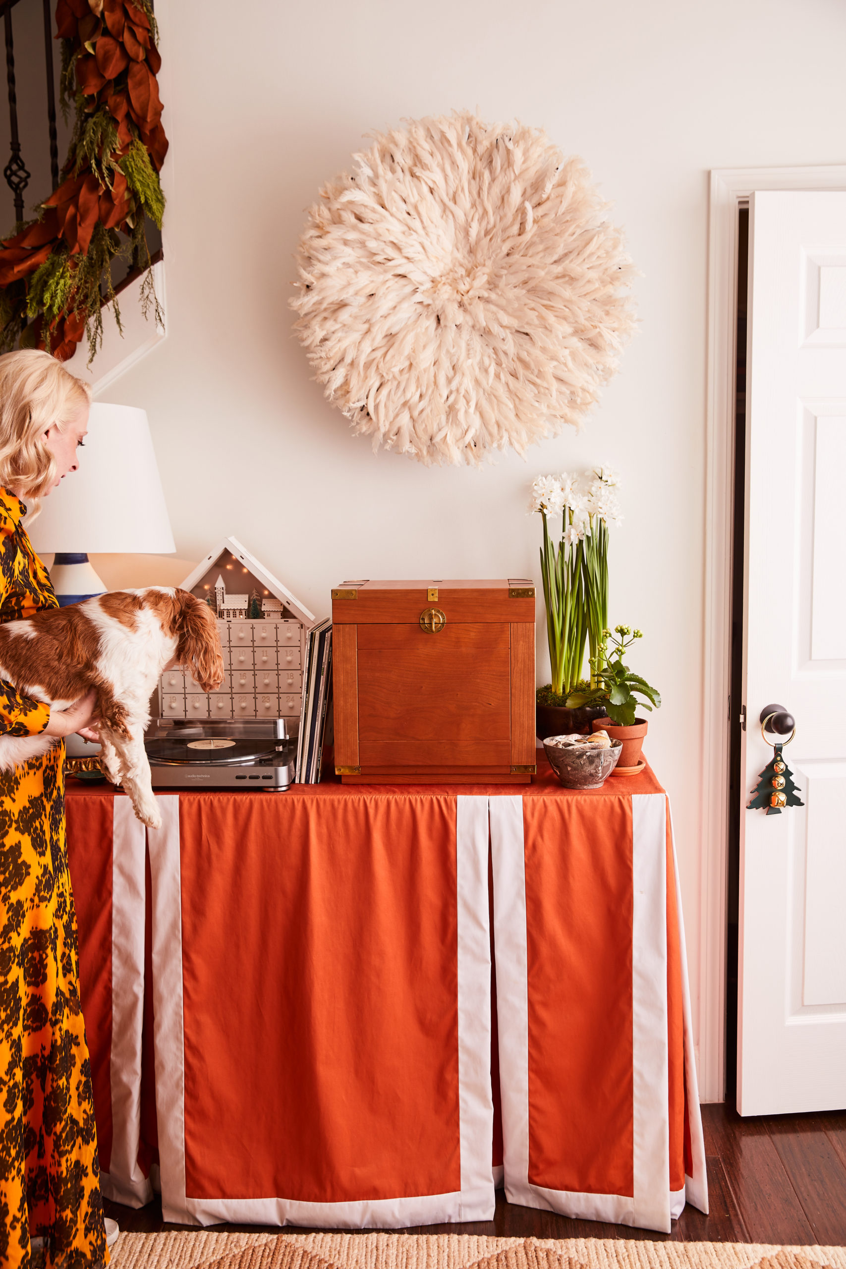
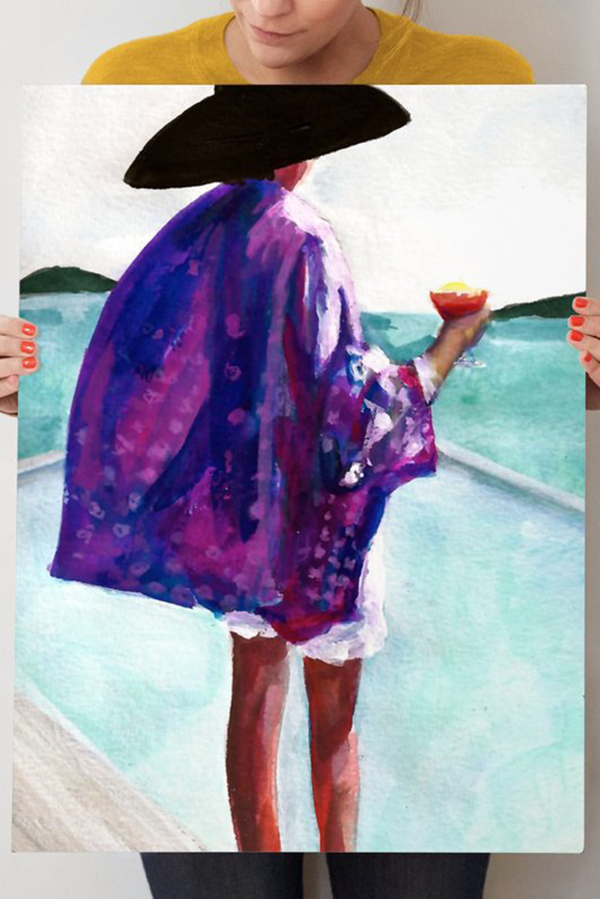
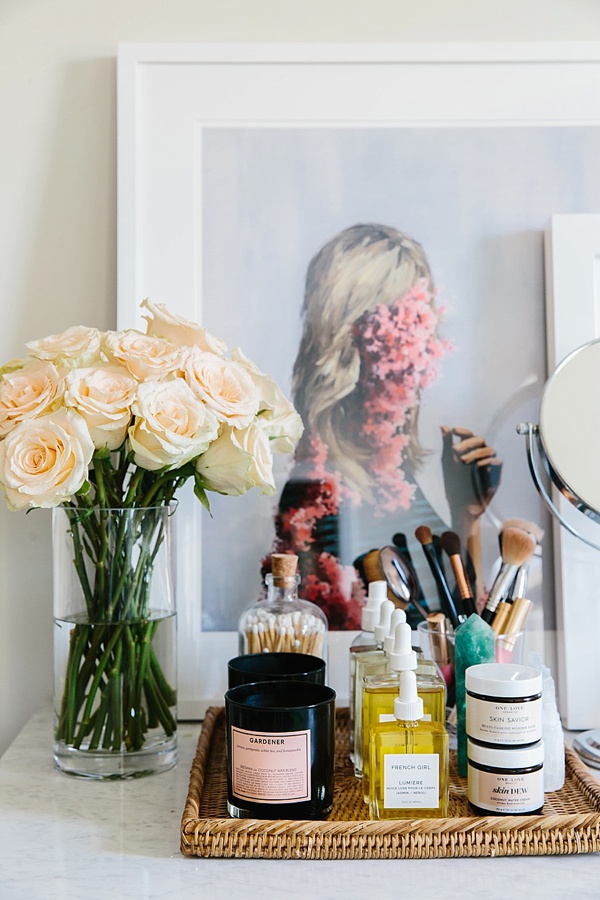
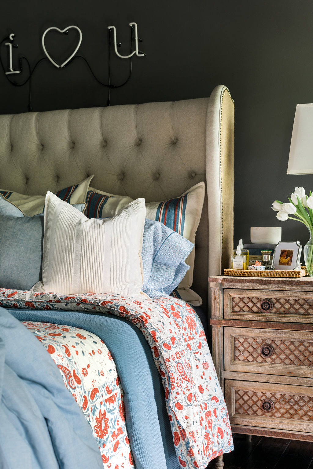
One Room Challenge Interiors Inspiration via Waiting on MarthaHow to style a great vignette | waitingonmartha.com #interiors #coffeetableStyling a great vignette | waitingonmartha.com How to style an entryway and vignette | waitingonmartha.com Styling a vignette and 3D gallery wall | waitingonmartha.comStyling a vignette in the entryway | waitingonmartha.com

In looking back on a lot of my past design work I’ve learned something about myself and how I view a space.  I love moments, or rather, vignettes.  When I look at a room, I don’t see four walls and measurements, I see how life will be lived.  I see late nights spent working cuddled in a chair.  Bags and shoes thrown down at the end of a long day.  Dinners and great bottles of wine being poured over an it-gets-better-with-age table.  In a cliche way, I see memories made.  

And thank goodness I love looking at it all that way because our office space at ADAC is not an easy, one-size-fits-all box.  It’s 900 square feet of strange angles and partitions in the most awkward places, (if only I had kept the floor plan to share with you all).  So when tackling the WOM office, I’m viewing it all in very distinct vignettes.  I mean technically our office is as big as my first studio apartment, so I’ve been working on this design for years.

When designing with vignettes in mind I always use rugs to define the space, which can prove difficult when it’s one large room.  You always want your rug colors and patterns to flow, and compliment each, other but never be matchy-matchy.  For this particular space I’ll be using one very large, vintage rug with a light neutral pattern in the main sitting area.  Then to compliment a jute rug layered with a faux animal hide rug in the conference “room.”  I’ve chosen to layer to add depth, texture and interest and to keep that vignette from becoming too bland.  In the entryway I’ll also be using an additional faux hide rug, but in a different, but complimentary color.  The entryway sizing is difficult so while using two similar rugs may seem duplicative, I think you’ll find when you see the final result that they work best in each space, and feel very separate from each other.

Another way I approach defining a space is through lighting.  While I would love to have a million chandeliers and pendant lights hanging it just doesn’t make sense, and will look too busy in an open concept room.  Instead mix it up.  Focus on one or two hanging lights that will always make a statement and various desk, table, and floor lamps where they are as functional as they are appealing.  Also by keeping the room white, which I spoke to last week, naturally brings a lightness to the room and I don’t want overpower it with lighting overkill.

Over the next few weeks, I’ll begin sharing each distinctly styled vignette, because honestly if I waited to share all the details during the final reveal we’d get weary from the amount of scrolling.  But in the mean time, I thought I’d share some of my favorite styled vignettes I’ve designed with you all.  Each distinct, each still loved and used daily (since they’re all in my home).  Tell me, do you find yourself designing through vignettes?  Truly, MKR

SHOP THE STORY / CLICK LEFT & RIGHT ARROWS TO EXPLORE


Photography, Rustic White for Waiting on Martha

The One Room Challenge 2016 Participants:

CLAIRE BRODY | THE CURATED HOUSE | DESIGN MANIFEST | DRIVEN BY DECOR | HONEY WE’RE HOME | HUNTED INTERIOR | THE MAKERISTA | MAKING IT LOVELY | MY SWEET SAVANNAH | PENCIL AND PAPER CO. | THE PINK CLUTCH | SAVVY HOME | SIMPLIFIED BEE | SKETCH 42 | JILL SORENSEN | ORLANDO SORIA | THOU SWELL | THE VAULT FILES | WAITING ON MARTHA | THE ZHUSH 

MEDIA PARTNER HOUSE BEAUTIFUL | TM BY CIH 

One Room Challenge…Week 2

Filed Under > Ideas & Inspiration

ORC-Week-2

Last week I shared my grand plans for completely re-doing the WOM office.  This week I’m sharing a little tendency/habit I have called  procrastination.  I’m a procrastinator.  Always have been, and I’m beginning to accept I probably always will be.  I tell myself it’s because I’m juggling so many things or because I’m at my best when the pressure is on, but really those are just things I, and we all, tell ourselves to make the habits we struggle with seem more acceptable.

To be fair I wasn’t sure which room I was going to work on for the ORC and when I finally did decide on my office to say I was already WAY behind the eight ball was an understatement.  I quickly gathered my thoughts and first took care of the layout and furniture as I knew it would all have to be specially ordered (sharing this next week).  Once that was taken care of I moved on to the “jewelry” of the room, specifically custom drapes for my picture window.  Secretly I had been waiting for this moment as there’s nothing more fun to a designer (at least this designer) than fabric choices.  For me fabrics pull the room together, if not create the feel of the room all together.  

As I headed into the fabric store I knew I wanted to do a neutral drape with a pop of color lining and a tassel to top it all off.  The neutral was easy, but the lining was proving to be more difficult and as I waded through the sea of fabrics I was beginning to think this might not be a feasible reality and then I saw it.  A glorious mango velvet.  It represented orange, my favorite color, but in a much softer way and all of a sudden my color palette and the entire room came together.  Only problem, it was back ordered 8 weeks.  8 weeks!?  The ORC will be over in 8 weeks!  Deflated and a tad sad I headed to the next fabric store.  Luckily there was another velvet in almost the exact same mango shade, the only problem it was twice the cost!  Twice!  And I needed 13 yards of it!  But this was my palette, this was my centerpiece, I had to buy the fabric.  So buy it I did.  Oh and did I mention I have to rush the order with the work room because the standard time frame doesn’t fit into the ORC timeframe.  My procrastination rearing it’s ugly head again.  

But this my friends is the life of design, and more appropriately the life of a procrastinator.  So cheers to embracing all of our habits (both good and bad), to trying to be better everyday, and to spending too much money on drapes that better be fan-freaking-tastic!  Truly, MKR

The Players…Abby M. Interiors  ||  Because It’s Awesome   ||  Bijou & Boheme  ||  Chinoiserie Chic  ||  The Decorista  ||  Design Chic  ||  The Design Daredevil  ||  Design Darling  ||  Design Indulgence  ||  Design Manifest  ||  House of Turquoise  ||  Jana Bek Design  ||  Jill Sorensen  ||  Maddie G. Designs  ||  Mimosa Lane  ||  A Piece of Toast  ||  The Pink Pagoda  ||  Stone Textile  ||  The Zhush  ||  Trademarked by Calling it Home


2016 Fall One Room Challenge: Week 6 Final Reveal, Part I

Transforming a high-end two bedroom apartment in 6 weeks
Filed Under > One Room Challenge

Neutral living room decor and gallery wall, @waitingonmartha #oneroomchallengeStatement art in a gender neutral bedroom, @waitingonmartha2016-11-07_0005 Gold and white bookshelf, @waitingonmartha Headboard and wall sconce, @waitingonmartha Chic bathroom styling, @waitingonmarthaStunning armoir and Penelope chairs, One Room ChallengePerfect desk styling, @waitingonmartha in One Room Challenge final revealOne Room Challenge gallery wall ideas, @waitingonmartha Chic bathroom styling ideas, @waitingonmartha Small space living room ideas, @waitingonmartha 2016-11-07_0015 2016-11-07_0014Triptograph in the hallway, @waitingonmartha2016-11-07_0020Media console and framed art, @waitingonmarthaGallery wall ideas and bamboo stools with setee, @waitingonmartha

The day of a final reveal in the One Room Challenge is always the best day!  And in our case, and lucky for you, this year we’re stretching it into TWO full reveal days.  It’s just really the only way to show you both spaces in all of their completed glory.  

But first, let me back up; if you’ve been following along for the past six weeks, you’ll know I’ve made it my mission to transform two model apartment units in the center of bustling Buckhead.  Of course, that has entailed an entirely different challenge than any of my former spaces, which were either rooms in my own home or the the WOM office (see ORC 1, ORC 2 and ORC 3).  All of these spaces allowed for me to pull my signature go-big-or-go-home moves, whether that was with custom lighting and fixtures, paint or wallpaper.  

While these apartments limited me in a few ways (they are rentals, after all!), they also had me starting with a bright, beautiful and clean slate.  As you can see here, our first apartment was already stunning, with plenty of natural light and the most high end, modern fixtures (you can find “before” photos here).  But even with the bumps, when you’re designing any space in just a few short weeks there are bound to be a few trials and tribulations along the way, (to get a full picture be sure to read Week 4‘s update if you haven’t yet). 

All that being said, I’m absolutely thrilled how today’s space came together.  I designed this two-bedroom apartment with a young couple in mind, and wanted to create an elevated, eclectic feel with of course, a gender-neutral palette.   I stayed true to my favorite blue and whites with a few pops of color here an there and infused plenty of details and accents that are full of texture, interest and personality…I hate for a space to feel generic, safe and downright boring. 

I also wanted to make the spaces feel real and livable, which meant running the gamut of high, mid, and lower priced items to bring that feeling to fruition.  I went high with some stunning statement pieces from Noir, ATG Stores, Taylor Burke Home, Annie Selke/Pine Cone Hill, and Worlds Away.  Hit that mid range with Society Social, AllModern, Minted, Joss & Main and Waiting On Martha Home.  And sourced great inexpensive details from TargetWorld Market, and even Urban Outfitters. By infusing high to low seamlessly, I was able to create a collected and homey feel, which is so very important in a rental space especially. 

Looking to the separate spaces themselves, the living room had a very unique size and layout I had to work within.  While seemingly difficult to design, I was able to work around both obstacles by utilizing versatile pieces that can pull double-duty when needed.  For example, I rather than your traditional coffee table, which honestly wouldn’t have fit in the space, I used a table on wheels that can be moved out of the way when needed and can double as a fantastic bar cart when entertaining.  Similarly, I turned to my go-to faux python console table, placed behind the custom sofa.  The console table provides a place for a table lamp, can easily hold items you’d typically place on the coffee table, plus houses a basket full of additional pillows and throws (because you can never have too many). 

While this apartment was a two bedroom unit, I opted to turn the second bedroom into an office.  The campaign desk suits the space perfectly, allowing the rest of the room to comfortably have the custom Taylor Burke Home settee, the perfect chair and ottoman for reading, and the collection of art (all fun, affordable prints from Minted, plus some framed pom pom tassels which I just love).  My hope was that while I chose to turn this space into an office, each possible future tenant could easily see this as either a bedroom or office, or even both if you get a pull out settee!

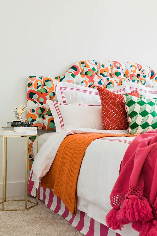
As we step into the bedroom, I can’t help but dote on the beautiful headboard from Noir, custom artwork by Blayne Macauley, and luxurious bedding from one of my favorites, Pine Cone Hill.  I’ve always been a big advocate for great bedding. You spend so much time in bed, so why not make it a true oasis with the good stuff?!  Actually, more on that to come; we’ll be sharing a complete how-to for properly dressing the bed here on the blog soon.  Anyway, along with the fantastic bedding, because space was again an issue, I did away with your traditional nightstands which would have made the space feel too cramped and instead brought in a smaller side table and my favorite wall sconce to provide an always needed night light.

So that’s that.  I’d love to know, what’s your favorite piece in today’s big reveal?!  And stay tuned tomorrow for the second apartment in all its fabulous girly glory.  Be sure to check out the credits below with all of the links to each piece pictured, and of course my other fellow participants’ final reveals today too; I know what I’ll be doing for the next few hours! Truly, MKR

SHOP THE STORY / CLICK LEFT & RIGHT ARROWS TO EXPLORE

Photography, Rustic White for Waiting on Martha

Living Room
Sofa | Throw Pillows | Armchairs | Gold Side Table | Lamp c/o | Rug | ArmoirConsole Table | Art  

Shelving unit | Bar stools (similar) | Ginger jar | Starbursts | Glass Beads | Darts | Plates | Glasses

Kitchen
RunnerCoral Art | Fruit Bowl | Swirl Vases here and here | Orchid | Planter

Bedroom
Headboard | Bedding c/o | Throw Pillows | Lamp c/o | End Table c/o | Decorative Urchin | Art | Media Console | African Slingshot Art | Lamp c/o | Vase | Buffalo 

Second Bedroom, Turned Office
Settee | Pillows (different color) | Rattan stools (similar) | Vase | Art: Nude, Motel, Pom Poms, TownHand Hook Worry Beads (similar), Surf Board | Faces | Chair & Ottoman WOM custom order, call for details

Desk (similar) | Abstract Art | Vase | Globe | Succulent | Brass Ruler | Brass Desk Accessories Holder | Chair | Pillow (different color)

Bathroom
Towels c/o | Bathroom rug | Shower Curtain | Vase | Soap Dispenser | Camera print | Wood Box 


Participants
JANA BEK | CHRIS LOVES JULIA | SHANNON CLAIRE | COCO.KELLEY | THE CURATED HOUSE

DRIVEN BY DÉCOR | THE ENGLISH ROOM | FROM THE RIGHT BANK | SHERRY HART

HI SUGARPLUM | HOUSE OF JADE | HUNTED INTERIOR | THE MAKERISTA | MAKING IT LOVELY

MARCUS DESIGN | PENCIL & PAPER CO. | MEGAN PFLUG | PLACE OF MY TASTE | SUBURBAN B’S

WAITING ON MARTHA  MEDIA PARTNER HOUSE BEAUTIFUL | TM BY CIH

Copyright © Welcome by Waiting on Martha  /
Back to Top