

First things first; I did not finish my room. For the first time, in the five One Room Challenges, I’ve participated in I’m turning in an incomplete project. A beautiful, but incomplete project. That’s why I’ve titled this reveal, “Part One” because I plan to share the room again when it’s truly complete. It may be awash in Christmas decor, but complete it will be.
So what didn’t get finished? My sectional. Which is funny considering my sectional is what spurred me to re-design this room. My current sectional is…tired would be the best word for it. Which only makes sense since this space is our only “living” space and has been very well lived in. But as mentioned in a previous post great sectionals are incredibly difficult to find and by the time I found the perfect one there was no way to turn it around in time since it’s made to order.
The other piece of the puzzle you won’t see today is my console/television area. The reasons for this are numerous and just part of the design process. No biggie though, I mean we’re not curing cancer here just redesigning a room.
Now that that’s out of the way, lets focus on what’s important…today’s reveal. Pretty amazing right? I’m not patting myself on the back or anything, but I couldn’t be happier with how this space ended up coming together.
You see when I first set out to complete this room for the ORC I was skeptical. I wanted a change, but I didn’t think the change I desired would actually create that much of an impact. Especially not an impact as big as those typically seen during the ORC. But if I’ve learned anything during this redesign it’s that a few strategic changes can make a major transformation happen. The three biggest changes in my space: paint, window treatments, and a rug switch up.
I’ve always been a person who preferred color on their walls, but between the Blog and the Shoppe my life is always so bright and colorful so I’d been craving a calmer space. The easiest way to accomplish that; paint your walls white. In my case All White by Farrow & Ball. It just makes this room so light and bright. Plus my new Jonathan Adler chandelier looks stunning hanging from the fresh clean ceiling.
Next, the rug. I’ve been lusting after the “Antelope” rug for as long as I can remember. Like leopard, I believe the Antelope print is a neutral. And the one I chose from Karastan is simply jaw dropping, and more reasonably priced to similar options. Trust me when I say, it’s even better in person, not to mention so much more comfortable than my last rug. As much as I love vintage and hand knotted rugs they just aren’t as comfortable as a SmartStrand silk woven one like this.
Third, and what I believe had the biggest impact, the draperies. I just keep standing in my foyer and looking down to the living room at those Stroheim draperies. The Stroheim Palapye fabric is a showstopper. The embroidered pattern gives the space interest, but doesn’t overpower the room. Hung well above the top trim and flush to the floor, rather than a puddle, the drapes make the room appear even taller than it is.
Speaking of fabric I also used Stroheim to re-cover my brass X benches. I love investing in great X benches like these ones from Taylor Burke Home because they’ll last forever and you only need about a yard of fabric to recover them. So when you’re ready for a redesign it won’t cost you an arm and leg to get a completely different look.
I also switched out my coffee table, opting for a simpler bright white one from Worlds Away. I kept the styling simple with a handmade bowl/vase from Jill Rosenwald and a woven tray full of necessities. Candles, matches, books, etc.
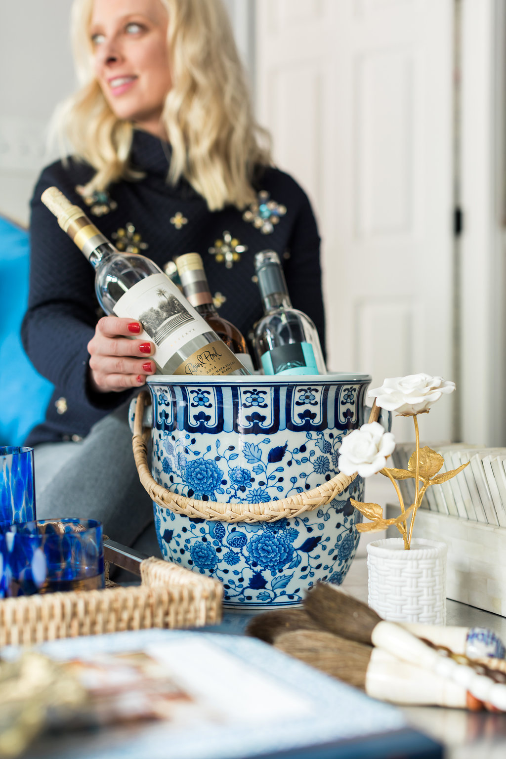
And you know my room wouldn’t be complete without a bar cart. I just love how this one from Bassett Mirror came together. With everything anyone needs to mix up a cocktail, including fresh herbs to add some life to both the cart and your cocktail, this cart is as functional as it is beautiful. And the best part, it’s on wheels to allow for easy movement during dinner parties or just family movie night. Oh, and how fun is my boob bowl full of matchboxes I collect.
Lastly, the textiles. I didn’t go as pillow crazy as previously, but I did still want to add a few fun accents. I chose textured neutrals and pale pink leathers from Serena and Lily. The cool, pale pink was the perfect hint of color and softened the space just enough. Softening the room was important to me because patterns can sometimes make a space look too intense so soft tones and soft textiles like the sheepskin and wool blankets, plus pillows really help calm it all down. And calm it makes me feel.
Thank you so much for following along during these seven weeks. I really am honored to always be a part of this amazing challenge! Truly, MKR

