


The day of a final reveal in the One Room Challenge is always the best day! And in our case, and lucky for you, this year we’re stretching it into TWO full reveal days. It’s just really the only way to show you both spaces in all of their completed glory.
But first, let me back up; if you’ve been following along for the past six weeks, you’ll know I’ve made it my mission to transform two model apartment units in the center of bustling Buckhead. Of course, that has entailed an entirely different challenge than any of my former spaces, which were either rooms in my own home or the the WOM office (see ORC 1, ORC 2 and ORC 3). All of these spaces allowed for me to pull my signature go-big-or-go-home moves, whether that was with custom lighting and fixtures, paint or wallpaper.
While these apartments limited me in a few ways (they are rentals, after all!), they also had me starting with a bright, beautiful and clean slate. As you can see here, our first apartment was already stunning, with plenty of natural light and the most high end, modern fixtures (you can find “before” photos here). But even with the bumps, when you’re designing any space in just a few short weeks there are bound to be a few trials and tribulations along the way, (to get a full picture be sure to read Week 4‘s update if you haven’t yet).
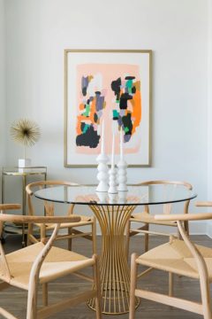
All that being said, I’m absolutely thrilled how today’s space came together. I designed this two-bedroom apartment with a young couple in mind, and wanted to create an elevated, eclectic feel with of course, a gender-neutral palette. I stayed true to my favorite blue and whites with a few pops of color here an there and infused plenty of details and accents that are full of texture, interest and personality…I hate for a space to feel generic, safe and downright boring.
I also wanted to make the spaces feel real and livable, which meant running the gamut of high, mid, and lower priced items to bring that feeling to fruition. I went high with some stunning statement pieces from Noir, ATG Stores, Taylor Burke Home, Annie Selke/Pine Cone Hill, and Worlds Away. Hit that mid range with Society Social, AllModern, Minted, Joss & Main and Waiting On Martha Home. And sourced great inexpensive details from Target, World Market, and even Urban Outfitters. By infusing high to low seamlessly, I was able to create a collected and homey feel, which is so very important in a rental space especially.
Looking to the separate spaces themselves, the living room had a very unique size and layout I had to work within. While seemingly difficult to design, I was able to work around both obstacles by utilizing versatile pieces that can pull double-duty when needed. For example, I rather than your traditional coffee table, which honestly wouldn’t have fit in the space, I used a table on wheels that can be moved out of the way when needed and can double as a fantastic bar cart when entertaining. Similarly, I turned to my go-to faux python console table, placed behind the custom sofa. The console table provides a place for a table lamp, can easily hold items you’d typically place on the coffee table, plus houses a basket full of additional pillows and throws (because you can never have too many).
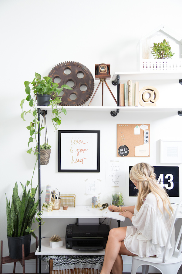
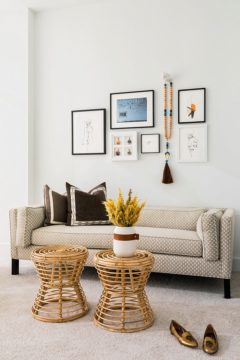
While this apartment was a two bedroom unit, I opted to turn the second bedroom into an office. The campaign desk suits the space perfectly, allowing the rest of the room to comfortably have the custom Taylor Burke Home settee, the perfect chair and ottoman for reading, and the collection of art (all fun, affordable prints from Minted, plus some framed pom pom tassels which I just love). My hope was that while I chose to turn this space into an office, each possible future tenant could easily see this as either a bedroom or office, or even both if you get a pull out settee!
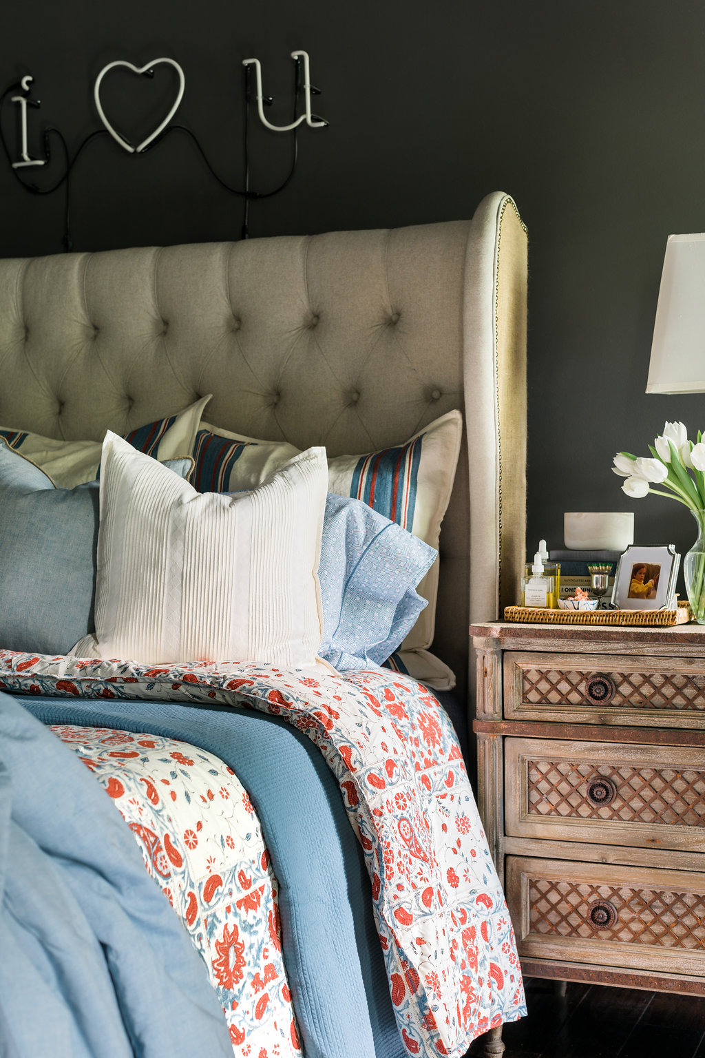
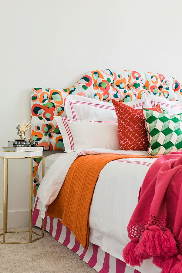
As we step into the bedroom, I can’t help but dote on the beautiful headboard from Noir, custom artwork by Blayne Macauley, and luxurious bedding from one of my favorites, Pine Cone Hill. I’ve always been a big advocate for great bedding. You spend so much time in bed, so why not make it a true oasis with the good stuff?! Actually, more on that to come; we’ll be sharing a complete how-to for properly dressing the bed here on the blog soon. Anyway, along with the fantastic bedding, because space was again an issue, I did away with your traditional nightstands which would have made the space feel too cramped and instead brought in a smaller side table and my favorite wall sconce to provide an always needed night light.
So that’s that. I’d love to know, what’s your favorite piece in today’s big reveal?! And stay tuned tomorrow for the second apartment in all its fabulous girly glory. Be sure to check out the credits below with all of the links to each piece pictured, and of course my other fellow participants’ final reveals today too; I know what I’ll be doing for the next few hours! Truly, MKR











i am DROOLING over everything- those furniture choices slay me!
You killed it. Can I move in?. Bravo on completing another wonderful One Room Challenge!
i never comment on blogs but i had to give you major props for SLAYING this challenge. my jaw dropped as i started to read your post and stayed open until the end. your design of this space is SO SO GOOD. bravo!!!!
I’m totally in love with all of the Noir pieces and tribal touches throughout, Mandy. This is far more than a one ROOM challenge, and I love each and every space. Bravo on another beautiful ORC!!
Sarah xx
Just stunning! The Blayne Macauley artwork in the bedroom is my favorite piece although the gray lumbar-shaped pillows with black details on the bed are gorgeous, too. Any chance of a link to them?
Never mind my pillow question, I found the link – to Target, no less!
I love it.. Really live-able and with great personality. I agree with another comment above… I could move in!
It looks absolutely fabulous! I love those bold statements like that great armoire in the living room! Can’t wait to see the other unit.
All these rooms are absolutely gorgeous!! The neutral and clean palette choices brighten up the rooms so much! I’m in love! <3
XO, Jessi
http://www.mywhitet.com/welcome-fendirumi-fendi-mwt/
You are a serious design genius! Absolutely loved every detail! Wondering if the link to the kitchen runner is accurate? It looks super blue on the Joss &Main site. Many thanks!
Oh my god, I want to live here!! Come to Maryland and decorate my home!!
Xx Taylor
http://lightscameracatwalk.com/
Love the vibe of these spaces Mandy! you’ve outdone your self again!
Amazing! You are so good with color and details. I love both of the apartments that you did.
I am loving every little detail in this space,love the NOIR pieces and the tribal touches personally have always loved them and you have addressed them so beautifully.
would love for such an amazing designer to stop by my blog, I will be revealing tomorrow because dont have the photo back from the photographer yet.
http://lakbirdesign.blogspot.com/2016/11/one-room-challenge-kitchen-remodel-week.html
Hi Tanya! Thanks so much – yes it is the runner from Joss & Main. It actually is pretty blue, and photographed less vibrant. Hope this helps!! xo
Hi Sheila! Aren’t they amazing?! Part of Nate Berkus’ new line at Target. 🙂 xo
We love to hear that, Nichole. Thank you!! xo
I think you did abut fifteen rooms! Wow, all the details and amazing choices. So good. I love how you layer all the elements and style each space. Great job…off to the other one…