Living

A Look Inside Waiting on Martha Home

Sharing a Quick Tour of the Brand New Waiting on Martha Home
Filed Under > Ideas & Inspiration

Waiting On Martha Home Waiting On Martha Home

As most of you know two weekends ago I celebrated the Grand Opening of Waiting On Martha Home, and while I still haven’t had time to catch my breath, I wanted to take a moment to share a peek into the weekend, the design, and a little into the process of how I got here.   

Opening my own brick & mortar shoppe has been a dream of mine for years.  Almost five years, and four different pop-up shop test runs if I’m being exact.  So believe me when I say getting to this moment has not been an easy journey.  

First I had to tackle the question of, “do I even want a retail storefront?”  Retail is not for the faint of heart; I lost many a night’s sleep making pro and con lists over this question.  But, in the end I knew this dream of being a Shoppe Girl has been in my heart well before there was a WOM.  

So with that box checked the next question was “where?”  This was definitely one of, if not the hardest part.  Location, location, location was of course key, but I also had a vision of what I wanted the storefront to look like.  And then the clientele of course; I needed to put roots in a place where Waiting On Martha Home would be welcomed and supported, and most importantly shopped!  Enter the Vinings Jubilee, an adorable neighborhood of speciality stores and restaurants tucked in historic Vinings Village Atlanta.  It was, it is, the perfect place for our flagship store!

Lastly, design.  This was by far the easiest, and most fun part of the whole process.  Having been dreaming this dream for so long I knew exactly what I wanted to do down to the very last detail.  First things first, demo.  

I worked closely with Rob and his amazing team from Vision Construction.  With the help of Vision we knocked down walls, tore up all the flooring, moved electrical, exposed windows that were hidden…which I’ll never quite understand, painted, wallpapered, and built out 8 custom shelving and cabinetry units and 1 custom beverage bar.

And while Vision was a dream to work with, I can’t give them all the construction credit.  My father, the talented man that he is, built by hand…in my parent’s garage no less, the most gorgeous check out station you’ll ever see. Plus he built the fireplace, laid the custom flooring in the backroom and with a little help from the hubs hung a room full of shiplap.  As Kat says, “dad is a unicorn.”

For the actual design details, it really breaks down to the paint, wallpaper, countertops, and flooring.  

For the flooring in the main room, I chose a wide plank, warm toned maple colored laminate wood flooring that I swear you’d never know wasn’t real wood.  This was able to save me quite a bit of cash, plus it’s so nice not having to worry about it getting scratched or damaged.  

In the back room, I went with hand-stamped laminate wood tiles from Charleston designer Mirth Studios.  I stumbled upon these tiles on Instagram and immediately fell in love.  Available in 40+ patterns, and with a 15 year warranty I knew they would be just the right amount of pizzaz I was looking for, plus the Sweet Cecilia design paired perfectly with my Farrow & Ball Pale Powder shiplap walls.  I loved the tiles so much, we are now the exclusive retail partner of Mirth Studios.  So if you’re in Atlanta, stop by the Shoppe and check some of the designs out for yourself! 

The wallpaper had to be grasscloth; no question in my mind.  My favorite line of grasscloth currently is from Bradley USA.  The quality is amazing, and it’s a better cost option than others. And though I loved all of the grasscloth patterns, colors, and textures I ended up going with the Jute Grasscloth in Gleam.  

Just as the wallpaper had to be grasscloth, the paint had to be Farrow and Ball.  If you remember I visited Farrow and Ball’s headquarters in England last September and actually saw the entire paint process from start to finish, and there’s just no one who does it quite like F&B.  

I used Chappell Green in lacquer, Pale Powder in both a flat and semi gloss, Dimity in lacquer, and All White in both a flat and semi gloss.  There really are no words to describe just how gorgeous it all turned out.  Honestly, the coloring evokes just the right amount of happy, calm, and bright…pure perfection.

Lastly, the marble.  This was a difficult task.  The marble needed to go in four very large places: the check out station, wrapping station, beverage bar, and fireplace.  Measuring to be at least 2 full slabs of the exact same marble, which meant digging through remanent pieces that are always more reasonably priced was not an option.  And of course I wanted thick, beautiful, white carrera-esq marble.  Not granite, not quartz, not laminate…marble.  

After visiting a few marble yards, and finding nothing in our budge, I was referred to Elise from Stone Select.  Thank God for Elise!! You see Elise is basically a stone-marble-granite dealer.  I told her what I wanted and she searched all the yards and found it.  The best part, she found it fast and under budget! Seriously, if you are in Atlanta and need marble Elise is your gal!

And with that, and a lot of product styling, my pinch-me moment of finally opening my Waiting On Martha Home doors was ready.  

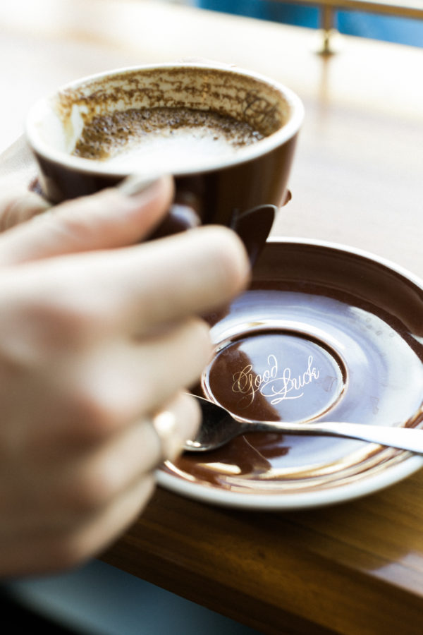
I’ll be putting the finishing touches on the place over the next few weeks, and invite you to come join the fun; sip on coffee in our custom coffee cups, treat yourself to a little “sercie” or “happy”, find gifts for quite literally everyone, or let me help in designing that custom piece of furniture you’ve been dreaming about.  And be on the lookout for upcoming events at Waiting on Martha Home.  

One more quick note; thank you.  I was thoroughly blown away by the support of WOM’s family and friends who came out to shop on opening day regardless of the torrential down pour.  To my online customers and friends who sent so many well wishes.  And of course, it meant the world to me to see the amazing response of the Vinings community.  Thank you to Kat, Liz, Steph, and the entire WOM Team.  To my parents, who have worked tirelessly my entire life to give me everything I could have wanted and needed, who have supported my dreams, and most importantly have loved me unconditionally.  And lastly, to my husband, who along with Addison is always my biggest cheerleader.  THANK YOU.  The best is yet to come Friends! Truly, MKR

P.S. Be sure to follow along on the shoppe’s Instagram and Facebook page for exciting updates, special discounts and more! xo 

Photography, Kathryn McCrary for Waiting on Martha

How to Style a Coffee Table: Dissecting the Design

The simple formula to a well-styled and functional vignette
Filed Under > Get The Look

how to style a coffee table, waitingonmartha.com

I have this love affair with coffee tables.  Maybe it all started when I first saw MKR’s in her home; an oversized silver trunk with gorgeous coffee table books, candles, vintage calligraphy brushes and fresh flowers.  Ever since then, my appreciation for a well-styled coffee table has only doubled.  We’ve shared tips on how to style a coffee table here before, but we also believe it’s something that will never grow old…so here’s a short and sweet reminder with inspiration.

The pattern I find with the best coffee tables is that they all include a variety of depth, texture and height.  Stacked coffee table books and flowers are easy ways to add the height, while trays and accents infuse different textures and interest to the styled vignette.

I’m including five key pieces to consider when styling a coffee table.  What would you add to the list?  Do you style and re-style your coffee table often, like I do?!  Cheers, Kat

P.S. A few weeks ago we dissected the design for console tables, too.  Check it out here.  xo 

SHOP THE STORY  / CLICK LEFT & RIGHT ARROWS TO EXPLORE


Wainwright Coffee Table, White

One Kings Lane, $529

Shop Now >

The Surface
A great coffee table allows for room to showcase your personality and favorite objects, along with a coaster or two with your glass of vino!  

Don’t limit yourself to default coffee tables, however.  Think outside the box with vintage trunks, ottomans and poufs too.  

Hand Painted Leopard Tray, Waiting On Martha

Hand Painted Cream Leopard Tray

Waiting on Martha Home,$170

Shop Now >

Trays
Trays are quite possibly the most important thing you can have on your coffee table; they corral objects and separate the surface from small objects, creating much-needed depth.  

What’s great too: trays can be added to unconventional surfaces like ottomans and poufs to instantly create a coffee table look and feel. 

The Book of Chic

Amazon, $85

Shop Now >

Books
Coffee table books instantly add personality and interest; they make the space feel like a home, and of course entertainment for the lingering guest.  And the best part?  They’re easily edited and changed whenever it strikes your fancy. 

Stack your favorite books by color, by topic and/or size.  Get creative; don’t take the stacks too seriously and change them around until they’re just right. 

Gold Banana Palm Leaf Large Tray

Waiting on Martha, $58

Shop Now >

Accents
Accents are the fun part!  Incorporate items that reflect your travels and passions; the things that make you happy.  You can edit your collection often, keeping the space looking fresh and inviting all year long. 

Some of our favorite accents include anything and everything gold, trinket trays and dishes for matchboxes, candles, vintage calligraphy brushes, crystals and palo santo sticks


28" Cymbidium in Pot, Faux

One Kings Lane, $99

Shop Now >

Flowers
You can never go wrong with fresh flowers or greenery in a vignette! They serve as a vibrant focal point for the space, and offer added height and texture.

While fresh flowers on a weekly basis can get expensive, another great option is a small plant like a topiary, succulent or cactus that’s easy to care for (see our list of our eight favorite, easy indoor house plants).  Oh, and faux flowers are really quite impressive these days too! 

Featured image, Rustic White for Waiting on Martha

How To Style A Console Table; Dissecting The Design

Breaking Down The Details of a Beautiful, Functional Console
Filed Under > Living

How To Style A Console Table, Waiting On Martha Blog

A styled console table, whether that’s in the entryway, hallway, or living room is one of our favorite times form meets function in every home.  So we thought we’d spend today breaking down just how to style a console table.

The console table pictured above, as well as the console table seen here, are some of our top-pinned images of all time!  In order to achieve a pin-worthy and truly functional space, it’s helpful to understand the different components of console table decor.     

When it comes to the actual “how” in how to style a console table, think outside the box. And let’s not forget what a console table can actually do for your home. The possibilities are truly endless; in fact MKR’s favorite version of a console table is actually used as a bar in her home and a coffee bar in the office.

Similar to the endless possibilities of what a console table can do for you is the decor that a console table can hold.  Trays, flowers, candles and art; the styling combinations bring beauty and organization together in one easy sweep.  

Balance is key.  Varied height with table lamps, accents and plants, along with bold accents and multiple dimensions all work in tandem to unify the design.  And while this space can be completely customized to show off your personality, it lends itself to frequent redesign with a simple edit of accents.

To go into a bit more detail, below we’ve broken down all of the design elements that make this space beautiful.  We’d love to know if you love a console table as much as we do and how are you using your console table?! Cheers, Kat

SHOP THE STORY  / CLICK LEFT & RIGHT ARROWS TO EXPLORE


Safavieh Ambler Clear Console Table

Overstock, $238.49

Shop Now >

The Surface
By starting with the surface, you’ll determine how big of statements you’ll use for the rest of the decor and accents.  Here, MKR has utilized the modern, clean design of a glass console table as the blank canvas to allow room for a show-stopping lamp, colorful art and statement stool to really shine. 

Other gorgeous options include ornate tables like this blue raffia, this natural grasscloth, and this bone-inlay console table.

One thing to consider: some console tables like this one have a lower, second shelf.  This will allow for more styling space, but will limit the use of stools and ottomans. 

Fashion-Walk by Ana Gaion

Minted, $178

Shop Now >

Art
Think of oversize wall art as the anchor of this space.  A bright, bold piece centers the vignette and gives it the dimension it deserves.  

Don’t want to invest in an original piece just yet?  Check out Minted and One Kings Lane for beautiful options for framed prints and printed canvases.  

Dixon Table Lamp

One Kings Lane, $599

Shop Now >

The Lamp
The next piece is a no-brainer; the lamp.  Not only will you want a lighting source on in this styled vignette, you will need the added height and interest it brings.  A table lamp instantly unifies the art and the styled items on the table.  MKR incorporated a stunning Mary McDonald statement lamp to great effect. 

More gorgeous options include this gold bamboo table lamp, this gilded beauty by AERIN, and this simplistic, and really reasonably priced, white table lamp

Perry Pillow-Top Ottoman, Beige

One Kings Lane, $795

Shop Now >

Stools & Ottomans
This part is what makes the space so pin-worthy!  Stools and ottomans are the perfect marriage of form and function, and they really take the vignette to the next level. 

Whether that’s a Moroccan leather pouf, a set of X benches, the White Hand Stool from Waiting on Martha as pictured above, or two chinoiserie garden stools, this detail always helps tie the space together.  Not to mention, it gives you a place to set your bag in the entryway! 

The Big Book of Chic

Amazon, $75

Shop Now >

The Book Stack
A stack of books instantly delivers the balance on the table that you’re aiming for; arrange 1-2 stacks with a variety in sizes—they don’t have to be perfect!  Have fun with your book selection, picking out titles and covers that show your personality and interests.  And MKR always reminds us to incorporate a pop of red in a vignette; here she used Art of the 20th Century to do the trick. 

Book stacks also act as the perfect pedestal for your favorite accents like a balloon dog, these geometric objects, a brass skull or this gold urchin

28" Cymbidium in Pot, Faux

One Kings Lane, $99

Shop Now >

Something Fresh
You can never go wrong with fresh blooms or greenery in a styled vignette.  Here, an orchid provides another point of interest and added height.  If you find yourself with a green thumb, having a live plant gives you the perfect excuse to enjoy this styled space throughout your week!  And if you can’t ever keep a plant alive, consider a beautiful faux option like this one

Gold Banana Palm Leaf Large Tray

Waiting on Martha Home, $58

Shop Now >

For the Trinkets
When you’re considering how to make this space as functional as it is beautiful, don’t forget a place to stash your car keys, especially if the console table is in the hallway or entryway. Decorative boxes and trinket dishes, like this one and this one, are the perfect additions to your book stacks and accents. 

Featured image, Rustic White for Waiting on Martha

Copyright © Welcome by Waiting on Martha  /
Back to Top