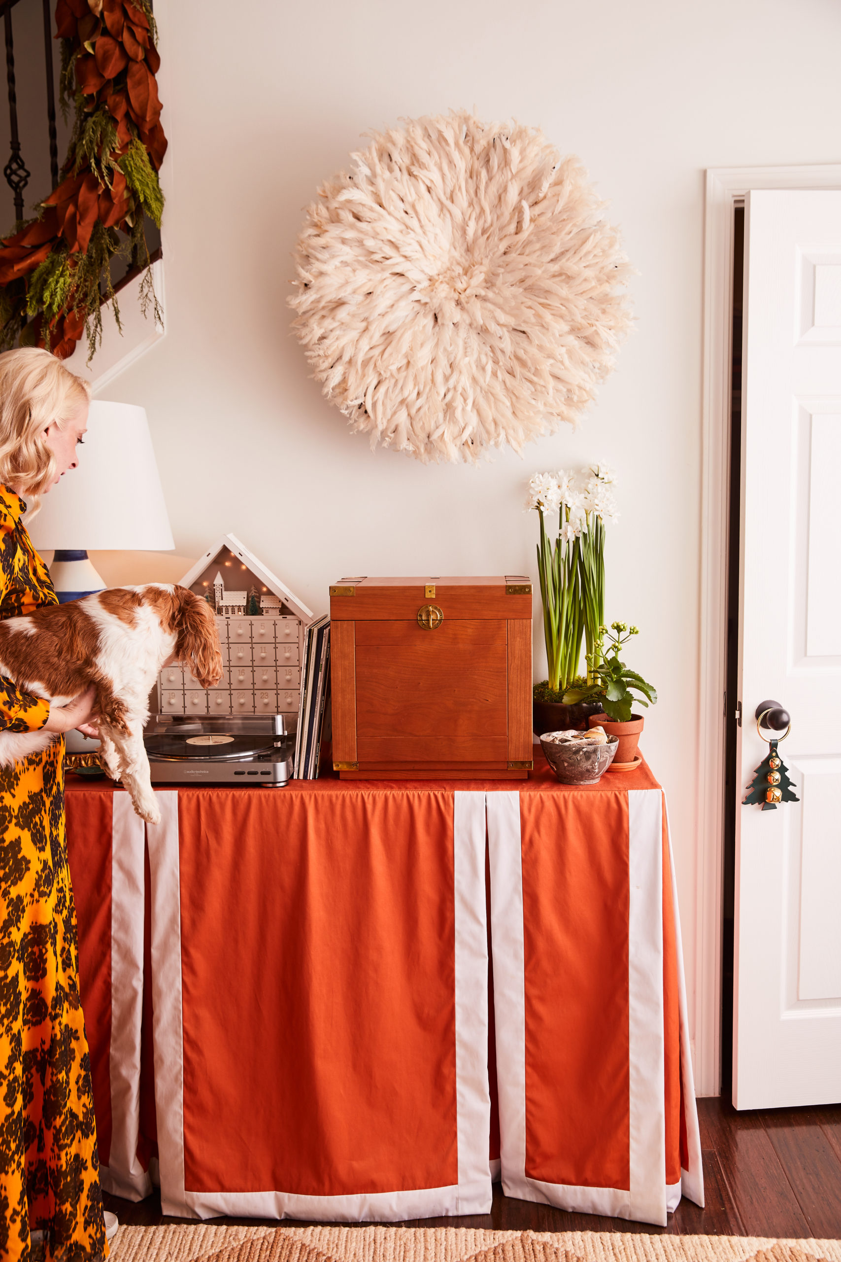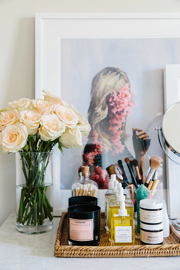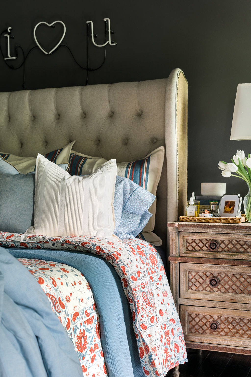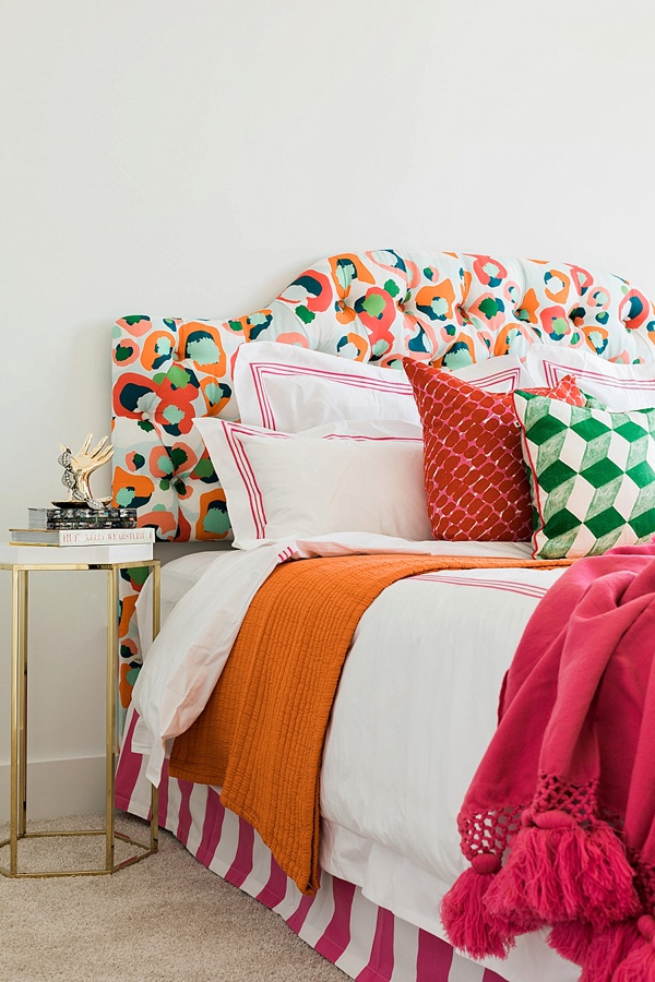


…And just when you’re dying to see the final reveal, I tease you one week longer! I know, I know, you thought I would share another peek at the design. But no, I thought it would be an exceptional time to share the “before” photos of our two model apartment units that we’ve transformed these past few weeks. Now, if you know how I do things in ORC’s past, I NEVER show the before photos. But there’s a new time for everything, and these photos help paint the picture of the journey that is this season’s One Room Challenge.
As I shared in previous weeks, my mission has been to rid the spaces of the impersonal, nondescript details, and instead bring in a warm, welcoming design that’s full of textures, motifs and decor that anyone would want to call home. As you can see in the photos above, both apartments are brand-spanking-new with gorgeous fixtures, flooring, and spare-no-expense kitchen and bath areas. There’s already a ton of natural light (hallelujah) thanks to the floor-to-ceiling windows.
But while all of these details are in fact wonderful, there’s a huge, tricky detail I’ve had to conquer; both spaces have extremely unique floor plans. And since these are both for rent, I can’t pull my standard big-statement-moves (wallpaper, dramatic light fixtures, bold paint) because it wouldn’t be fair to have tenants fall in love with details they aren’t allowed to implement themselves! You can read about a few of the road bumps I’ve hit along the way in last week’s post.
So friends, sit tight until next week when we share the ever exciting One Room Challenge final reveal in all its glory. Cheers! Truly, MKR

