If you’re following along on Snapchat (username WAITINGONMARTHA), you’ll know I started the install process on our two 2016 One Room Challenge spaces late last week. Which means any lingering giddy feelings that came with week 1 quickly evaporated into the anxious anticipation that comes with week 2 and beyond. Already there have been obstacles to overcome, and many phone calls made about delivery deadlines. But let’s not get ahead of ourselves, I’ll be sharing more about install and disastrous moments next week. This week, I’m still feeling a bit on my game, so I thought I’d share five things you’ll find in the spaces this go around. Truly, MKR
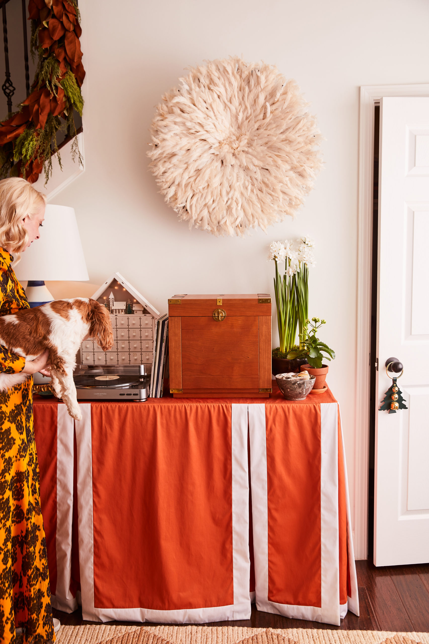
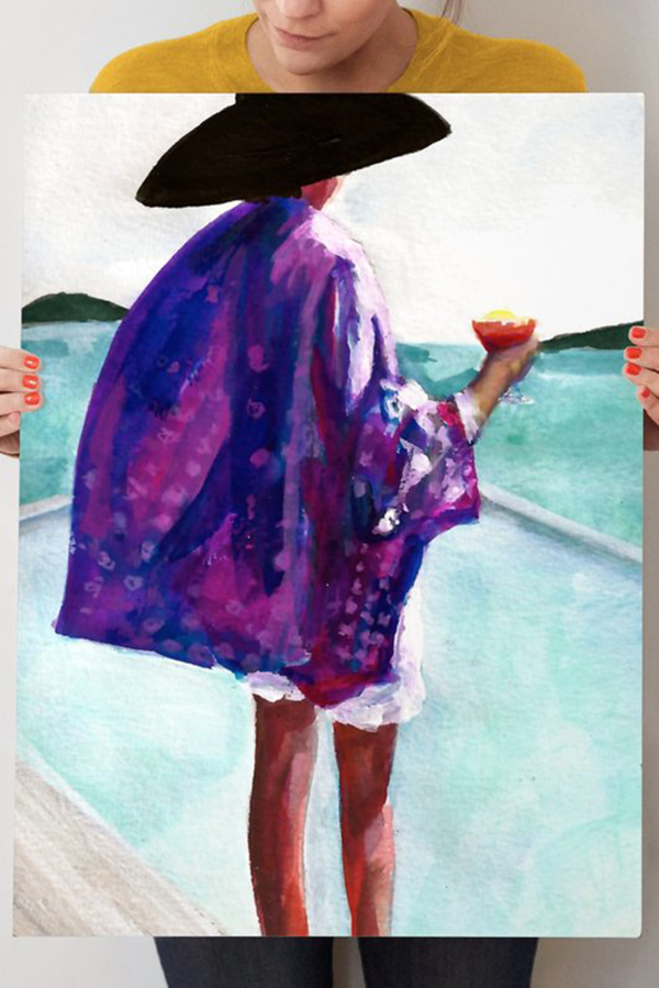
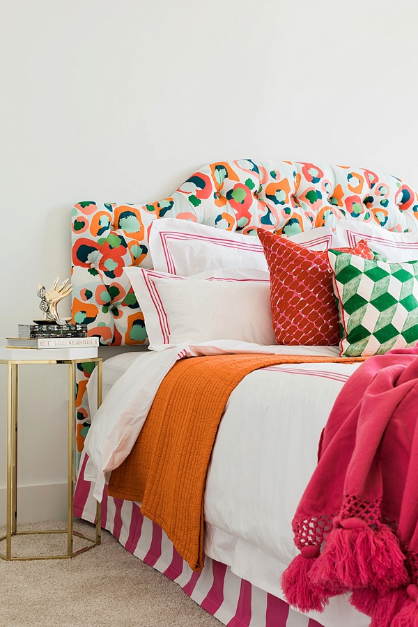
No. 1…Colors, prints and patterns. While these three items are definitely a signature move of mine, expect to see them executed in a completely different way. Typically, I showcase bold moments by painting or wallpapering, but as I explained last week that wasn’t an option which meant I had to find another way to bring the fun in. So rather the wall, this time you’ll find my “go big, or go home” moments on the furniture pieces themselves.
No. 2…A truly edited space. Editing has never been my strong suit. Typically, I’m a more-is-more person (proof here). But in this One Room Challenge, my mission is to create an environment that someone can see themselves living in. Which means I’ll be aiming to give someone just enough to make them want to scream “sold!” but allow them to envision the space as their home rather than my home.
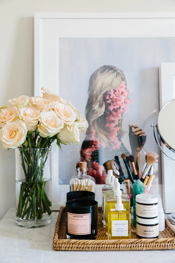
No. 3…A mix of materials. With an open space concept like the one I’m designing, it’s important to define the space. While I want everything to feel cohesive, I also want your eye to be pulled to different areas, allowing each part to have it’s own moment. One of the biggest ways I’m doing that is by utilizing a mix of materials such as glass, brass, lacquer, mirrored, various woods, linens, velvets, rattans, and even a little marble. Hopefully the end result will be spaces that feel distinct, rather than matchy-matchy.
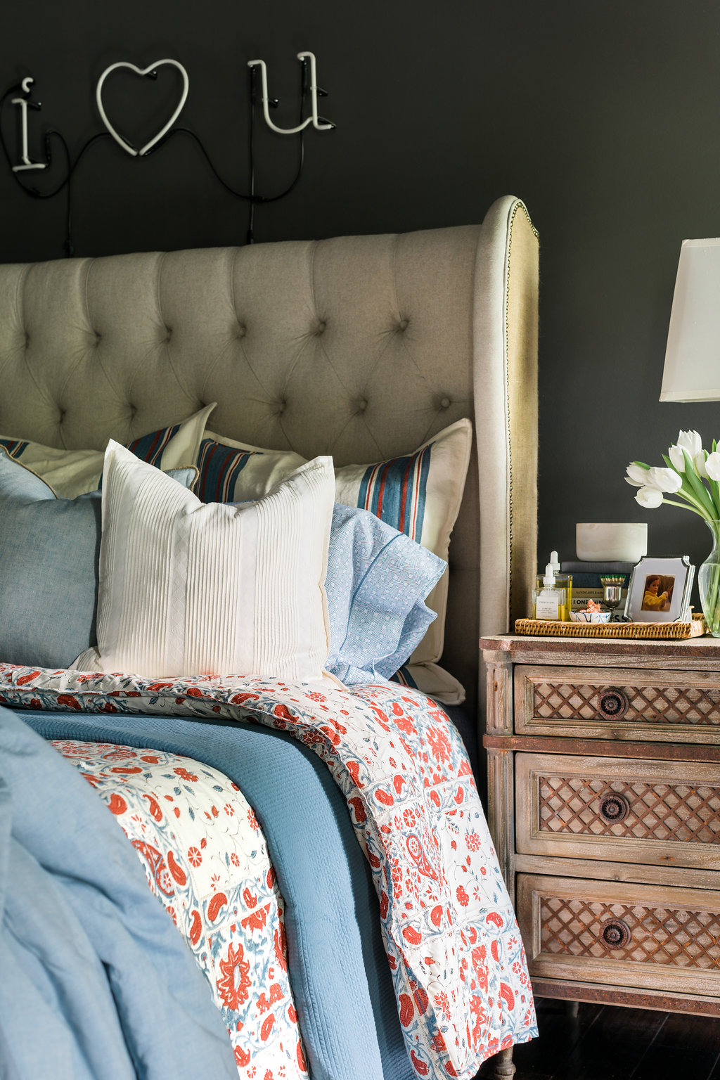
No. 4…Texture. Along that same note, textures are a key component to adding interest, depth and warmth; so in these spaces, I’ll be bringing in textures whenever I can. Be on the lookout for faux python, rugs in varying fabrics such as faux hide, sisal and wool, linen headboards, and plenty of 3D art and textiles. I’m hoping through the textures, materials, prints and patterns every piece will have a story to tell.
No. 5…Custom Specs. It’s easy, when you walk into a blank canvas such as these spaces, to feel overwhelmed and instantly become a slave to the space. But I’m a strong believer that you need to make the room work for you. Don’t be afraid to talk with manufacturers about custom sizing for your bigger pieces. Rather than take a “one size fits all”, I worked with Roxy at Society Social to create a console table and two sofas that feel like they were made for the space. And FYI, the custom pricing was surprisingly nominal, and the effect of a perfectly tailored piece was priceless.

