results for one room challenge

Creating A Cozy Space with Serena & Lily

Switching up my favorite little nook with the help of an amazing rattan daybed
Filed Under > Get The Look

Styling a daybed, Waiting On Martha Styling a daybed, Waiting On Martha rattan daybed styling, Waiting On Martha Styling a daybed, Waiting On Martha rattan daybed styling, Waiting On Martha

I’ve always been a fan of the daybed, and as of late daybeds are showing up everywhere in the home.  Outdoor space, add a daybed.  Nursery, add a daybed. Breakfast nook, add a daybed.  Plus they’re chicer than ever.  Take for example this Avalon rattan daybed from Serena and Lily.  When I first spied it I knew I had to find a space for it.  That space turned out to be my sitting room in my bedroom.

Let’s pause right here to discuss something for perspectives sake.  When you read the sentence above you probably thought, if I have a sitting room in my bedroom then my home must be quite spacious.  Not exactly.  My home is great, but it’s not a McMansion by any stretch of the imagination. For some reason when they built our home they added a sitting room to the master making it larger than our family room and dining room combined.  However, because we don’t have a basement and only a family room, I was committed to making the sitting area an actual space that was used and not just a pretty room to look at. 

Since my husband and his abnormally large television took over the family room, I naturally retreated to our bedroom.  Which was fine by me because the bedroom is, and always has been, my favorite room in every home I’ve ever lived in. I know most sleep experts would warn against it, but there’s nothing I look forward to more than cozying up in my bed with a stack of magazines, a great glass of wine, and the apple tv fired up and ready. It’s like that Drake song; “I only love my bed and my momma.” Preach Drake, preach.

Anyway, I’ve gotten off track, back to the Avalon rattan daybed.  Before the daybed entered our life I had a whole sitting area set up with two very large chairs, a coffee table and ottomans.  That worked, but over the years how I’ve used the space has changed.  Before I really only used it to watch a movie.  Now I was craving a new space I could spend my morning quiet time, work, and watch a movie when the mood hit.  And the daybed was the perfect way to make this new vision become a reality.

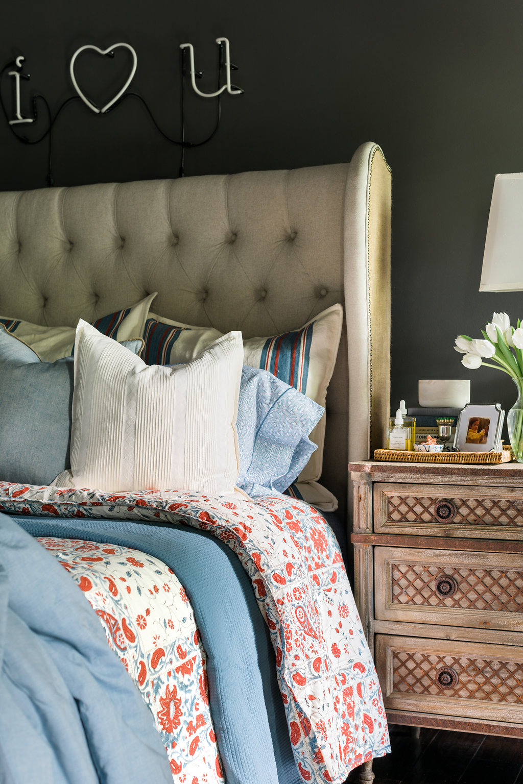
The chairs and coffee table went bye-bye, and the whole room shifted.  I put the Avalon rattan daybed against the wall and loaded it down with my favorite gingham sheet set and quilt from Serena and Lily plus a few throws, and a good amount of pillows. This created the perfect, and most cozy spot, to spend quiet time in the morning and movie time at night.  Because there wasn’t room for a coffee table I added an end table that can easily move around to where it’s needed most.  And lastly, I brought a small white desk up and placed it opposite the daybed. By positioning the furniture like this I maintained the square shape which helps it feel like a separate space rather than just an extension of the bedroom.

I’ve been living with this new set up for a few weeks now and I’m loving it.  And I’m not the only one, you can see that Addison has really taken to the daybed as well! Truly, MKR

Photography, Rustic White Interiors | This post was in collaboration with Serena & Lily.  A brand I love and adore.  Opinions are 100% my own.

2016 Fall One Room Challenge: Week 3

How To Add Art To Your Home That's Anything But Boring
Filed Under > One Room Challenge

2016 Fall One Room Challenge

There’s nothing that makes a space quite like art.  It’s the easiest way to infuse personality and really make a space your own.  That’s why in all of my ORC’s and in all of my design, including my own home, there’s always an emphasis on art.  Which brings us to the focus this week.

Next week, I’ll begin to actually show you the space coming together, specifically the art, but this week I thought I’d share my art -focused design board, as well as a few tips that I always adhere to when bringing art into my life.

When talking, designing and buying art, I stick to a few rules.  Rule one: buy what you love.  Like wine, art is subjective, so unless your collecting or investing, then forget about if the art will lose its value, or if it’s well respected, or blah, blah blah.  If you love it, buy it.  End of story.

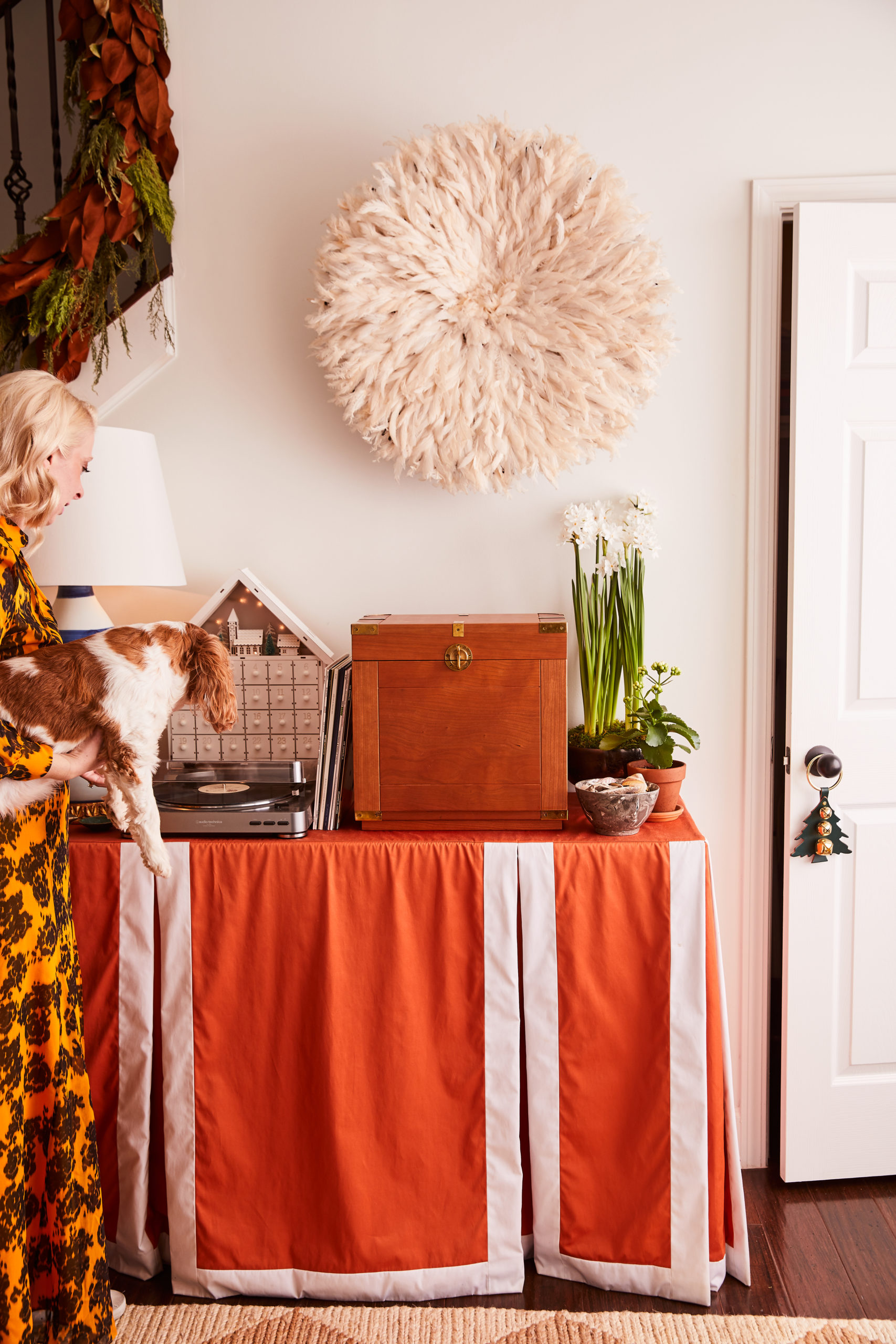
Rule two: always think three-dimensionally.  Art isn’t just something you frame; it’s African juju hats, baskets and skateboards (see my loft), it’s literally anything you can hang on the wall.  So add a bit of dimension and depth by thinking outside the frame.  Oh, and bonus points if you can fit a swing arm lamp or sconce into the mix.

Rule three: mix it up with frames and sizing.  With so many framing options now available (white, gold, wood, ghost, black) there’s no need to be basic.  Plus digital framing services make it easier than ever; I’m a big fan of Simply Framed.  Same goes with sizing; treat a gallery wall like a puzzle and mix in all shapes and sizes.

Now that you’ve heard my three rules of thumb when it comes to art installations, tell me…do you like to go bold on your walls? What 3-D details are you dying to try? Stay tuned for next week’s peek into the spaces, where I start to incorporate these pieces you see here.  Truly, MKR 

P.S. Follow along on Snapchat tomorrow as I give you a few sneak peeks as I actually begin installing the art into the space.

SHOP THE STORY / CLICK LEFT & RIGHT ARROWS TO EXPLORE


One. Natural Juju Hat | Two. “Leaf in Green” | Three. “The Sassi” | Four. “Surf” | Five. Alchemy, by Steve McKenzie | Six. 12″ Hope Basket | Seven. “No Vacancy” | Eight. “Pining for Pineapple” | Nine. | Ten. Circular Rattan Wall Mirror 

The Players: Jana Bek | Chris Loves Julia | Shannon Claire | Coco.Kelley | The Curated House | Driven by Décor | The English Room | From the Right Bank | Sherry Hart | Hi Sugarplum | House of Jade | Hunted Interior | The Makerista | Making it Lovely | Marcus Design | Pencil & Paper Co. | Megan Pflug | Place of My Taste | Suburban B’s | Waiting on Martha 

 Media Partner House Beautiful | TM by CIH

How To Keep Making Room For A Growing Art Collection

Easy Framing & Finding Space For New Art with help from Simply Framed
Filed Under > Ideas & Inspiration

3d Gallery wall ideas complete with our favorite Juju Hat, waitingonmartha.com How to arrange a gallery wall, including our favorite juju hat via @Waitingonmartha Colorful paintings & gallery wall ideas via @waitingonmartha Gallery wall art ideas via @waitingonmartha How to arrange a gallery wall complete with our favorite natural feathered juju hat, waitingonmartha.com

You may remember my colorful and quirky loft space from a 2015 One Room Challenge; it had a MAJOR mix of playful colors, patterns and textures galore with its centerpiece being my gallery wall of collected art.  With a whopping 24 pieces on the wall itself, I feel like I defined a whole new level of “gallery wall.” 

When I initially created the gallery, I purposely left some room on the wall for the collection to evolve and grow.  It wasn’t until recently, right before Christmas, when I walked into my guest room (rather storage room) and saw over a dozen pieces just leaning against the wall, unframed and collecting dust, did I realize that I better get them on the wall before it becomes too daunting to do so.  And if I’m being honest, a dozen plus pieces was already becoming to feel daunting.

I had used a few framers in the past, but with each frame ringing anywhere from $200 to upwards of a $1,000 for my largest piece, the idea of framing everything was even more daunting than getting them hung on the wall.  Fortunately, I had recently met the founder of Simply Framed at a conference here in the A.  I was beyond inspired by her story and bootstrap mentality of starting her business.   I knew next time I needed a framer,  Simply Framed would be where I turned.

And man, am I happy I did.  I cannot tell you how simple and seamless the entire process was.  Simply Framed‘s approach to all of this framing business is beyond refreshing.  I went online, picked out my mattes and frames then Simply Framed sent me the shipping tubes and pre-paid labels to send in all of my art safely.  Once everything arrived, I worked closely with their customer service team to make sure all of the art was perfectly matched up to it’s corresponding frame because I was nervous with so many pieces and different frames things would get mixed up.  In less than two weeks, I received my pieces back at home, along with an easy framing kit that, again, made it ridiculously simple to finish the project. 

When it came to actually laying out a gallery wall of this size and caliber, I can honestly say I was a tad on the uneasy side.  When buying each piece, I wasn’t thinking “…oh this piece of artwork will look great next to this piece, and that piece”.  I simply bought what I loved and had faith it would work itself out.  I mean, I have plenty of walls, so if it didn’t incorporate well in the gallery, I knew there would be another wall or shelf where it would work. In the end, I was thrilled to find that even though the majority of the pieces were bold and bright, the overall tone worked well; with a warm, peachy neutral emphasis and clean, modern frames. It’s funny how even though you often don’t intentionally think about a color scheme or pattern, one always seems to naturally work its way out. 

This time around that natural theme included a bold, colorful nude by Kate Waddell via Well + Wonder. Collective.  Have you heard of Well + Wonder?  It’s a beautiful website with a collection of southern-curated artists, and it’s quickly become my go-to when I’ve got the itch for a new addition at a price that doesn’t make me feel buyers remorse.  This industry has me fortunate in meeting so many talented creatives and collectives like Well + Wonder, I always enjoy finding new additions; each one carrying a special feeling, memory, or moment.     

Some other new finds include my floral girl by Clare Elsaesser, the 1955 Gerry Winogrand print, a perspective-invoking “Look Down” print by Gail Schechter, the upside-down palm trees, my Sally King Benedict tennis court, Gray Malin’s lamas, and of course my gorgeous ladies by Haley Mitchell that you may remember from the WOM offices at ADAC.  And my wall wouldn’t be complete without 3D accents such as a NEW natural/toffee colored Juju hat that’s a bit smaller than our original size and the oversized worry beads hanging from the hand hook.

Of course there’s more that goes into a gallery than tone and gorgeous art, so stay tuned tomorrow for more tips on nailing a strong gallery wall (pun included).  Truly, MKR

SHOP THE STORY  / CLICK LEFT & RIGHT ARROWS TO EXPLORE

Photography, Rustic White for Waiting on Martha | This post is in collaboration with Simply Framed, a brand we love and adore.  All opinions are 100% our own. 

Copyright © Welcome by Waiting on Martha  /
Back to Top