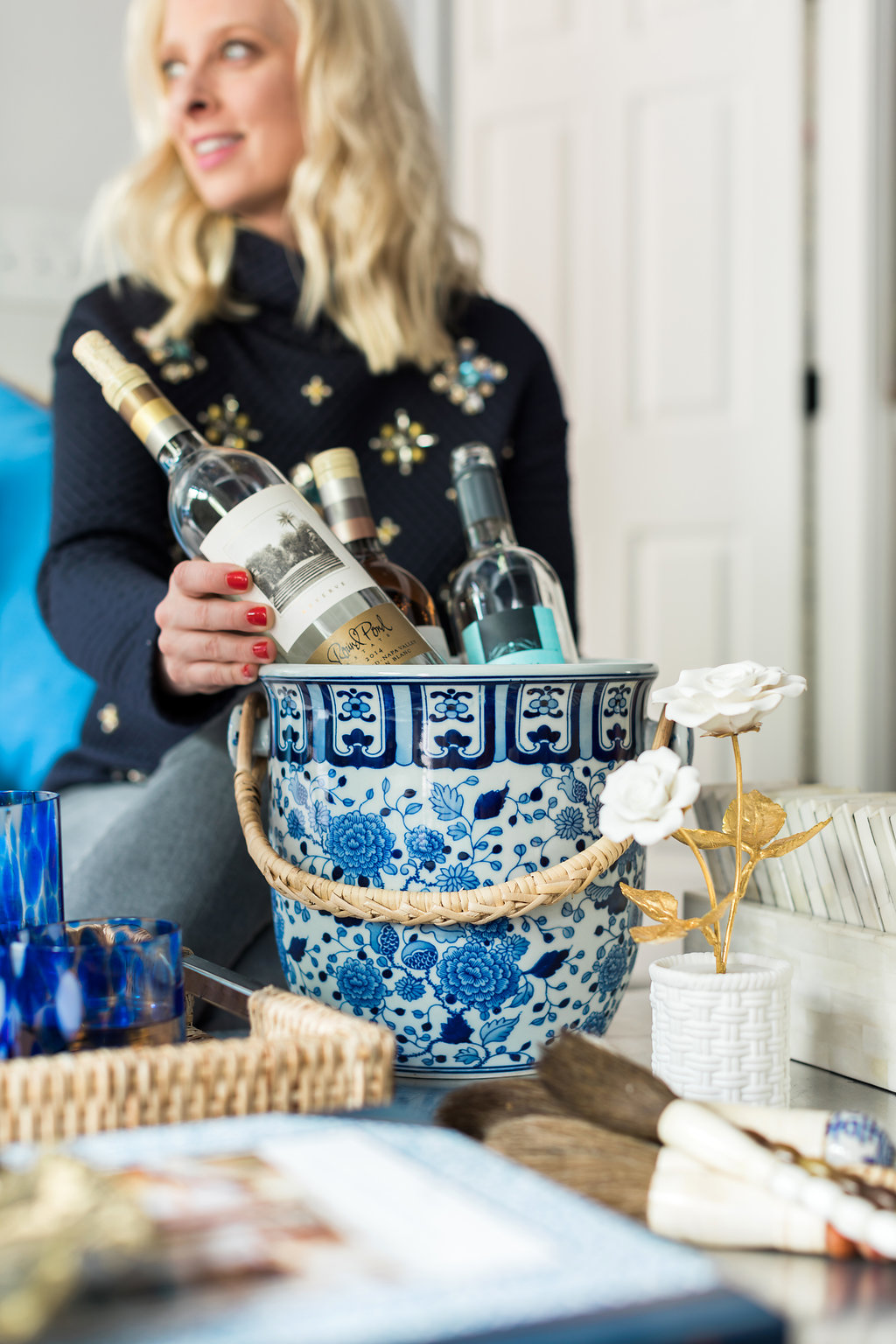
I’ve always been a fan of a great at-home bar. I strongly believe it’s a must-learn life skill to mix up classic cocktails, and as an avid host, it’s important to provide an array...
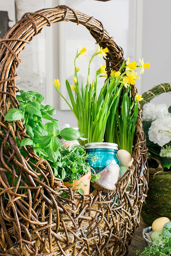
Looking back on Easter as a child, I remember how excited I was to dig through my Easter basket. Full of chocolate bunnies, malt ball Easter eggs, Peeps, golden coins, and my favorite Cadbury...
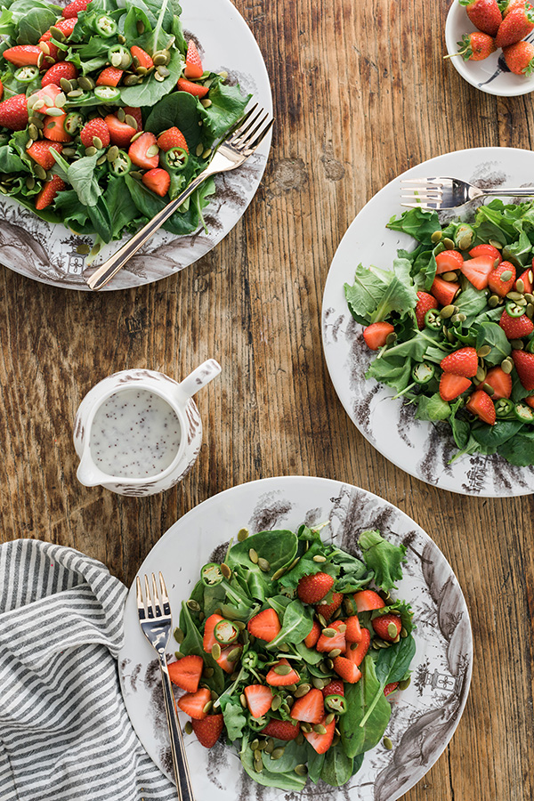
Lets be honest, salads can be boring. So I’m always trying to think outside of the box to come up with salad recipes that I’ll thoroughly enjoy, but are beyond easy to make. Enter...
Lets be honest, salads can be boring. So I’m always trying to think outside of the box to come up with salad recipes that I’ll thoroughly enjoy, but are beyond easy to make. Enter...
…And just when you’re dying to see the final reveal, I tease you one week longer! I know, I know, you thought I would share another peek at the design. But no, I thought it would be an exceptional time to share the “before” photos of our two model apartment units that we’ve transformed these past few weeks. Now, if you know how I do things in ORC’s past, I NEVER show the before photos. But there’s a new time for everything, and these photos help paint the picture of the journey that is this season’s One Room Challenge.
As I shared in previous weeks, my mission has been to rid the spaces of the impersonal, nondescript details, and instead bring in a warm, welcoming design that’s full of textures, motifs and decor that anyone would want to call home. As you can see in the photos above, both apartments are brand-spanking-new with gorgeous fixtures, flooring, and spare-no-expense kitchen and bath areas. There’s already a ton of natural light (hallelujah) thanks to the floor-to-ceiling windows.
But while all of these details are in fact wonderful, there’s a huge, tricky detail I’ve had to conquer; both spaces have extremely unique floor plans. And since these are both for rent, I can’t pull my standard big-statement-moves (wallpaper, dramatic light fixtures, bold paint) because it wouldn’t be fair to have tenants fall in love with details they aren’t allowed to implement themselves! You can read about a few of the road bumps I’ve hit along the way in last week’s post.
So friends, sit tight until next week when we share the ever exciting One Room Challenge final reveal in all its glory. Cheers! Truly, MKR
SHOP THE STORY / CLICK LEFT & RIGHT ARROWS TO EXPLORE
This week’s peek at our progress in the ever-exciting 6-week One Room Challenge of designing the WOM office is, as promised in Week 2, another styled vignette. If you remember, last week I shared scenes from my desk (with a killer light box that I think every person should find a spot for #justsaying) but this week’s vignette it’s all about our newly styled entryway.
When styling an entryway that is functional, but truly makes a statement—which you know I had to do because it’s the WOM office we’re talking about here—I’m a big proponent of variety. Variety in height, variety in textures, and variety in pieces that are as functional as they are beautiful. So when deciding on pieces and decorative accents for the entry I went with a less is more attitude (so not like me) and aimed to keep the coloring fairly neutral with a pop of the bluest of blues and a thorough mixture of textures.
Now when I say textures, I mean rich, intricately detailed textures that bring a little intrigue to a space. To accomplish that in our entry I chose a faux cowhide rug (we used the golden brown in the entryway and you’ll see the white layered atop a sisal rug in the conference room soon!), a faux ostrich and gold nailhead console table, a very interesting, and just a tad crazy, horse skull to add that hint of masculinity I love and a jagged stone turquoise lamp to add that hint of femininity I crave. And if that wasn’t enough mixing of textures to top it all off I hung a giant, statement making white bamboo mirror. I know just like with patterns y’all tend to get a little nervous. But when mixing textures, don’t hesitate to incorporate pattern and color as well; a single pop of color and any pattern along your original color palette will allow the mixing to work every time. And can we just stop for a minute and talk about these faux cowhide rugs from Lulu & Georgia. They look incredibly “real,” but with no guilt or eeew feeling that it was once a living creature, plus the cost is extremely reasonable! Win win!!
Lastly, I mentioned functionality, which is always key for me in any space. A few things that are a MUST HAVE for me in any entry way are: a mirror for any last minute zhushing, a trinket tray, in the case the gold hamsa hand, allowing a place for keys, and some sort of bench or ottoman to put on or take off your shoes. I especially love when the ottomans can easily slide under the console table since many entry ways are narrow and don’t provide a lot of room. These particular ottomans were designed by yours truly in a gorgeous chinoiserie patterned fabric from Lacefield and brought to life by some of the most skilled workmen in the trade, Westside Custom Upholstery.
Tell me friends, are you liking how the space is coming together? Truly, MKR
SHOP THE STORY / CLICK LEFT & RIGHT ARROWS TO EXPLORE
Well today is the day, The Big Reveal for the One Room Challenge. Over the past five weeks, you’ve watched my loft come together, and you’ve seen the colorful and quirky vibes that inspire the space. Today, I couldn’t be more excited to show you the final product.
A cozy reading corner with a hanging rattan chair seemed like an obvious choice in the room. Paired with white sheepskin rugs and my favorite gold pouf, the pieces created a separate and distinct sitting area still in view of all the gorgeous art. And I love that I can easily pull my tini table away from the main seating to provide a place to set my wine and current reading materials.
The sofa upholstered in custom Steve Mckenzie’s loop fabric, which you caught a glimpse of last week, is grounded by a classic jute rug that lightens up the dark wood floors and brings the vibe back to casual. Society Social’s python parson table in stone provides the perfect set up for our bar and the Cleo Bunching Tables work perfectly for the odd room size, while allowing space for books and personal items. And because seating is limited my funky, marabou feathered poufs are ready to be put to use as additional seating or to pull up for a quick game of backgammon.
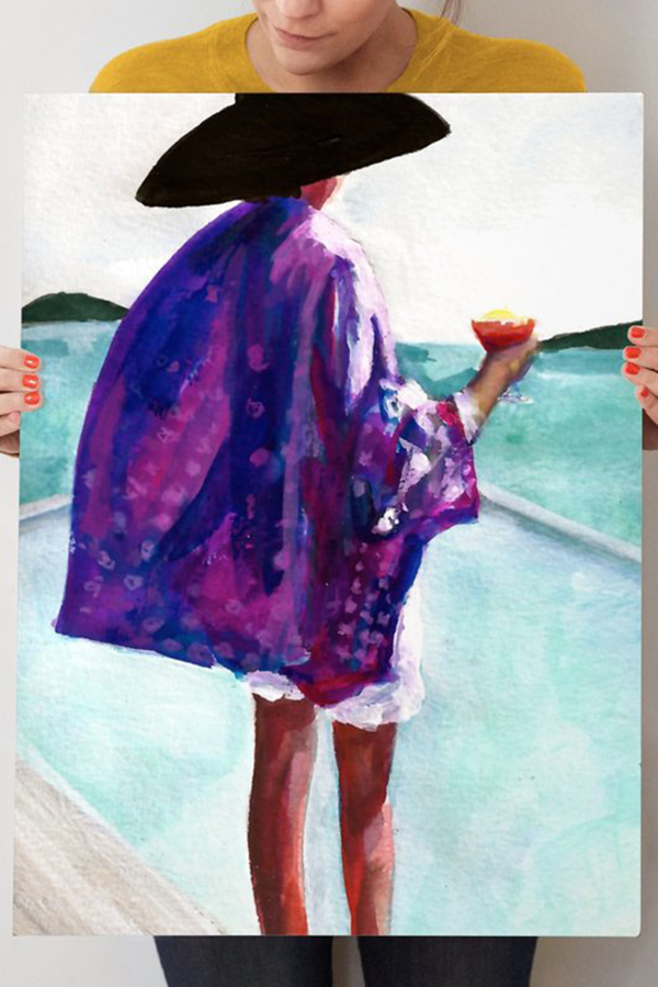
Finally, rounding out the room, and really putting the cherry on the sundae, is my gallery wall. With 24 total pieces hung on one gigantic wall I mixed and matched 3d items such as a gold hand hook, skateboard, and sconce with classic photographs and one of a kind paintings from the likes of Gray Malin,Britt Bass, Minted, and Sally King Benedict to really give it a collected and personal feel. Plus there’s room for the wall to grow and evolve as I continue to find and add new pieces.
Well my friends, that completes my second One Room Challenge (check out the past 5 weeks HERE). The space may have turned out more Palm Springs than Palm Beach, but regardless, I hope you love my loft as much as I do, and I hope that it inspires you to be bold and have fun with design. Life is too short to always play it safe. Truly, MKR