MKR’s Home Tour

A Bedding Refresh with Lauren Ralph Lauren Home

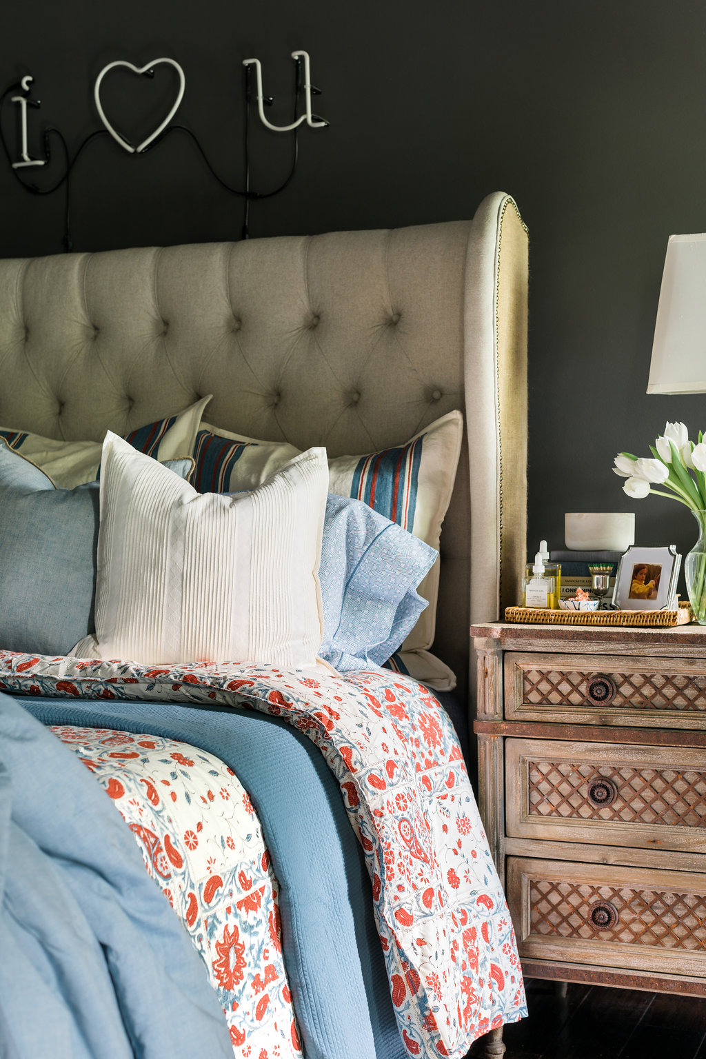
Cool blues, creams and a pop of red give the bedroom an instant boost
Filed Under > Ideas & Inspiration

Lauren Ralph Lauren Kelsey bedding ideas on Waiting on Martha Lauren Ralph Lauren Kelsey Bedding on Waiting on Martha Lauren Ralph Lauren towels on Waiting on MarthaLauren Ralph Lauren bedding on Waiting on Martha Lauren by Ralph Lauren Kelsey bedding on Waiting on Martha Lauren by Ralph Lauren bedding on Waiting on Martha

I’ve always enjoyed a well-made bed. It’s truly an everyday luxury in my opinion. And after a long day, there’s nothing more inviting to me than slipping into fresh sheets.

Seeing as how much I love proper linens, I was shocked when I realized how long it had been since I bought myself new bedding or even towels.  I mean it had been years!  So when Lauren Ralph Lauren Home invited me to do a bedding refresh the timing couldn’t have been more perfect.  

It’s true that I was long overdue for a refresh.  I’d say that it was partly due to the fact that it’s hard to find a line of high quality bedding at an approachable price; one that doesn’t sacrifice timeless style or fresh designs.  Believe me, I’ve looked.  I had thought about splurging on linens, but every time I was about to pull the trigger I would second guess myself.  I mean if I’m spending an entire paycheck on linens then they better be ones I’ll love forever…am I right!!

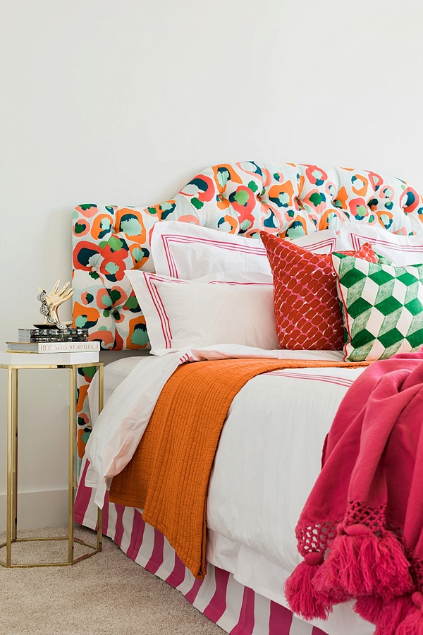
That’s why I was so thrilled to discover Lauren Ralph Lauren Home’s collection of beautiful bed linens.  Specifically the Ralph Lauren Kelsey Bedding Collection.  They’re soft, luxurious and really comfortable.  They’re perfect for the every day, while still providing that elevated feel in our bedroom.  

As I selected the pieces for my bedding refresh, I quickly decided that I’m done with duvets.  Done.  I know they’re easy, but in their place I’ve rediscovered the beauty of comforters, coverlets and quilts; combined, they offer dozens of opportunities to switch up how the bedding looks plus they add polished layers to any bed. It’s those details, and that added thought of various textures and patterns, I’m finding, that really tie the space together. Not to mention they just look better.  My duvet never laid well on the bed and the duvet insert would always get stuck down in one corner or the other.  

As for choosing the styles and colors, I gravitated to a mix of cool blues and creams, with a pop of red.  If you remember, I always write about the importance of incorporating a pop of red in design. Red always warms any space up and makes a room feel complete!  I also mixed in various complimentary colors and prints: ticking stripes on the shams, this pattern on the sheets , and a soft silky blue on the Graydon quilt which might be my favorite piece in the entire collection.  It’s light, yet cozy, and beyond soft!

For the towels I decided on classic white for myself and blues for the guests.  And I must add, the towels are deliciously plush, and give me that feeling of being at my own at-home spa every time I use them!

I’m incredibly pleasedas is the hubswith this timeless refresh on one of our favorite spaces.  Tell me, are you looking to update your nest anytime soon?! Are you Team Comforter or Team Duvet?  Truly, MKR

P.S. For a step-by-step tutorial on how to properly make a bed in 8 easy steps, click HERE. xo 

Photography, Rustic White for Waiting on Martha | This post is in collaboration with Lauren Ralph Lauren Home 

How To Hang a Gallery Wall in 5 Easy Steps

Tips and Tricks for Laying Out and Nailing a Great Gallery Wall
Filed Under > Get The Look

How To Hang A Gallery Wallin 5 Easy Steps, Waiting On Martha

Yesterday I shared a look at my updated gallery wall with Simply Framed, a wall that definitely doesn’t shy from the bold or colorful.  And while gallery walls tend feel very “one-and-done,” I touched upon the process of continually adding to your collection and making room as I’ve always been a believer that a spectacular gallery wall should feel truly collected, and evolve over time. 

I know the process of actually laying out and hanging a great gallery wall can be quite intimidating.  So if you’re feeling hesitant in the time it will take, and putting a bunch of holes in the wall, I’m here to tell you that there are several steps to consider even before that hammer is in your hand.

Below, I’ve broken down a few easy steps, tricks and tips to keep in mind as you’re beginning with your wall.  Yes, it involves some planning and the right tools (I’d recommend this easy, ready-to-use tool kit), and will take some time to get it just right.   But the beauty of an amazing gallery wall, is that it’s ever-changing alongside you.  So don’t be afraid to mix-and-match because there really aren’t any rules.  That’s the beauty of art; you like what you like, and it doesn’t matter what anyone else thinks, you’re the one that has to live with it.  So here’s to great gallery walls that reflect your personality, and to ones that never take themselves too seriously!  Good luck!  Truly, MKR

SHOP THE STORY  / CLICK LEFT & RIGHT ARROWS TO EXPLORE


Start with a Hero Piece

Madalyn Print, Haley Mitchell

Shop Now >

Always start with a large hero, or anchor piece where your eye will go first.  While yes, you want your wall to house all different shaped and sized pieces of art if you have a ton of smaller pieces with no large “wow” piece your wall won’t make the impact you want a gallery wall to always make.

Visualize & Plan the Gallery Wall

Scotch Painter's Tape

Shop Now >

The best way to do this is by laying the pieces on the floor. This way, you’ll be able to visualize different setups, making easy adjustments and tweaks as you decide.  You can then reproduce the layout with blue painter’s tape on the wall; it will accurately reflect the sizes of your pieces and how they’ll look placed together.  Try not to hang everything too closely together, you want about 2-3 inches at least between pieces.  Mix up the levels at which you hang, you don’t want it too look like perfect rows, instead try to hang pieces just above or below the other pieces.  And one last tip, once you have everything on the floor the way you’d like take a picture of it with your phone in case you forget exactly what piece went where as you begin to dissect it.

Mix & Match

El Morocco 1955, Garry Winogrand

Shop Now >

You want the gallery wall to have a personality and feel that it’s been collected over time.  By mixing and matching frames, as well as incorporating illustrations, paintings, prints and 3-D objects (like a juju feather hat, skateboard or sconce), you create an eclectic, lived-in feel. 

Have the Right Tools Handy

Simply Framed

Shop Now >

Save yourself some sanity and gather all of the tools you’ll need to see the project from start to finish.  That includes: a hammer, nails, level, tape measurer, pencil & eraser, blue painter’s tape, a small notebook (which is helpful for writing down the measurements of the art) and a screwdriver.

Simply Framed is genius and sells a ready-to-use tool kit (only $39), which contains everything you’ll need to do the job right, all in a durable carryall that won’t take up too much room in, if you’re anything like me, is an already overstuffed garage or closet.  

Have Fun With It

Worry Beads, Fredericks and Mae

Shop Now >

Remember that there is no specific formula for laying out a beautiful gallery wall. Don’t take yourself too seriously. Know that your gallery wall can always move, evolve and grow! 

Photography, Rustic White for Waiting on Martha | This post is in collaboration with Simply Framed, a brand we love and adore.  All opinions are 100% our own. 

How To Keep Making Room For A Growing Art Collection

Easy Framing & Finding Space For New Art with help from Simply Framed
Filed Under > Ideas & Inspiration

3d Gallery wall ideas complete with our favorite Juju Hat, waitingonmartha.com How to arrange a gallery wall, including our favorite juju hat via @Waitingonmartha Colorful paintings & gallery wall ideas via @waitingonmartha Gallery wall art ideas via @waitingonmartha How to arrange a gallery wall complete with our favorite natural feathered juju hat, waitingonmartha.com

You may remember my colorful and quirky loft space from a 2015 One Room Challenge; it had a MAJOR mix of playful colors, patterns and textures galore with its centerpiece being my gallery wall of collected art.  With a whopping 24 pieces on the wall itself, I feel like I defined a whole new level of “gallery wall.” 

When I initially created the gallery, I purposely left some room on the wall for the collection to evolve and grow.  It wasn’t until recently, right before Christmas, when I walked into my guest room (rather storage room) and saw over a dozen pieces just leaning against the wall, unframed and collecting dust, did I realize that I better get them on the wall before it becomes too daunting to do so.  And if I’m being honest, a dozen plus pieces was already becoming to feel daunting.

I had used a few framers in the past, but with each frame ringing anywhere from $200 to upwards of a $1,000 for my largest piece, the idea of framing everything was even more daunting than getting them hung on the wall.  Fortunately, I had recently met the founder of Simply Framed at a conference here in the A.  I was beyond inspired by her story and bootstrap mentality of starting her business.   I knew next time I needed a framer,  Simply Framed would be where I turned.

And man, am I happy I did.  I cannot tell you how simple and seamless the entire process was.  Simply Framed‘s approach to all of this framing business is beyond refreshing.  I went online, picked out my mattes and frames then Simply Framed sent me the shipping tubes and pre-paid labels to send in all of my art safely.  Once everything arrived, I worked closely with their customer service team to make sure all of the art was perfectly matched up to it’s corresponding frame because I was nervous with so many pieces and different frames things would get mixed up.  In less than two weeks, I received my pieces back at home, along with an easy framing kit that, again, made it ridiculously simple to finish the project. 

When it came to actually laying out a gallery wall of this size and caliber, I can honestly say I was a tad on the uneasy side.  When buying each piece, I wasn’t thinking “…oh this piece of artwork will look great next to this piece, and that piece”.  I simply bought what I loved and had faith it would work itself out.  I mean, I have plenty of walls, so if it didn’t incorporate well in the gallery, I knew there would be another wall or shelf where it would work. In the end, I was thrilled to find that even though the majority of the pieces were bold and bright, the overall tone worked well; with a warm, peachy neutral emphasis and clean, modern frames. It’s funny how even though you often don’t intentionally think about a color scheme or pattern, one always seems to naturally work its way out. 

This time around that natural theme included a bold, colorful nude by Kate Waddell via Well + Wonder. Collective.  Have you heard of Well + Wonder?  It’s a beautiful website with a collection of southern-curated artists, and it’s quickly become my go-to when I’ve got the itch for a new addition at a price that doesn’t make me feel buyers remorse.  This industry has me fortunate in meeting so many talented creatives and collectives like Well + Wonder, I always enjoy finding new additions; each one carrying a special feeling, memory, or moment.     

Some other new finds include my floral girl by Clare Elsaesser, the 1955 Gerry Winogrand print, a perspective-invoking “Look Down” print by Gail Schechter, the upside-down palm trees, my Sally King Benedict tennis court, Gray Malin’s lamas, and of course my gorgeous ladies by Haley Mitchell that you may remember from the WOM offices at ADAC.  And my wall wouldn’t be complete without 3D accents such as a NEW natural/toffee colored Juju hat that’s a bit smaller than our original size and the oversized worry beads hanging from the hand hook.

Of course there’s more that goes into a gallery than tone and gorgeous art, so stay tuned tomorrow for more tips on nailing a strong gallery wall (pun included).  Truly, MKR

SHOP THE STORY  / CLICK LEFT & RIGHT ARROWS TO EXPLORE

Photography, Rustic White for Waiting on Martha | This post is in collaboration with Simply Framed, a brand we love and adore.  All opinions are 100% our own. 

Copyright © Welcome by Waiting on Martha  /
Back to Top