Living

2017 One Room Challenge, Week 2

Deciding on the Design Corner Stones for My New Living Room
Filed Under > Living

Blue & White Living Room, 2017 One Room Challenge, Waiting On Martha

If you missed the exciting news last week, or are new here to WOM—welcome!— I’m dishing some design details on my living room today as part of the 2017 One Room Challenge. 

The beloved ORC is a high energy 6-week design project with fellow bloggers/designers around the web, and it’s one of my favorite ways to kick my butt into gear to redo spaces that need some attention and a little TLC.

And before you say it; I know the room pictured is already beautiful.  I LOVE this room!  But this photo was taken three years ago.  So you can imagine that the space doesn’t look entirely like it once did.  It’s the most lived-in, most highly trafficked rooms in our home, one been torn apart for many a movie night and photo shoot – I shoot all of my food photo shoots in the living room.  Not to mention, Addison, my Cavalier King Charles Spaniel, has completely destroyed my beautiful Lacefield pillows by using every single one of them as a bed.  

But back to the living room redesign.  In tackling this space I face a few key challenges I needed to meet head on from the get go.  First, I don’t have a formal living room. Meaning this room is it.  So the room has to be beautiful yet functional. 

Second, the layout is funky.  It’s directly connected to my kitchen and dining nook in an open floor plan, and proves to be a bit limiting when coming up with my big design dreams.  Due to its size and shape it simply HAS to have a sectional in it, but sectionals are large and tend to suck up the entire room.  Especially a room this size.

Which brings me to my third challenge.  I need to find accent pieces, think side tables, bar carts, and additional seating, that can easily be brought in and out of the space when needed.  

Luckily, this isn’t my first rodeo when it comes to the space and after hours of pouring over and testing out the cornerstones pieces of the room I think I’ve finally settled on a design and can get moving.

Below—BlogLovin’ friends be sure to click into the post to see the full detailed list!—I’m sharing those five design elements that I am leaning on to pull together the room and truly act as “anchors” for the design. Truly, MKR

P.S. You can read about week one of the Fall 2017 One Room Challenge HERE.

SHOP THE STORY  / CLICK LEFT & RIGHT ARROWS TO EXPLORE


Envelop L-Shaped Sectional

Bassett, $5,287

Shop Now >

The Ideal Sectional Sofa

So sectionals are hard.  I think the problem is that they’re either super masculine-leather-and-oversized, they’re very formal, or they’re one of those stiff, uncomfortable ones. 

When I set my eyes on this L-shaped sectional by Bassett, I knew instantly that it was the perfect piece for our space.  It’s just modern enough; the envelope shape of the cushions along with the more traditional base is simply gorgeous. 

Besides the fact that it’s going to be incredibly comfortable and basically a cloud for our at-home movie nights, it’s also really easy to move around and adjust.  Seriously…you can move around the pieces of the sectional as you can see the video here.  

I’ll be talking alllllll about the selection process of a sectional sofa later, but until then I’ll be hanging tight until it gets delivered.  With furniture like this, you always get a little nervous about timing.  So that’s why I knew I needed to get this baby ordered ASAP.


Karastan Forfar Hazelnut Rectangle

Bellacor, $385

Shop Now >

A Rug to Ground to the Room

A rug is obviously functional, but it’s also the perfect way to infuse that hint of modern, that pop of color or that vintage detail.  It’s how I like to add personality or feeling into the room.  And when done right, it grounds the entire design.

I’ve seen this rug by Karastan, what I like to call an Antelope Rug, in various designed spaces.  I’ve always, always loved it as a stair runner.  I’m especially drawn to it for this space because it will hold up well in such a high traffic area. 

I’m also a big mixer of patterns and prints.  Very much like my Thibault wallpaper as seen in my home office, the print is really just a pretty neutral that adds interest. It’s one of my favorite statement pieces for this space!

P.S. I’m so over rug pads in general.  I’m officially converting to rug tape to secure a large piece like this one. 


Jute Wide Puka Grasscloth

Bradley

Shop Now >

Texture to Add a “Wow” Factor

I knew I wanted to incorporate tons of texture to the room.  Texture’s just my thing.  And in my opinion, fabric is one of the most fun things to pick out.

But once you settle on a design, you need to remember that it all takes time to upholster and reupholster furniture, and create custom drapery.  It can take up to 6 weeks for even the simple projects.  And just because it seems simple to you, that doesn’t mean it will be a quick turnaround if your upholsterer is busy.  A good rule of thumb?  Always allow for at least 10 days cushion for anything custom (drapery and upholstery), or you may get slammed with a hefty rush fee. 

As for my status, well I’m really pushing it right now because I first need to finalize the sectional and the rug – the two biggest pieces of the design – before moving forward with any of my fabric orders. 

I do know that I want to use the same grasscloth wallpaper from Bradley that I used in our shoppe in Atlanta. 

I’m also debating between a couple of Stroheim fabrics, along with a fun trim for the drapery.  And yes, I’ve decided that I will be keeping the bamboo window treatments. 

When we do share more about the new drapery in upcoming weeks, I’ll go into detail about measurements and rules of thumb when doing this at home.  I’ve found that it can be a bit confusing! 

I’m also going to be recovering the x-bench stools as seen in the photo above with another Stroheim fabric that will complement the rest of the room.  

Bassett Mirror Marney Bar Cart

Gilt Groupe, $399

Shop Now >

Functional Pieces

As I mentioned above, my living room is THE room in my home.  I don’t have a formal living room or a formal dining room.  It’s attached to the kitchen and dining nook in an open floor plan.  That being said, I always need to consider functionality for the pieces in the space.

So here’s what I’m on the hunt for: a large surface to serve as a coffee table that also stores and displays accents and necessities, baskets for blankets, a side table and/or foot stools, etc. 

I’ve already scored this beautiful Bassett Mirror bar cart.  Its unique silhouette and easy mobility make it a truly versatile addition to the room that I’ll be thrilled to put to use. 

Because the sectional is such a large piece, and because my living room is a limited space for all of this living, all of these pieces need to be small enough to be placed, and used, throughout the room.  

Robert Abbey Jonathan Adler Ventana Ebony Wood & Antique Brass Eight-Light Chandelier

Bellacor, $823.86

Shop Now >

Lighting as the “Jewelry” of the Room

I absolutely love custom lighting and fixtures in a space.  I’ve always considered them to be the “jewelry” on the room because they are the icing on the cake when the design all comes together.  Really, really pumped about the chandy I’ve settled on. 

I’m really lucky with this space when considering what piece to invest in because I don’t need to worry how much light the chandelier puts out.  I have a ton of natural light and recessed, or can, lighting already in place.  

I do however need to worry about my husband’s 80″ television. I can’t have the chandelier hanging low enough so that it blocks the view of the TV from the sofa. 

Featured image, Rustic White for Waiting on Martha

Boxwood Avenue | Coco & Jack | Design Manifest | IBB for DWD | The House That Lars Built | Little Green Notebook | The Makerista | Making it Lovely | Old Brand New | Old Home Love |  The Painted House | Megan Pflug Designs | Pink Pagoda | Erica Reitman | Sacramento Street | Simply Grove | Jill Sorensen | Sugar & Cloth | Vintage Rug Shop | Waiting on Martha

Media Partner House Beautiful | TM by ORC

The Fall 2017 One Room Challenge: We’re Back!

The start of yet another amazing 6-week design project
Filed Under > Living

One Room Challenge on Waiting on Martha
ORC projects on Waiting on Martha
ORC design project on waitingonmartha.com

One Room Challenge design reveal

We’re walking down blog memory lane today, reminiscing on past spaces as we gear up for the Fall 2017 One Room Challenge!  I hope you’re as excited as we are, because this one’s going to be one for the books.

If you’re not familiar with the ORC, these 6-week, high energy design projects are INTENSE.  But in an intensely satisfying, instant gratification way too…ha!  Stress runs at an all-time high as we take you through a full room design at record speed in just six short weeks.  Think of it sort of like a reality tv show when we dream big and hit a few hurdles along the way like delays in product shipments, problems with installations and assembly.  Fingers crossed that we’ll be smooth cruisin’ this go around. 

But seriously, these challenges are FUN.  They always introduce us to new friends, connect us with some of our favorite fellow bloggers.  And it’s always the perfect kick in the butt to get going, and finish, a design project.  

So before we share a peek at this round’s space, let’s take a look back.  My first ORC was in 2014 when I redesigned my home office.  I lightened up the space with modern, crisp whites and warm maple woods.  And I anchored the room with pops of orange, mango and all shades of blue plus metallic accents of gold and silver.  I mixed it all up with modern and traditional pieces giving it a more collected and eclectic feel.

In 2015, I styled a fun and quirky space for the upstairs loft in my home. I brought a whole new definition to “gallery wall” with an eclectic mix-and-match approach, TONS of pops of color, and even some 3-D elements. 

Spring 2016, I tackled the WOM office space in ADAC.  It was a big, airy space with an industrial feel, and it posed a challenge of designing and styling a large room with many different “moments” as I like to call them.  I couldn’t have loved the result more; the soft neutrals and feminine feel to the space was just the environment I dreamed of creating for the team. 

Last fall, I got really ambitious as I set out to transform two high-end apartments in the heart of Buckhead.  This ORC brought on a different challenge.  It wasn’t like any of my previous projects.  All of the spaces prior allowed for me to pull my signature go-big-or-go-home moves, whether that was with custom lighting and fixtures, paint or wallpaper.  Decorating these rentals, on the other hand, had me starting with a bright, beautiful and clean slate.  See the final reveals for both spaces here and here.

And finally this year.  This year I’ll be re-decorating the most lived in room in my house, my living room.  While it was once a beautiful space because of the high traffic it’s turned into a bit of a mess in dire need of a facelift.  And while you may think a living room is easy, this one is not.  The layout makes it extra tricky to navigate plus I only have one living room to actually live in. Not a formal living and family room, no downstairs TV room, or even a hearth.  My home has just this one space to kick back and get cozy.  Plus, the living room is truly my husband’s domain so it needs to meet my beauty standards with his comfort and technology desires.  Trust me, this six weeks will provide plenty of challenges.  Truly, MKR

SHOP THE STORY  / CLICK LEFT & RIGHT ARROWS TO EXPLORE


Photography, Rustic White for Waiting on Martha

Boxwood Avenue | Coco & Jack | Design Manifest | IBB for DWD | The House That Lars Built | Little Green Notebook | The Makerista | Making it Lovely | Old Brand New | Old Home Love | The Painted House | Megan Pflug Designs | Pink Pagoda | Erica Reitman | Sacramento Street | Simply Grove | Jill Sorensen | Sugar & Cloth | Vintage Rug Shop | Waiting on Martha *

Media Partner House Beautiful | TM by ORC

A Bedding Refresh with Lauren Ralph Lauren Home

Cool blues, creams and a pop of red give the bedroom an instant boost
Filed Under > Ideas & Inspiration

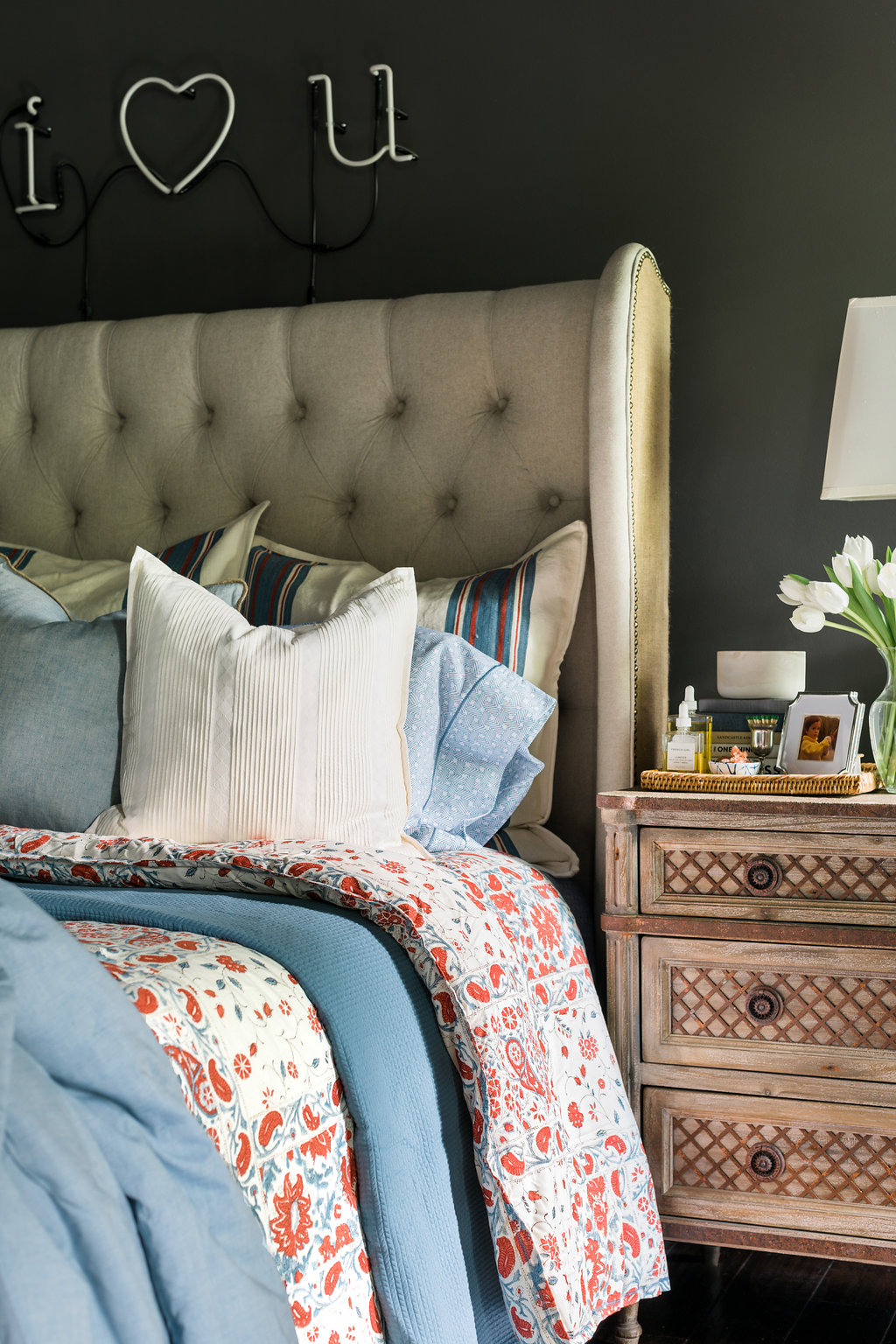
Lauren Ralph Lauren Kelsey bedding ideas on Waiting on Martha Lauren Ralph Lauren Kelsey Bedding on Waiting on Martha Lauren Ralph Lauren towels on Waiting on MarthaLauren Ralph Lauren bedding on Waiting on Martha Lauren by Ralph Lauren Kelsey bedding on Waiting on Martha Lauren by Ralph Lauren bedding on Waiting on Martha

I’ve always enjoyed a well-made bed. It’s truly an everyday luxury in my opinion. And after a long day, there’s nothing more inviting to me than slipping into fresh sheets.

Seeing as how much I love proper linens, I was shocked when I realized how long it had been since I bought myself new bedding or even towels.  I mean it had been years!  So when Lauren Ralph Lauren Home invited me to do a bedding refresh the timing couldn’t have been more perfect.  

It’s true that I was long overdue for a refresh.  I’d say that it was partly due to the fact that it’s hard to find a line of high quality bedding at an approachable price; one that doesn’t sacrifice timeless style or fresh designs.  Believe me, I’ve looked.  I had thought about splurging on linens, but every time I was about to pull the trigger I would second guess myself.  I mean if I’m spending an entire paycheck on linens then they better be ones I’ll love forever…am I right!!

That’s why I was so thrilled to discover Lauren Ralph Lauren Home’s collection of beautiful bed linens.  Specifically the Ralph Lauren Kelsey Bedding Collection.  They’re soft, luxurious and really comfortable.  They’re perfect for the every day, while still providing that elevated feel in our bedroom.  

As I selected the pieces for my bedding refresh, I quickly decided that I’m done with duvets.  Done.  I know they’re easy, but in their place I’ve rediscovered the beauty of comforters, coverlets and quilts; combined, they offer dozens of opportunities to switch up how the bedding looks plus they add polished layers to any bed. It’s those details, and that added thought of various textures and patterns, I’m finding, that really tie the space together. Not to mention they just look better.  My duvet never laid well on the bed and the duvet insert would always get stuck down in one corner or the other.  

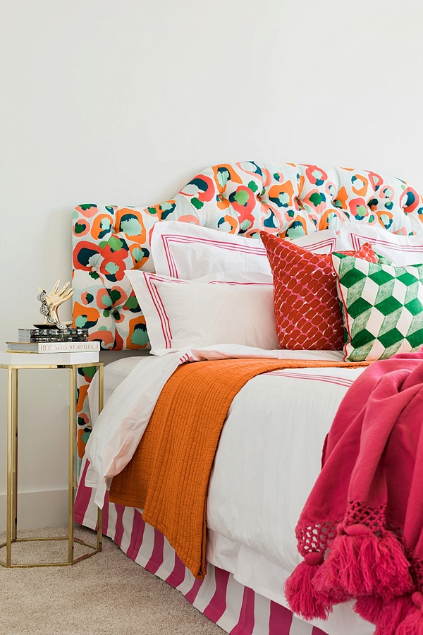
As for choosing the styles and colors, I gravitated to a mix of cool blues and creams, with a pop of red.  If you remember, I always write about the importance of incorporating a pop of red in design. Red always warms any space up and makes a room feel complete!  I also mixed in various complimentary colors and prints: ticking stripes on the shams, this pattern on the sheets , and a soft silky blue on the Graydon quilt which might be my favorite piece in the entire collection.  It’s light, yet cozy, and beyond soft!

For the towels I decided on classic white for myself and blues for the guests.  And I must add, the towels are deliciously plush, and give me that feeling of being at my own at-home spa every time I use them!

I’m incredibly pleasedas is the hubswith this timeless refresh on one of our favorite spaces.  Tell me, are you looking to update your nest anytime soon?! Are you Team Comforter or Team Duvet?  Truly, MKR

P.S. For a step-by-step tutorial on how to properly make a bed in 8 easy steps, click HERE. xo 

Photography, Rustic White for Waiting on Martha | This post is in collaboration with Lauren Ralph Lauren Home 

Copyright © Welcome by Waiting on Martha  /
Back to Top