Living

The One Room Challenge 2016: Week Three

An Inspiring Workspace Made Easy with bxxlght
Filed Under > Ideas & Inspiration

Enjoy the journey lightbox sign, Waiting on MarthaHead down hustle on lightbox, Waiting on Martha Waiting on Martha office "Enjoy the Journey"Office inspiration from Waiting on Martha

Friends, it’s all starting to come together and we’re officially at the half-way mark!  Every time I participate in The One Room Challenge, I know it’ll be a whirlwind and these six weeks are no different. I’m thrilled to see my original vision come to life from my mood board at the start of the challenge, and seriously am bursting in anticipation to share the rest of the space with you!

As you remember last week, I talked about how big the Waiting on Martha office space is…a whopping 900+ square feet which was about the size of my first studio apartment.  So in order to define this large room, I knew I wanted to tackle the space with several separate vignettes to offer the team proper places to brainstorm, gather and of course, hustle. 

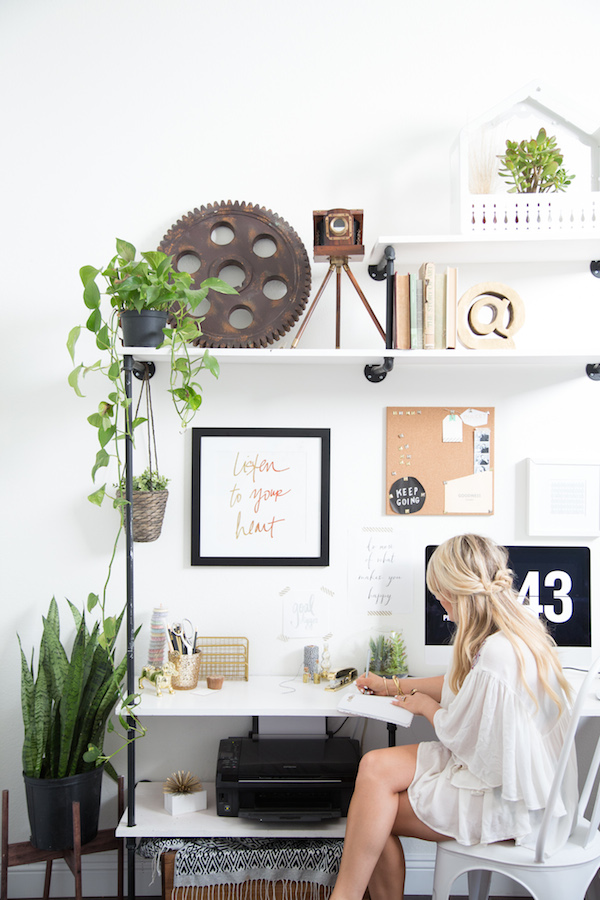
The first styled vignette, or moment as I called them in Week 2, is where you’ll be able to find me in major #GSD mode: my desk. It needed to be just as functional as beautiful, and with clean lines and warm details I feel I’ve achieved both. I settled on a great desk from AllModern, who, just a FYI, have SO many amazing (and affordable) modern desks like this one pictured.  My desk houses a few pretties like a hand-painted brushstroke lamp, leopard vase/pen cup and new personalized stationery, but is also large enough to work on projects without feeling cramped at all, and serving as the perfect clean surface for business meetings and beyond. 

Of course, there’s no denying that the hero of this styled vignette is the light box.  The second I spotted it I knew it must be mine. I mean what better place to have this beauty than the team office with a few great words to live by?!  Naturally I went ahead and bought enough letters to be able to switch out one inspiring quote from the next (5 quotes in total to be exact).  And while the light box was a bit of an investment, it’s going to be around forever to offer a bit food for thought in the WOM offices and beyond.

But alas, with Week 3 here and gone, it’s officially crunch-time friends, and that means we’re on the home stretch until the big Final Reveal.  Stay tuned next week for a peak at another styled vignette (the entryway)…and in the meantime I’ll be busy styling what might just be my favorite ORC project yet!  Truly, MKR

SHOP THE STORY / CLICK LEFT & RIGHT ARROWS TO EXPLORE


Photography, Rustic White for Waiting on Martha

THE ONE ROOM CHALLENGE 2016 PARTICIPANTS:

CLAIRE BRODY | THE CURATED HOUSE | DESIGN MANIFEST | DRIVEN BY DECOR | HONEY WE’RE HOME | HUNTED INTERIOR | THE MAKERISTA | MAKING IT LOVELY | MY SWEET SAVANNAH | PENCIL AND PAPER CO. | THE PINK CLUTCH | SAVVY HOME | SIMPLIFIED BEE | SKETCH 42 | JILL SORENSEN | ORLANDO SORIA | THOU SWELL | THE VAULT FILES | WAITING ON MARTHA | THE ZHUSH 

MEDIA PARTNER HOUSE BEAUTIFUL | TM BY CIH 

Inspired by Color with HGTV Home By Sherwin-Williams & HGTV Smart Home

A Tour at the Brilliant HGTV Smart Home 2016 Proves the Continual Power that Paint has on Design
Filed Under > Ideas & Inspiration

Blog-HGTV14 Blog-HGTV2Blog-HGTVBlog-HGTV5Blog-HGTV17Arm chair and side table as interior inspiration | waitingonmartha.comBathroom details via Waiting on MarthaDining room inspiration with bold art and chandelier | waitingonmartha.comIndoor plant and table vignette | waitingonmartha.com Console table styling with bold art | waitingonmartha.com Green velvet sofa and living room inspiration | waitingonmartha.comNursery inspiration in the HGTV Smart Home | waitingonmartha.com

If you follow along on IG then you saw I recently returned from a wonderful segway-riding weekend in Raleigh, N.C., where HGTV HOME by Sherwin-Williams invited me and a few other bloggers to spend a little bit of time in the brand new, and gorgeous, HGTV Smart Home 2016.  And by a little bit of time, I mean I pretended I was moving in that weekend.

Designed by fellow Chicagoan Tiffany Brooks, the HGTV Smart Home was a great testament not only for the power of all things tech, but also for the power of paint. The entire home incorporated a great mix of calming, traditional neutrals, but also bold, saturated rooms full of color from the HGTV HOME by Sherwin-Williams Neutral Nuance Color Collection.  As I toured the 3,300 square feet of this Southern smart home, I of course was drawn to all things blue and grey; the kitchen and dining room being great examples of how to mix and play off the two. But perhaps my favorite room of all?  The nursery with its gender-neutral teal blue walls ( Riverway HGSW3302 and bright playful patterns.  

Being chocked full of HGTV HOME by Sherwin-Williams color I knew the house would quickly remind me of my love for bold color and stoke those fires to redecorate for the umpteenth time, but I didn’t realize just how GENIUS the place would be too.  It didn’t earn its name as a “Smart Home” for no reason, friends.  High tech additions were designed to make modern life easier, from automated thermostats to integrated entertainment systems, self-watering plants, and doors that can be locked and lights that can be turned off with an app on your phone (!!!).  If your mind is as blown as mind was, just go on and read a bit more behind the build

And I’m sure this comes to no surprise to most of you, but it didn’t take me long in Raleigh to see that it’s a place where I could happily spend a lot more time.  We had tons of great food, saw so many interesting sites and got a feel for an inspiring creative business scene that left me feeling energized and inspired.  The HGTV HOME by Sherwin-Williams team organized a great itinerary for the group; we toured Videri Chocolate Factory and Raleigh Denim Workshop, where you could simply feel these creatives pour their heart and soul into their work.  We also strolled through the North Carolina Museum of Art, which was beyond beautiful and somewhere I could easily spend days, and we even hopped on some Segways to see Oakwood Historic District (which was sooo fun and a great way to see the historic homes).

Experiencing lovely Raleigh and HGTV‘s brilliant and bold Smart Home with HGTV HOME by Sherwin-Williams was such a treat, and I’m even more adamant about the fact that paint (especially when we’re talking about the best of the best here) really does set the tone for your home.  Truly, MKR

P.S. Head on over to enter the HGTV Smart Home giveaway so you can call this gorgeous and genius space home (you can enter once a day!). xo


SHOP THE STORY / CLICK LEFT & RIGHT ARROWS TO EXPLORE


ALL PHOTOGRAPHY ORIGINAL TO WAITING ON MARTHA | THIS STORY IS IN COLLABORATION WITH HGTV HOME BY SHERWIN-WILLIAMS

PAINT COLORS:

EXTERIOR:
EXTERIOR BRICK, SW7639 Ethereal Mood
SIDING, SW7639 Ethereal Mood
TRIM, SW6385 Dover White
SHUTTERS, SW6207 Retreat
FRONT PORCH & FRONT PORCH CEILING, Ebony Stain 2718
FRONT PORCH RAILINGS, Wrought Iron
REAR PORCH CEILING, SW6385 Dover White
REAR PORCH RAILS, SW6385 Dover White
REAR PORCH FLOOR, PAINTED
GARAGE, SW6385 Dover White

INTERIOR:
MASTER BEDROOM CEILING, JOGGING PATH SW 7638
UPSTAIRS GUEST BEDROOM’S EN-SUITE BATHROOM AND TERRACE SUITE CEILING, ECRU HGSW3196
WALLS AND TRIM IN THE UPSTAIRS FLEX SPACE, ANONYMOUS HGSW3483
NURSERY, Riverway HGSW3302
CEILING OF THE ENTIRE FIRST FLOOR AND BASEMENT, URBANE BRONZE HGSW3481
BASEMENT WORKOUT ROOM, ACCESSIBLE BEIGE HGSW2487
WALLS OF THE ENTIRE FIRST FLOOR, SEDATE GRAY HGSW3227
MASTER BEDROOM AND BATHROOM AND FIRST FLOOR MUDROOM, WALLS OF THE TERRACE SUITE AND BASEMENT BATHROOM, DOVER WHITE HGSW4032
FIRST FLOOR POWDER ROOM, HIGH TEA HGSW3212

The One Room Challenge 2016: Week Two

Discussing how to tackle a difficult space plan through styled vignettes
Filed Under > Ideas & Inspiration

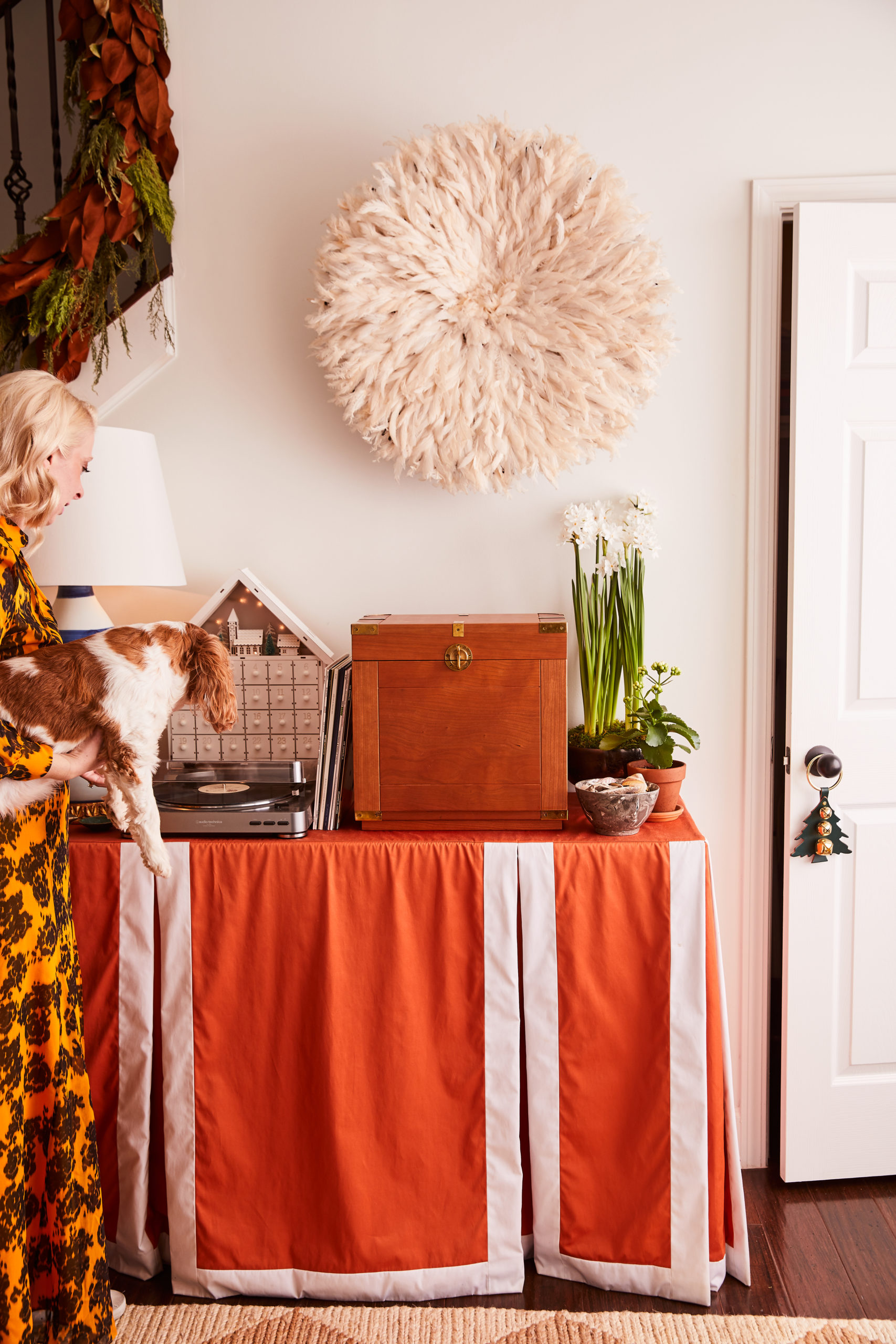
One Room Challenge Interiors Inspiration via Waiting on MarthaHow to style a great vignette | waitingonmartha.com #interiors #coffeetableStyling a great vignette | waitingonmartha.com How to style an entryway and vignette | waitingonmartha.com Styling a vignette and 3D gallery wall | waitingonmartha.comStyling a vignette in the entryway | waitingonmartha.com

In looking back on a lot of my past design work I’ve learned something about myself and how I view a space.  I love moments, or rather, vignettes.  When I look at a room, I don’t see four walls and measurements, I see how life will be lived.  I see late nights spent working cuddled in a chair.  Bags and shoes thrown down at the end of a long day.  Dinners and great bottles of wine being poured over an it-gets-better-with-age table.  In a cliche way, I see memories made.  

And thank goodness I love looking at it all that way because our office space at ADAC is not an easy, one-size-fits-all box.  It’s 900 square feet of strange angles and partitions in the most awkward places, (if only I had kept the floor plan to share with you all).  So when tackling the WOM office, I’m viewing it all in very distinct vignettes.  I mean technically our office is as big as my first studio apartment, so I’ve been working on this design for years.

When designing with vignettes in mind I always use rugs to define the space, which can prove difficult when it’s one large room.  You always want your rug colors and patterns to flow, and compliment each, other but never be matchy-matchy.  For this particular space I’ll be using one very large, vintage rug with a light neutral pattern in the main sitting area.  Then to compliment a jute rug layered with a faux animal hide rug in the conference “room.”  I’ve chosen to layer to add depth, texture and interest and to keep that vignette from becoming too bland.  In the entryway I’ll also be using an additional faux hide rug, but in a different, but complimentary color.  The entryway sizing is difficult so while using two similar rugs may seem duplicative, I think you’ll find when you see the final result that they work best in each space, and feel very separate from each other.

Another way I approach defining a space is through lighting.  While I would love to have a million chandeliers and pendant lights hanging it just doesn’t make sense, and will look too busy in an open concept room.  Instead mix it up.  Focus on one or two hanging lights that will always make a statement and various desk, table, and floor lamps where they are as functional as they are appealing.  Also by keeping the room white, which I spoke to last week, naturally brings a lightness to the room and I don’t want overpower it with lighting overkill.

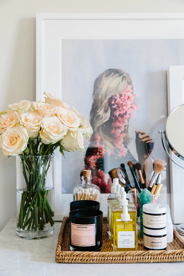
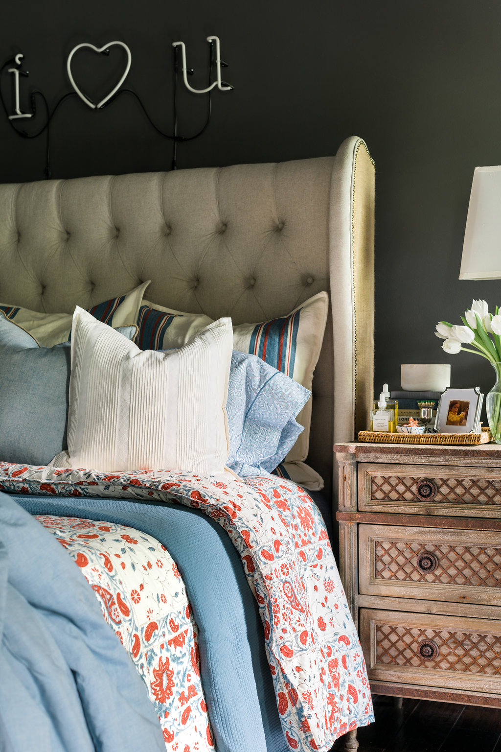
Over the next few weeks, I’ll begin sharing each distinctly styled vignette, because honestly if I waited to share all the details during the final reveal we’d get weary from the amount of scrolling.  But in the mean time, I thought I’d share some of my favorite styled vignettes I’ve designed with you all.  Each distinct, each still loved and used daily (since they’re all in my home).  Tell me, do you find yourself designing through vignettes?  Truly, MKR

SHOP THE STORY / CLICK LEFT & RIGHT ARROWS TO EXPLORE


Photography, Rustic White for Waiting on Martha

The One Room Challenge 2016 Participants:

CLAIRE BRODY | THE CURATED HOUSE | DESIGN MANIFEST | DRIVEN BY DECOR | HONEY WE’RE HOME | HUNTED INTERIOR | THE MAKERISTA | MAKING IT LOVELY | MY SWEET SAVANNAH | PENCIL AND PAPER CO. | THE PINK CLUTCH | SAVVY HOME | SIMPLIFIED BEE | SKETCH 42 | JILL SORENSEN | ORLANDO SORIA | THOU SWELL | THE VAULT FILES | WAITING ON MARTHA | THE ZHUSH 

MEDIA PARTNER HOUSE BEAUTIFUL | TM BY CIH 

Copyright © Welcome by Waiting on Martha  /
Back to Top