Living

2016 Fall One Room Challenge: Week 3

How To Add Art To Your Home That's Anything But Boring
Filed Under > One Room Challenge

2016 Fall One Room Challenge

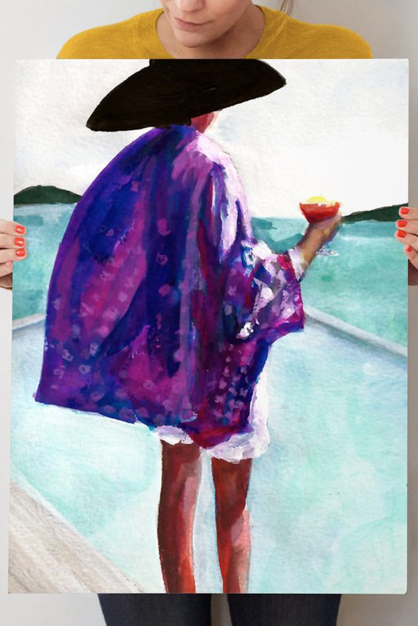
There’s nothing that makes a space quite like art.  It’s the easiest way to infuse personality and really make a space your own.  That’s why in all of my ORC’s and in all of my design, including my own home, there’s always an emphasis on art.  Which brings us to the focus this week.

Next week, I’ll begin to actually show you the space coming together, specifically the art, but this week I thought I’d share my art -focused design board, as well as a few tips that I always adhere to when bringing art into my life.

When talking, designing and buying art, I stick to a few rules.  Rule one: buy what you love.  Like wine, art is subjective, so unless your collecting or investing, then forget about if the art will lose its value, or if it’s well respected, or blah, blah blah.  If you love it, buy it.  End of story.

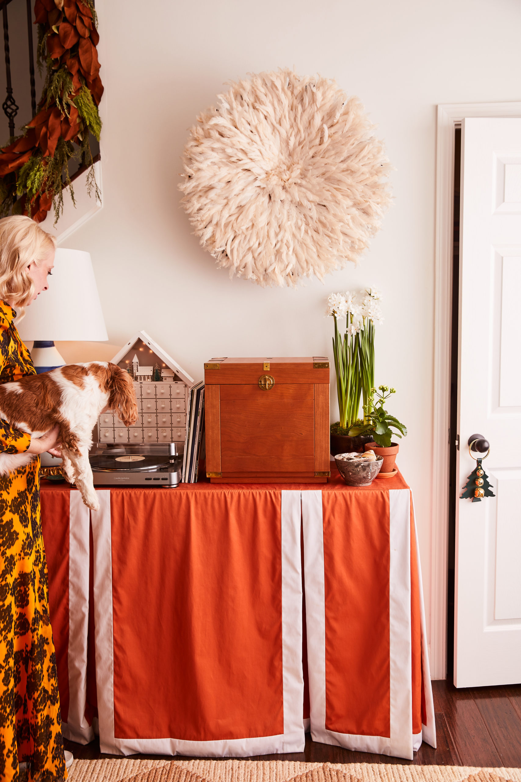
Rule two: always think three-dimensionally.  Art isn’t just something you frame; it’s African juju hats, baskets and skateboards (see my loft), it’s literally anything you can hang on the wall.  So add a bit of dimension and depth by thinking outside the frame.  Oh, and bonus points if you can fit a swing arm lamp or sconce into the mix.

Rule three: mix it up with frames and sizing.  With so many framing options now available (white, gold, wood, ghost, black) there’s no need to be basic.  Plus digital framing services make it easier than ever; I’m a big fan of Simply Framed.  Same goes with sizing; treat a gallery wall like a puzzle and mix in all shapes and sizes.

Now that you’ve heard my three rules of thumb when it comes to art installations, tell me…do you like to go bold on your walls? What 3-D details are you dying to try? Stay tuned for next week’s peek into the spaces, where I start to incorporate these pieces you see here.  Truly, MKR 

P.S. Follow along on Snapchat tomorrow as I give you a few sneak peeks as I actually begin installing the art into the space.

SHOP THE STORY / CLICK LEFT & RIGHT ARROWS TO EXPLORE


One. Natural Juju Hat | Two. “Leaf in Green” | Three. “The Sassi” | Four. “Surf” | Five. Alchemy, by Steve McKenzie | Six. 12″ Hope Basket | Seven. “No Vacancy” | Eight. “Pining for Pineapple” | Nine. | Ten. Circular Rattan Wall Mirror 

The Players: Jana Bek | Chris Loves Julia | Shannon Claire | Coco.Kelley | The Curated House | Driven by Décor | The English Room | From the Right Bank | Sherry Hart | Hi Sugarplum | House of Jade | Hunted Interior | The Makerista | Making it Lovely | Marcus Design | Pencil & Paper Co. | Megan Pflug | Place of My Taste | Suburban B’s | Waiting on Martha 

 Media Partner House Beautiful | TM by CIH

2016 Fall One Room Challenge: Week 2

What you can expect to find in my ORC spaces
Filed Under > Ideas & Inspiration

fallorc2016

If you’re following along on Snapchat (username WAITINGONMARTHA), you’ll know I started the install process on our two 2016 One Room Challenge spaces late last week.  Which means any lingering giddy feelings that came with week 1 quickly evaporated into the anxious anticipation that comes with week 2 and beyond.  Already there have been obstacles to overcome, and many phone calls made about delivery deadlines.  But let’s not get ahead of ourselves, I’ll be sharing more about install and disastrous moments next week.  This week, I’m still feeling a bit on my game, so I thought I’d share five things you’ll find in the spaces this go around.  Truly, MKR

No. 1…Colors, prints and patterns.  While these three items are definitely a signature move of mine, expect to see them executed in a completely different way.  Typically, I showcase bold moments by painting or wallpapering, but as I explained last week that wasn’t an option which meant I had to find another way to bring the fun in.  So rather the wall, this time you’ll find my “go big, or go home” moments on the furniture pieces themselves.

No. 2…A truly edited space.  Editing has never been my strong suit.  Typically, I’m a more-is-more person (proof here).  But in this One Room Challenge, my mission is to create an environment that someone can see themselves living in.  Which means I’ll be aiming to give someone just enough to make them want to scream “sold!” but allow them to envision the space as their home rather than my home.  

No. 3…A mix of materials
.  With an open space concept like the one I’m designing, it’s important to define the space.  While I want everything to feel cohesive, I also want your eye to be pulled to different areas, allowing each part to have it’s own moment.  One of the biggest ways I’m doing that is by utilizing a mix of materials such as glass, brass, lacquer, mirrored, various woods, linens, velvets, rattans, and even a little marble.  Hopefully the end result will be spaces that feel distinct, rather than matchy-matchy.

No. 4…Texture.  Along that same note, textures are a key component to adding interest, depth and warmth; so in these spaces, I’ll be bringing in textures whenever I can.  Be on the lookout for faux python, rugs in varying fabrics such as faux hide, sisal and wool, linen headboards, and plenty of 3D art and textiles.  I’m hoping through the textures, materials, prints and patterns every piece will have a story to tell.

No. 5…Custom Specs.  It’s easy, when you walk into a blank canvas such as these spaces, to feel overwhelmed and instantly become a slave to the space.  But I’m a strong believer that you need to make the room work for you. Don’t be afraid to talk with manufacturers about custom sizing for your bigger pieces.  Rather than take a “one size fits all”, I worked with Roxy at Society Social to create a console table and two sofas that feel like they were made for the space.  And FYI, the custom pricing was surprisingly nominal, and the effect of a perfectly tailored piece was priceless. 

SHOP THE STORY / CLICK LEFT & RIGHT ARROWS TO EXPLORE

AS PICTURED: Banana leaf pillow | blue pillow (similar) | pineapple print | motel print | lamp | armoir (similar here and here) | headboard (similar) | striped rug | faux hide rug | console table

JANA BEK | CHRIS LOVES JULIA | SHANNON CLAIRE | COCO.KELLEY | THE CURATED HOUSE

DRIVEN BY DÉCOR | THE ENGLISH ROOM | FROM THE RIGHT BANK | SHERRY HART

HI SUGARPLUM | HOUSE OF JADE | HUNTED INTERIOR | THE MAKERISTA | MAKING IT LOVELY

MARCUS DESIGN | PENCIL & PAPER CO. | MEGAN PFLUG | PLACE OF MY TASTE | SUBURBAN B’S

WAITING ON MARTHA  MEDIA PARTNER HOUSE BEAUTIFUL | TM BY CIH


DIY: How to Paint Bathroom Cabinets Like a Pro

The tricks to an easy step in transforming your bathroom
In Partnership with BEHR Paint
Filed Under > Styling "How-To's" & Tips

Painting your cabinets and trim in the bathroom, #DIY @waitingonmartha
Simple steps to transform your bathroom and paint your cabinets. @waitingonmartha @behrpaint #spon #DIY
blog-interiors-behrdiy2
Transform your bathroom and #DIY paint your cabinets and trim. @waitingonmartha @behrpaint #spon

Yesterday’s reveal of my bold green bathroom makeover hopefully had you itching to dip the brush into the paint can and get started.  As you saw, paint is one of four easy and inexpensive ways to update and completely transform your bathroom.  And while I get that it can feel a bit daunting to go bold with your color choice, I hope hope you can see from yesterday’s collab with BEHR Paint that going bold with just the right color can be one of the best design decisions you make.  

While painting walls is pretty straightforward, it’s the cabinetry and doors that can get a bit tricky.  So I’ve laid out a few easy steps I take whenever I’m tackling a paint project like this.  Check them out below, and tell me, do you have any home DIY projects you’re looking to tackle?  Truly, MKR

No. 1…Remove the cabinets from the hinges, as well as all of the knobs.  This step will make your life a lot easier when you go to sand the surface (which is a must-do). Skipping this step will give you a headache later, so it’s definitely worth your while. Be careful to keep track of all hardware as you do so, as you’ll need it to restore the cabinet doors to their hinges. 

No. 2…Sand the entire area of the cabinet doors.  You’ll want to do this in order to sand down the edges and smooth out the entire surface for the new paint. Don’t go crazy with the sanding, just an easy smoothing of the surfaces will do.

No. 3…Start painting.  Generally, I use at least two coats of paint for cabinetry.  Cabinets and doors tend to chip easier than the rest of the room simply because the amount of natural use they get so wear and tear will show quickly.  I’ve found that two coats of paint cover the surface well, and I always keep a can of touch-up paint on hand for when nicks do happen.  And when painting with bold colors, I paint them all by hand.  You’ll really want to take your time with the blue painter’s tape to appropriately line the edges (check out this great blue painter’s tape how-to, or get your most OCD friend to help you here).  By focusing on perfection on this step, you’re less likely to run into any mess-ups you’ll have to fix later.  And one major tip I have for mess ups is to simply keep a small bucket with cold water next to me as I paint by hand.  Being able to act fast using cold water and either paper towels for small spots or a hand towels for larger areas allows you to fix any oops moments.  

No. 4…Place cabinet doors back onto their hinges and secure. After the paint has completely dried (please do not rush the drying process), remove the blue painter’s tape and secure your cabinetry back in its place. 

No. 5…Add statement making knobs to finish the look. Lastly, place your updated selection of knobs, or as I consider it jewelry, on the newly painted cabinets. I scored some stunning hardware, which compliments the paint color to perfection. 

Photography, Rustic White for Waiting on Martha | This post is in collaboration with BEHR Paint, a brand we love and adore.  All opinions are 100% our own. 

Copyright © Welcome by Waiting on Martha  /
Back to Top