Living

Getting Cozy With Nate Berkus at Target

Updating my favorite space with the new Nate Berkus at Target Fall 2016 Line
Filed Under > Ideas & Inspiration

nb1
nb2
nb3nb4nb5

It’s official; everything Nate Berkus touches turns to gold.  Case in point: his amazing new fall/holiday collection at Target.  

I’ve been a fan of Nate’s for what seems like forever, and anytime he releases a new Nate Berkus at Target Collection I’ve been known to rush to my nearest Target at all hours of the day or night to get my hands on pieces from the line.  So when I got the opportunity to collaborate on the Nate Berkus at Target fall/holiday line I of course jumped at the chance to add a few of his latest and greatest to my home.  

If you remember, this isn’t our first collaboration with Nate.  Last year I collaborated on a spring living room refresh and you’ll still find all of the pieces scattered throughout my home and office.  That collection was all about laid-back California vibes, making it perfect for the freshness and warmth that spring always seems to bring.  But this collection is completely different, and completely perfect for switching things up as temps begin to drop and the holidays begin to sneak up on us. 

And I must say, this most recent collection may have any collections from the past beat, because this time he’s introduced furniture to the line!  That’s right…furniture.  And in all of its black and white and gold goodness, it’s really a no-brainer that it’s going to be a hit.  The whole collection is so strong, but I think it’s the furniture that is truly the strongest.  I was extremely impressed with the construction of the pieces, especially at the wallet-friendly price point. 

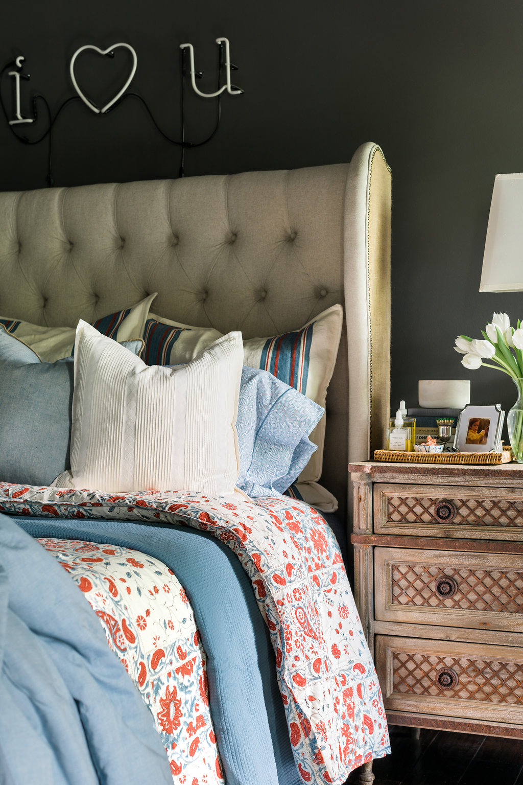
With the look of the fall line (textured neutrals, elegant metallics and subtle glam details), I knew immediately I wanted to incorporate these pieces into my bedroom sitting room.  This time of year, it’s where you’ll find me with a glass of wine, my favorite magazines by the fire.  And as you’ll remember, the space doesn’t shy from the drama; the walls are painted a deep, rich grey and includes a cozy spot with a coffee table and two grand statement armchairs.  Pretty much perfect for a little black, white and gold, no?

I was quick to grab this gorgeous gold side table.  In any part of my home, I like to have little tables like this for drinks, candles, magazines…you name it. They’re easy to move around, and perfect for when you’re cuddled in a corner and have no plans on moving.  

I also picked up this great little black and rattan ottoman.  As you can see in the photos, it’s intricate construction makes this piece really stand out, and works wonderfully next to the chairs.  

Naturally I have a bar cart in the room, so I picked up these cool gold obelisks as accent pieces as well as this white vase to house my collected quail feathers.

On our coffee table, I added this wood studded box (for stashing the not-so-pretty necessities such as remotes!) and this beautiful starburst gold bowl for my collection of matches. And of course no coffee table is complete without a tray, and this striking black and gold hexagon tray, is both a piece of art and also serves a most functional purpose.  

Lastly, throw pillows.  I’m one of those people that change out my throw pillows every season, so I was quick at the draw with this faux sheepskin one (it feels very wintery), as well as this fun geo pillow with tassels and denim studded pillow.  Those along with his striped tassel throw will help make it hard to leave once settled in. 

Obsessed much?  Yes, yes I am. But my excitement over the finds doubled (tripled really) at the chance to chat with Nate about the collection. I loved hearing that he really does travel to Target’s HQ in Minnesota, to do a little quality control on every product.  That means touching and testing every single sample.  And if something doesn’t feel right?  In his own words “it’s either fixed or pitched.”  Knowing that he signs off on everything that makes it to the shelves makes me love, and trust everything that much more.  

I also asked him if it was hard to design within Target’s friendly price point?  To my surprise he quickly responded that it wasn’t.  Explaining that Target is super open-minded when it comes to his ideas on materials and designs and trying to make what he’s envisioning come to life. 

Finally, we of course talked about inspiration.  Nate said he’s the most inspired by his globe trotting ways; and is constantly bringing back samples, pieces, and textures from all over the world that he tries to work into his designs. And as if he could get any cuter, he mentioned how much he loves seeing how everyone styles the pieces in their own homes. So get to Instagramming, because NB is watching what you share!  

Tell me friends, have you scored pieces from the Nate Berkus 2016 Fall/Holiday collection yet?! Truly, MKR

P.S.  I’ll be sharing a few more great finds from the collection as part of the big ORC reveal (wait till you see the bathroom rugs), so stay tuned!  xo

SHOP THE STORY / CLICK LEFT & RIGHT ARROWS TO EXPLORE

Photography, Rustic White for Waiting on Martha | This post is in collaboration with Target and Nate Berkus, both brands we love and adore.  All opinions are 100% our own. 

2016 Fall One Room Challenge: Week 5

Sharing a Peek at The 'Before' Scenes of the Spaces
Filed Under > One Room Challenge

amli3
amli1
amli2

…And just when you’re dying to see the final reveal, I tease you one week longer!  I know, I know, you thought I would share another peek at the design.  But no, I thought it would be an exceptional time to share the “before” photos of our two model apartment units that we’ve transformed these past few weeks.  Now, if you know how I do things in ORC’s past, I NEVER show the before photos.  But there’s a new time for everything, and these photos help paint the picture of the journey that is this season’s One Room Challenge

As I shared in previous weeks, my mission has been to rid the spaces of the impersonal, nondescript details, and instead bring in a warm, welcoming design that’s full of textures, motifs and decor that anyone would want to call home. As you can see in the photos above, both apartments are brand-spanking-new with gorgeous fixtures, flooring, and spare-no-expense kitchen and bath areas.  There’s already a ton of natural light (hallelujah) thanks to the floor-to-ceiling windows.  

But while all of these details are in fact wonderful, there’s a huge, tricky detail I’ve had to conquer;  both spaces have extremely unique floor plans.  And since these are both for rent, I can’t pull my standard big-statement-moves (wallpaper, dramatic light fixtures, bold paint) because it wouldn’t be fair to have tenants fall in love with details they aren’t allowed to implement themselves!  You can read about a few of the road bumps I’ve hit along the way in last week’s post

So friends, sit tight until next week when we share the ever exciting One Room Challenge final reveal in all its glory.  Cheers!  Truly, MKR

SHOP THE STORY / CLICK LEFT & RIGHT ARROWS TO EXPLORE

Photos via Amli 3464

JANA BEK | CHRIS LOVES JULIA | SHANNON CLAIRE | COCO.KELLEY | THE CURATED HOUSE

DRIVEN BY DÉCOR | THE ENGLISH ROOM | FROM THE RIGHT BANK | SHERRY HART

HI SUGARPLUM | HOUSE OF JADE | HUNTED INTERIOR | THE MAKERISTA | MAKING IT LOVELY

MARCUS DESIGN | PENCIL & PAPER CO. | MEGAN PFLUG | PLACE OF MY TASTE | SUBURBAN B’S

WAITING ON MARTHA  MEDIA PARTNER HOUSE BEAUTIFUL | TM BY CIH

2016 Fall One Room Challenge: Week 4

Install in-progress & a few road bumps along the way
Filed Under > One Room Challenge

One Room Challenge sneak peek, @waitingonmartha

Week Four is here, and man does it all feel real (wait did I say that last week?  It’s all starting to blend).  But if you’ve been following along, then you know I’ve been busy working away and designing two (yes two) model apartment units. And in the previous One Room Challenge projects, around Week Four I’d be scrambling, finalizing plans and placing last-minute orders (only to hold my breath they’ll arrive in time).  Fortunately this year, I have a strict deadline to adhere to, with everything installed for a walk-through with the AMLI team this Friday. Yes, this Friday!

So this week instead of still waiting for pieces to arrive, I’ve been enjoying perhaps my favorite part of the process; styling and putting the finishing touches on the spaces.  But fair warning, if you know how I design, then you know I’m pretty heavy-handed when it comes to styling.  However, because I wanted to create the perspective where renters are able to envision moving their own life into these spaces, I’ve shown great—and I mean great—restraint when its come to styling each room and vignette.  And I must say, it’s been a breath of fresh air to not over accessorize.      

Anyway, like with any One Room Challenge project, I have hit a few road bumps along the way as I began installing each room. But one thing I’ve learned is that you just have to roll with it.  There’s no way you’re going to get through a design project without something getting damaged or delayed.  I of course had to remind myself of this (maybe over and over) this week as I had late deliveries and items arrive that looked nothing like I had anticipated.
 
Hurricane Matthew got in the way of a handful of deliveries (among everything else!).  Some vendors on the east coast experienced major delays, causing me to surrender a key piece or two that were in my initial plan.  I also had a few surprises; when I ordered these chairs, they appeared a cool, chambray blue.  This week, they arrived looking a charcoal grey black instead. Thankfully, they still look stunning in the space (!).

I also had one console arrive completely broken.  Shattered.  With less than two weeks to complete the project (even less if you count Friday’s walk-through), I knew I had to improvise and quickly come up with a Plan B. One of my rugs also turned out to be a tad too big…which usually isn’t so bad.  BUT I had planned to use it to define an office space from the combined living room.  Luckily, I was able to make it work with a little more lead-in into the living room. Lastly, I ordered a mirror that looks a little more antiqued than I had originally envisioned it to be.  Again, I’m grateful that it still works in the space.  

It’s a whirlwind, but now we’re down to the grind!  Wish me luck as I put the finishing touches on everything this week.  Stay tuned for next week when we start sharing a few of the rooms in all their final reveal glory.  Truly, MKR

SHOP THE STORY / CLICK LEFT & RIGHT ARROWS TO EXPLORE

Photography original to Waiting on Martha

Jana Bek | Chris Loves Julia | Shannon Claire | Coco.Kelley | The Curated House

Driven by Décor | The English Room | From the Right Bank | Sherry Hart

Hi Sugarplum | House of Jade | Hunted Interior | The Makerista | Making it Lovely

Marcus Design | Pencil & Paper Co. | Megan Pflug | Place of My Taste | Suburban B’s

Waiting on Martha  Media Partner House Beautiful | TM by CIH

Copyright © Welcome by Waiting on Martha  /
Back to Top