


Friends, the day is here! The Final Reveal of another One Room Challenge is always one of my favorite posts, showing the culmination and result of six insanely fast weeks of design and transformation. This go-around, I set out to tackle the Waiting on Martha office in ADAC, a whopping 950+ square foot space to house my growing business and team.
After creating my original mood board with warm neutrals and a wealth of textures, I aimed to make the space feel inspiring and welcoming, but faced the challenge of pulling together such a large space. My solution, then, was to break down the large space into several smaller vignettes—or moments, as I like to call them. The result was an office perfectly designed for collaborating, #GSD’ing and visiting with clients and guests.
To start, the entryway effortlessly welcomes you with styling details fit for an entryway found at home. Everything I used in this vignette is both beautiful AND practical…its mirror, console table, custom stools and statement lamp all serve a purpose by the door and set the stage for the rest of the design.
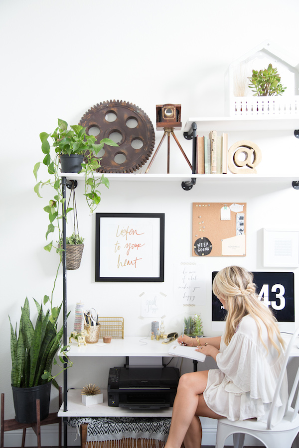
Compared to past desks you may have seen of mine this desk area is uber clean and very work-friendly with plenty of space to actually work! My modern, clean, and large white desk with our amazing light box (with every changing quotes that resonate deeply) sells this vignette as a strong focal point, anchoring the room and is probably everyone’s favorite part of the space.
In the back corner of the room, I wanted a place for a conference table for team meetings and team meals, but not your typical, boring conference table. So instead I chose a vintage 1920’s Parisian wedding table to give warmth to the meeting space, (story goes, for outdoor weddings families simply nailed together found boards to create these simple, yet stunning tables, similar here). The Society Social accent chairs upholstered in Lacefield fabric flank the table for a punch of blue & white (you know it’s my fave), while simple, modern shell chairs fill the rest of the table. Beneath our feet you’ll find my favorite rug combo; a large jute layered with a faux white cowhide rug. And how could I forget about my new giant print, from Minted?! The photograph captures the juxtaposition between bold and minimalist to a T, and its pretty copper frame compliments the room perfectly.
Next, our DIY fabric covered bulletin boards with their brass “library” light fixtures ended up serving as great anchors to the most expansive wall and the perfect backdrop to our sitting room. I have a feeling I’m going to enjoy any reason to sit in our “sitting room” because of how gorgeous this vignette turned out…Our Taylor Burke Home Settee with Lacefield pillows and West Elm velour metal armchairs in blush (a similar style in more muted colors is available here), our white side table, Gregg Park coffee table, and a MAJOR vintage rug from Bellwether (phew, that’s quite a list). Any “sitting room” wouldn’t be finished in my book without a bar cart, and this simple gold bar cart offers just the right amount of surface for all of our refreshments mid-meeting.
Opposite our bulletin boards is another massive wall which I lined with two cube shelving units and my ever-growing collection of cookbooks and design books. When styling the bookshelves to achieve the ultimate #shelfie, I ended up flipping the books around so their spines didn’t show. As you know, I hoped to achieve a softer, calmer look to this space and as I was filling the shelves, the colors and titles ended up looking busy and a bit garish. A quick solution was to turn the books around, and arrange them by category (so I still know where to find them!).
Because our job isn’t your typical 9-5’er, our office tends to be a revolving door, which means no one really “calls dibs” on any specific surface. That being said, I knew we needed to designate an actual work space before we all ended up on the floor with bean bag chairs (not that I really hate bean bag chairs). Therefore, I kept it simple by combining two Ikea desks, a couple of killer Mac screens with laptop plug-ins, all tied together with a simple yet statement making Taylor Burke pendant and a piece of art from Hayley Mitchell that speaks for itself. AH-MAH-ZING!
Lastly, while everything shown in the office is beautiful to look at, the office needed a practical storage solution to keep things organized (and fuel our coffee addiction, duh). Enter my handy cabinet and simple wall shelving from Lowe’s. I turned Allen + Roth closet organization units topped with Allen + Roth baskets into a refreshment station and storage closet stowing our office printer, modem, phone, and all that necessary jazz. A sheepskin runner from Lulu & Georgia finishes off the area and adds that bit of soft touch to what could be a colder space. FYI I’ll be doing an additional post in a week or two sharing how this area came together with plenty of organizational tips to boot so stay tuned for that.
Whew! That was a mouthful and it was one heck of a six weeks, but I couldn’t be more thrilled with the end result for the new Waiting on Martha team office thanks to The One Room Challenge! A huge thanks to Linda, House Beautiful, all of the incredibly generous sponsors and Rustic White for capturing the space to share with you all today. Be sure to check out the other participants’ final reveals in the links below, and I’d love to hear what you all think of the design in the comments! Truly, MKR




It’s absolutely stunning, Mandy! So so perfect!
Fabulous space! I really like how you used all neutrals that lean to the brown side, without being beige. It’s so warm & very inviting. I’ve been eyeing that light box too! Congrats on an amazing transformation.
It looks like a beautiful space to work! Great Job!
I cannot even comment on one thing without opening the flood gates to comment on EVERY DETAIL! OHHHH my gosh. I’ve loved the sign since you wrote about it weeks ago, but I am literally in love with soooo much about this space. What an inspiring place to work (and play)! xx
Thanks Mallory!!! We are SO excited about the space. xo
Holy geeze…this is so so good. I’m in love with your blush, cream, white, wood palate…just feels so elegant. And that sign is the stuff dreams are made of. Every inch feels so perfectly styled and layered…what an absolute perfect space to work and be inspired in! Stunning, stunning job!
Thanks Hollie! That’s exactly what I thought too…too often the beiges and neutrals end up being boring and too safe I think! I told MKR that I was so inspired with how she used the neutrals but kept things interesting. Thanks for following along! xo
Thank you Joy! xo
Oh my gosh Elise thank you for the kind words – means a lot to our team! We’re thrilled with how everything turned out and can’t wait to #GSD in there! xo
Thank you so much Christine! Such sweet words – we’re aww’ing over here! xoxo
Mandy! Your One Room Challenges are my FAV! This office is just too good! Love the art & color palette!
xoxo!
Shelby
Wow Mandy I just love how bright and fun you’ve made this office space! Kudos on yet another fab ORC transformation! I love seeing how your office evolves as your business grows, especially your art pieces! Bravo on a job well done!
This has been my only WOW moment going through all the posts so far- great job!!
Oh my gosh thank you Bridget! Means the world to us. xo
Love the transformation!! Beautiful colors!! And I love Hailey Mitchell’s piece! I am also using one in my daughter’s bedroom to be revealed tomorrow!! Congrats!
Obsessed! Absolutely LOVE it! Every single detail, every corner, love love love!
What a beautiful combination of colors. I love the mid-century feel of the chairs paired with such a modern color combo. The x-based stools are amazing. I’m revealing my room tomorrow as a guest participant. I would love to have you stop by. Great space!
OH MY GOODNESS….. what a dream!!!! Can I come work for you guys??? This is such an inspiring space. Love it all!
Bravo Mandy! The space looks fabulous. I want to work there!
Thank you friend!!! xo
Can I come work here??? I am absolutely in love. One of the most beautiful offices I’ve ever seen!!
Seriously? I could live in this office! Just absolutely WOW! I love everything that went into this space !
Oh how I would love to work here! What a beautifully designed space!! I love all of the details and special touches you included here. Great work, perfect workspace!
outstanding! what a dream office space. loving all of the vignettes – that entry!
congrats!!!
xo
cristin
whoa! such an amazing work space.
I love all of your moments! This looks like such a great place to work.
Great job!
And you’re inspiring me to come up with a better solution for my inspiration boards.
Beautiful, and unique! I love your style. Everything came together so nicely, and love that sign!
My favorite moment by far is the vintage sign that says “remember why you started.” It gives soul to the space. I love the quiet palette and the organic, eclectic mix of textures and patterns. Definitely a space I’d love to work in every day! Beautifully done, Mandy!
xx Sarah
This is gorgeous!!! Absolutely love the color tones and cozy, yet sophisticated feel of the space. And that art, oh my goodness, I’m in love! Thank you for sharing and inspiring, this is great!
Erin, Attention to Darling
http://www.attentiontodarling.com
LOVE. Beautiful as always, Mandy!
I love the gold accents and midcentury modern vibes! Absolutely gorgeous!
LOVE this space – very inspirational! Makes me want to work on my space now…
This one is a real beauty, It is my favorite this round. Great work!
I love literally everything about this space. It might be my favorite room to come out of the ORC this round. It’s just perfection – hope you don’t mind me sharing.
This is possibly the most elegant studio workspace I’ve ever laid my eyes on! You tackled so many different spaces with a soothing neutral palette and a beautiful mix of styles! I love the layers of details in each vignette and the way you brought comfortable seating to each area. Fabulous job!!
Such a beautiful space! All looks incredible. Would you mind sharing with me where you got the cube bookshelves? The ones in the link are different and I like yours a lot better 😉 Thanks!
Mandy, this looks SO GOOD!!!! So inspired by your space!
Wonderful job mixing these elements together to make them look natural.