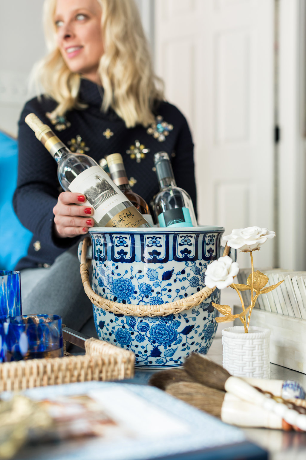
I’ve always been a fan of a great at-home bar. I strongly believe it’s a must-learn life skill to mix up classic cocktails, and as an avid host, it’s important to provide an array...
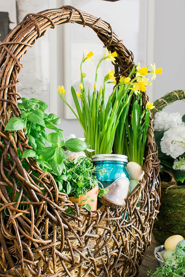
Looking back on Easter as a child, I remember how excited I was to dig through my Easter basket. Full of chocolate bunnies, malt ball Easter eggs, Peeps, golden coins, and my favorite Cadbury...
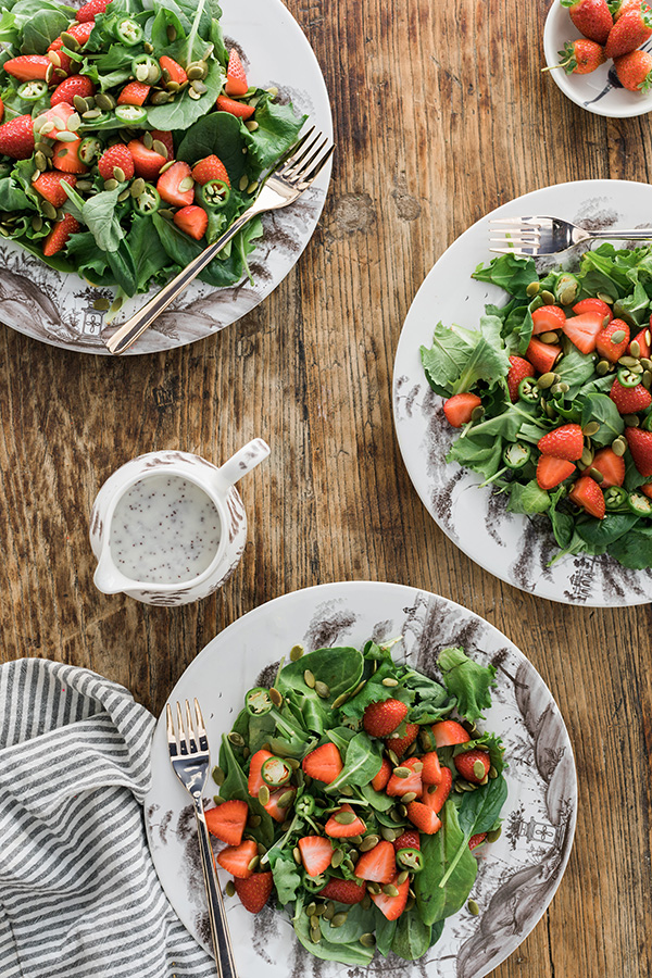
Lets be honest, salads can be boring. So I’m always trying to think outside of the box to come up with salad recipes that I’ll thoroughly enjoy, but are beyond easy to make. Enter...
Lets be honest, salads can be boring. So I’m always trying to think outside of the box to come up with salad recipes that I’ll thoroughly enjoy, but are beyond easy to make. Enter...
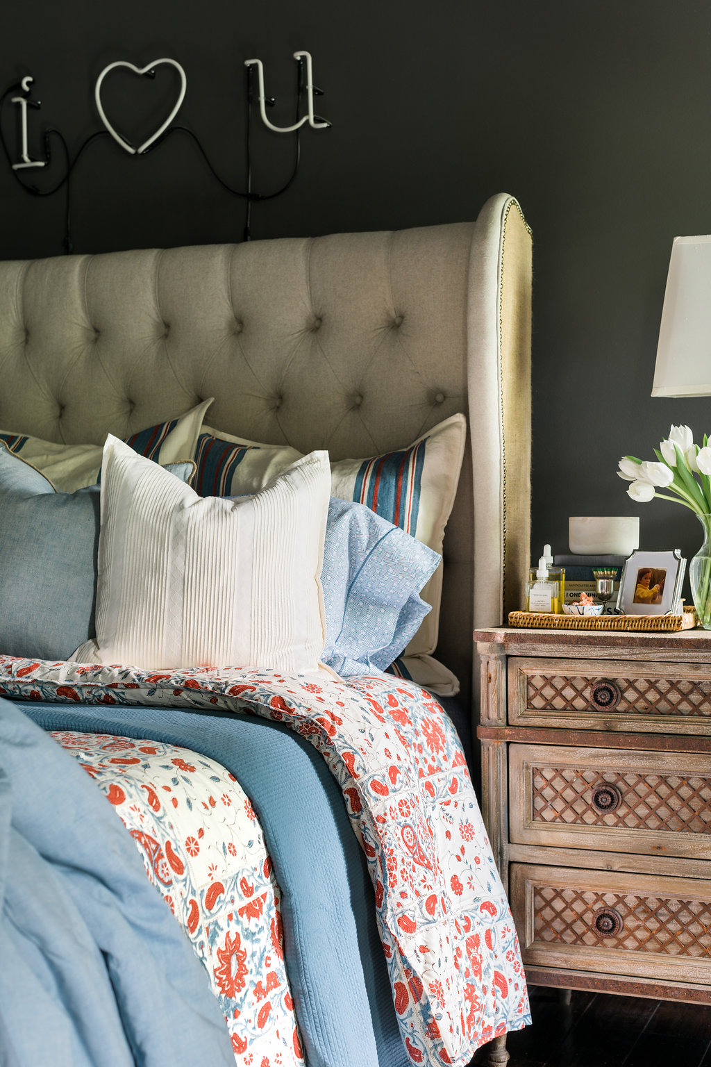
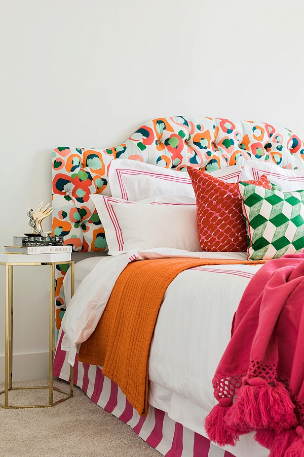
I’ve always enjoyed a well-made bed. It’s truly an everyday luxury in my opinion. And after a long day, there’s nothing more inviting to me than slipping into fresh sheets. Seeing as how much I love proper linens, I was shocked when I realized how long it had been since I bought myself new bedding or even towels. I mean it had been years! So when Lauren Ralph Lauren Home invited me to do a bedding refresh the timing couldn’t have been more perfect.
It’s true that I was long overdue for a refresh. I’d say that it was partly due to the fact that it’s hard to find a line of high quality bedding at an approachable price; one that doesn’t sacrifice timeless style or fresh designs. Believe me, I’ve looked. I had thought about splurging on linens, but every time I was about to pull the trigger I would second guess myself. I mean if I’m spending an entire paycheck on linens then they better be ones I’ll love forever…am I right!! That’s why I was so thrilled to discover Lauren Ralph Lauren Home’s collection of beautiful bed linens. Specifically the Ralph Lauren Kelsey Bedding Collection. They’re soft, luxurious and really comfortable. They’re perfect for the every day, while still providing that elevated feel in our bedroom. As I selected the pieces for my bedding refresh, I quickly decided that I’m done with duvets. Done. I know they’re easy, but in their place I’ve rediscovered the beauty of comforters, coverlets and quilts; combined, they offer dozens of opportunities to switch up how the bedding looks plus they add polished layers to any bed. It’s those details, and that added thought of various textures and patterns, I’m finding, that really tie the space together. Not to mention they just look better. My duvet never laid well on the bed and the duvet insert would always get stuck down in one corner or the other. As for choosing the styles and colors, I gravitated to a mix of cool blues and creams, with a pop of red. If you remember, I always write about the importance of incorporating a pop of red in design. Red always warms any space up and makes a room feel complete! I also mixed in various complimentary colors and prints: ticking stripes on the shams, this pattern on the sheets , and a soft silky blue on the Graydon quilt which might be my favorite piece in the entire collection. It’s light, yet cozy, and beyond soft!
For the towels I decided on classic white for myself and blues for the guests. And I must add, the towels are deliciously plush, and give me that feeling of being at my own at-home spa every time I use them! I’m incredibly pleased—as is the hubs—with this timeless refresh on one of our favorite spaces. Tell me, are you looking to update your nest anytime soon?! Are you Team Comforter or Team Duvet? Truly, MKR
P.S. For a step-by-step tutorial on how to properly make a bed in 8 easy steps, click HERE. xo
Photography, Rustic White for Waiting on Martha | This post is in collaboration with Lauren Ralph Lauren Home
As most of you know two weekends ago I celebrated the Grand Opening of Waiting On Martha Home, and while I still haven’t had time to catch my breath, I wanted to take a moment to share a peek into the weekend, the design, and a little into the process of how I got here.
Opening my own brick & mortar shoppe has been a dream of mine for years. Almost five years, and four different pop-up shop test runs if I’m being exact. So believe me when I say getting to this moment has not been an easy journey.
First I had to tackle the question of, “do I even want a retail storefront?” Retail is not for the faint of heart; I lost many a night’s sleep making pro and con lists over this question. But, in the end I knew this dream of being a Shoppe Girl has been in my heart well before there was a WOM.
So with that box checked the next question was “where?” This was definitely one of, if not the hardest part. Location, location, location was of course key, but I also had a vision of what I wanted the storefront to look like. And then the clientele of course; I needed to put roots in a place where Waiting On Martha Home would be welcomed and supported, and most importantly shopped! Enter the Vinings Jubilee, an adorable neighborhood of speciality stores and restaurants tucked in historic Vinings Village Atlanta. It was, it is, the perfect place for our flagship store!
Lastly, design. This was by far the easiest, and most fun part of the whole process. Having been dreaming this dream for so long I knew exactly what I wanted to do down to the very last detail. First things first, demo.
I worked closely with Rob and his amazing team from Vision Construction. With the help of Vision we knocked down walls, tore up all the flooring, moved electrical, exposed windows that were hidden…which I’ll never quite understand, painted, wallpapered, and built out 8 custom shelving and cabinetry units and 1 custom beverage bar.
And while Vision was a dream to work with, I can’t give them all the construction credit. My father, the talented man that he is, built by hand…in my parent’s garage no less, the most gorgeous check out station you’ll ever see. Plus he built the fireplace, laid the custom flooring in the backroom and with a little help from the hubs hung a room full of shiplap. As Kat says, “dad is a unicorn.”
For the actual design details, it really breaks down to the paint, wallpaper, countertops, and flooring.
For the flooring in the main room, I chose a wide plank, warm toned maple colored laminate wood flooring that I swear you’d never know wasn’t real wood. This was able to save me quite a bit of cash, plus it’s so nice not having to worry about it getting scratched or damaged.
In the back room, I went with hand-stamped laminate wood tiles from Charleston designer Mirth Studios. I stumbled upon these tiles on Instagram and immediately fell in love. Available in 40+ patterns, and with a 15 year warranty I knew they would be just the right amount of pizzaz I was looking for, plus the Sweet Cecilia design paired perfectly with my Farrow & Ball Pale Powder shiplap walls. I loved the tiles so much, we are now the exclusive retail partner of Mirth Studios. So if you’re in Atlanta, stop by the Shoppe and check some of the designs out for yourself!
The wallpaper had to be grasscloth; no question in my mind. My favorite line of grasscloth currently is from Bradley USA. The quality is amazing, and it’s a better cost option than others. And though I loved all of the grasscloth patterns, colors, and textures I ended up going with the Jute Grasscloth in Gleam.
Just as the wallpaper had to be grasscloth, the paint had to be Farrow and Ball. If you remember I visited Farrow and Ball’s headquarters in England last September and actually saw the entire paint process from start to finish, and there’s just no one who does it quite like F&B.
I used Chappell Green in lacquer, Pale Powder in both a flat and semi gloss, Dimity in lacquer, and All White in both a flat and semi gloss. There really are no words to describe just how gorgeous it all turned out. Honestly, the coloring evokes just the right amount of happy, calm, and bright…pure perfection.
Lastly, the marble. This was a difficult task. The marble needed to go in four very large places: the check out station, wrapping station, beverage bar, and fireplace. Measuring to be at least 2 full slabs of the exact same marble, which meant digging through remanent pieces that are always more reasonably priced was not an option. And of course I wanted thick, beautiful, white carrera-esq marble. Not granite, not quartz, not laminate…marble.
After visiting a few marble yards, and finding nothing in our budge, I was referred to Elise from Stone Select. Thank God for Elise!! You see Elise is basically a stone-marble-granite dealer. I told her what I wanted and she searched all the yards and found it. The best part, she found it fast and under budget! Seriously, if you are in Atlanta and need marble Elise is your gal!
And with that, and a lot of product styling, my pinch-me moment of finally opening my Waiting On Martha Home doors was ready.
I’ll be putting the finishing touches on the place over the next few weeks, and invite you to come join the fun; sip on coffee in our custom coffee cups, treat yourself to a little “sercie” or “happy”, find gifts for quite literally everyone, or let me help in designing that custom piece of furniture you’ve been dreaming about. And be on the lookout for upcoming events at Waiting on Martha Home.
One more quick note; thank you. I was thoroughly blown away by the support of WOM’s family and friends who came out to shop on opening day regardless of the torrential down pour. To my online customers and friends who sent so many well wishes. And of course, it meant the world to me to see the amazing response of the Vinings community. Thank you to Kat, Liz, Steph, and the entire WOM Team. To my parents, who have worked tirelessly my entire life to give me everything I could have wanted and needed, who have supported my dreams, and most importantly have loved me unconditionally. And lastly, to my husband, who along with Addison is always my biggest cheerleader. THANK YOU. The best is yet to come Friends! Truly, MKR
P.S. Be sure to follow along on the shoppe’s Instagram and Facebook page for exciting updates, special discounts and more! xo
If you’ve been following my journey from the beginning then you’d know that I’ve been dreaming about taking Waiting On Martha the e-commerce shoppe to Waiting On Martha the brick and mortar for five years now.
I’ve been patient; doing my due diligence through four different pop up shops that ranged from one weekend to 8 months. Those experience have been priceless. They have helped me understand exactly what it takes to run a retail store alongside a busy e-commerce business. How much staff I would need, how much money it would actually take, what sells in store verses online, and most importantly if I really wanted to get in the retail game. And after many years and a very long pro/con list my answer is yes.
So without further ado, I am thrilled, nervous, but mostly just plain ready to tell you that Waiting on Martha Home will finally be opening in the Vinings Jubilee this June!!!
Truthfully, while this took four long years to come to fruition now it feels like everything is moving at lighting speed. There hasn’t even been time to pop a bottle of Veuve. The minute the lease was signed I had my inspiration boards pulled up and got right to work planning the design elements and making this dream a reality.
Where the Shoppe stands now is a completely destroyed demo mess. I’ve knocked down walls and tore up floors in preparation for all the pretty that’s to come. The team I’m working with has been a dream and for anyone in the Atlanta area I highly suggest Rob from Vision Construction, seriously he’s made this experience actually fun! I’ll of course be taking you all through each and every step until we open our doors, including an IG Story tour this weekend, but for now I thought it best to start with what I’m doing design wise.
The great news is my Shoppe is truly in the form of a home, so I feel like I’m designing a place where I would live. I’m bringing in soft, light and airy vibes in the form of grasscloth wallpaper, shiplap, custom cabinetry and four different paint colors from my friends at Farrow & Ball.
I’ve worked with F&B numerous times in the past and even visited England where all the magic happens this past fall. So when it came to this project I knew there was no other choice than Farrow & Ball. Which brings me to our signature color: Chappell Green. In the past our signature color has been navy, and while you’ll still find plenty of blue and white moments in the Shoppe, in my heart of hearts I knew this new chapter needed a new color and I knew that color was Chappell Green.
I mean Chappell Green is really where it all started for me; I’ve had a love affair with this green for years now. The cool, rich sage color is entirely elegant, while lending a certain femininity as well. And I just love its chameleon-like ability to go with just about everything. It plays nice with bold colors, while acting as the perfect neutral too.
In the Brick & Mortar, you’ll find Chappell Green in key accent places like our checkout station—made lovingly by my ever talented father—and our coffee bar and front door. Along with items such as bags, tags, tissue paper and a few other fun pieces we have our friend Jenn Gietzen working up some watercolor goodness for.
Along with Chappell Green, you can expect to see very soft paint tones. Think mint green, natural sand and white paint colors. Farrow & Ball’s Dimity is a very beautiful light natural color that’s almost like a smooth vanilla that we’ll be using on all of the custom woodwork and cabinetry. I needed a color that would make the beautiful custom cabinetry stand out, but allow the products we’re selling to really shine. Dimity also plays perfectly with F&B’s All White which will be used on all of the trim and ceiling.
Rounding out my paint choices will be Farrow & Ball’s Pale Powder. This pale minty-blue shade will painted over the shiplap my father, husband and I will be hanging in the back room. I love shiplap’s ability to add texture and dimension to a space, while giving it an older, almost historic feel.
And if pale powder shiplap didn’t make this room feel special enough, I’ll be accenting the shiplap with Mirth Studio’s hand-crafted wood flooring tiles in Sweet Cecilia. Available in various patterns and prints these show-stopping tiles are like nothing I’ve ever seen before and I’m thrilled to say we will also be the exclusive retail partner for Atlanta.
Finalizing the core design elements would be of course grasscloth wallpaper. You know I couldn’t do a space and not wallpaper. I mean I LOVE wallpaper. And since texture is one of my favorite elements, I had to, of course, go with grasscloth. I settled on the most gorgeous “Puka” jute from Bradley, a design showroom at ADAC here in Atlanta.
Lastly, I’ll be indulging my love of art with an Artist in Residency program. Every 6-8 weeks, I’ll be bringing in a new artist with original pieces to be displayed and sold in store. Since this all began in our first pop up with Atlanta’s very own Britt Bass, there really was no other choice as to who would be our first artist in residence for the Brick and Mortar. Britt really awakened my love for art, and I couldn’t be more thrilled to have her kick this all off.
There you have it; the dream has become a reality. Thank you to everyone who has followed since the beginning, or is just following now. To every person who ever bought anything from my e-commerce shoppe, the pop up shops, or the warehouse sales. To all the full time staff, part time staffers and interns over the years, thank you. To my parents, husband and friends that have moved me more times than I can count and who will move me again this one last time, thank you. Just thank you. You are all the reason I’m able to do this and still love doing it. Thank you. Truly, MKR
P.S. Now to the biz talk! WOM has immediate openings for two-three part-time and possibly one full-time retail associate for the Waiting on Martha Home brick and mortar location. The ideal candidate will have retail experience, know how to hustle, have a knack for creativity and merchandising, and be a self starter to work with our crazy, but amazing, small business! Comment with any questions below, and please email all resumes to liz@waitingonmartha.com. xo