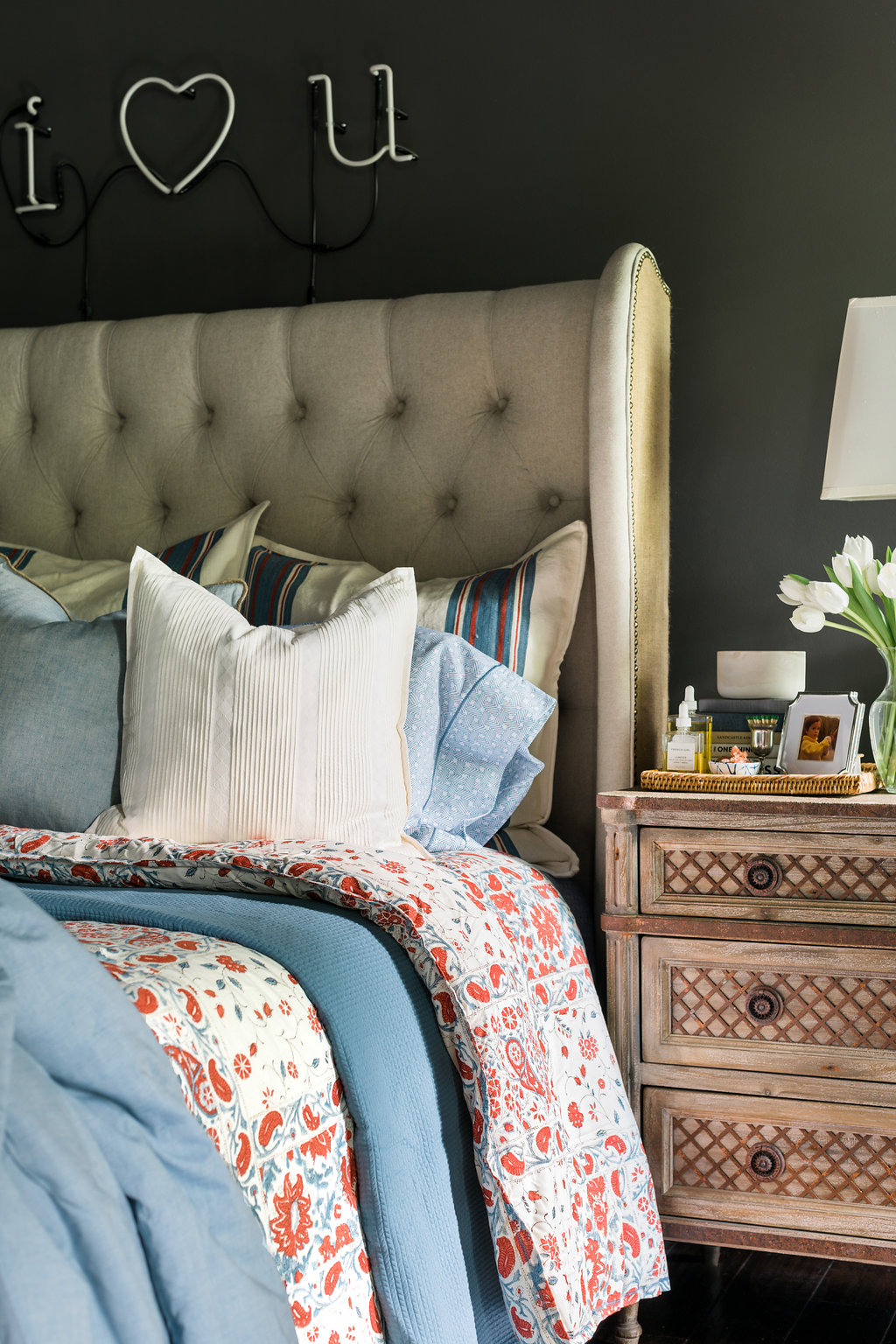
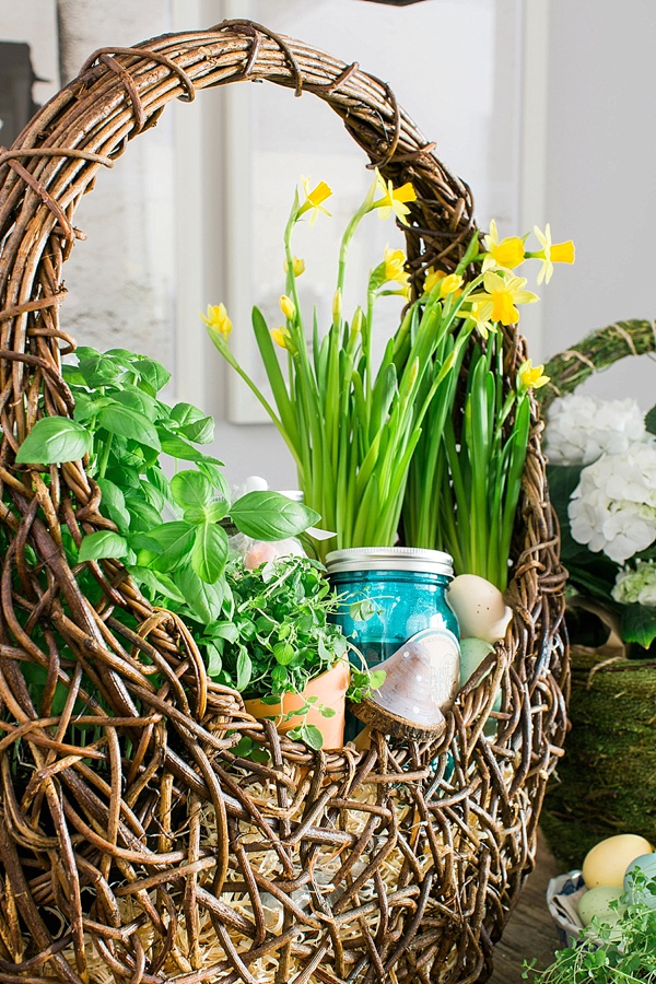
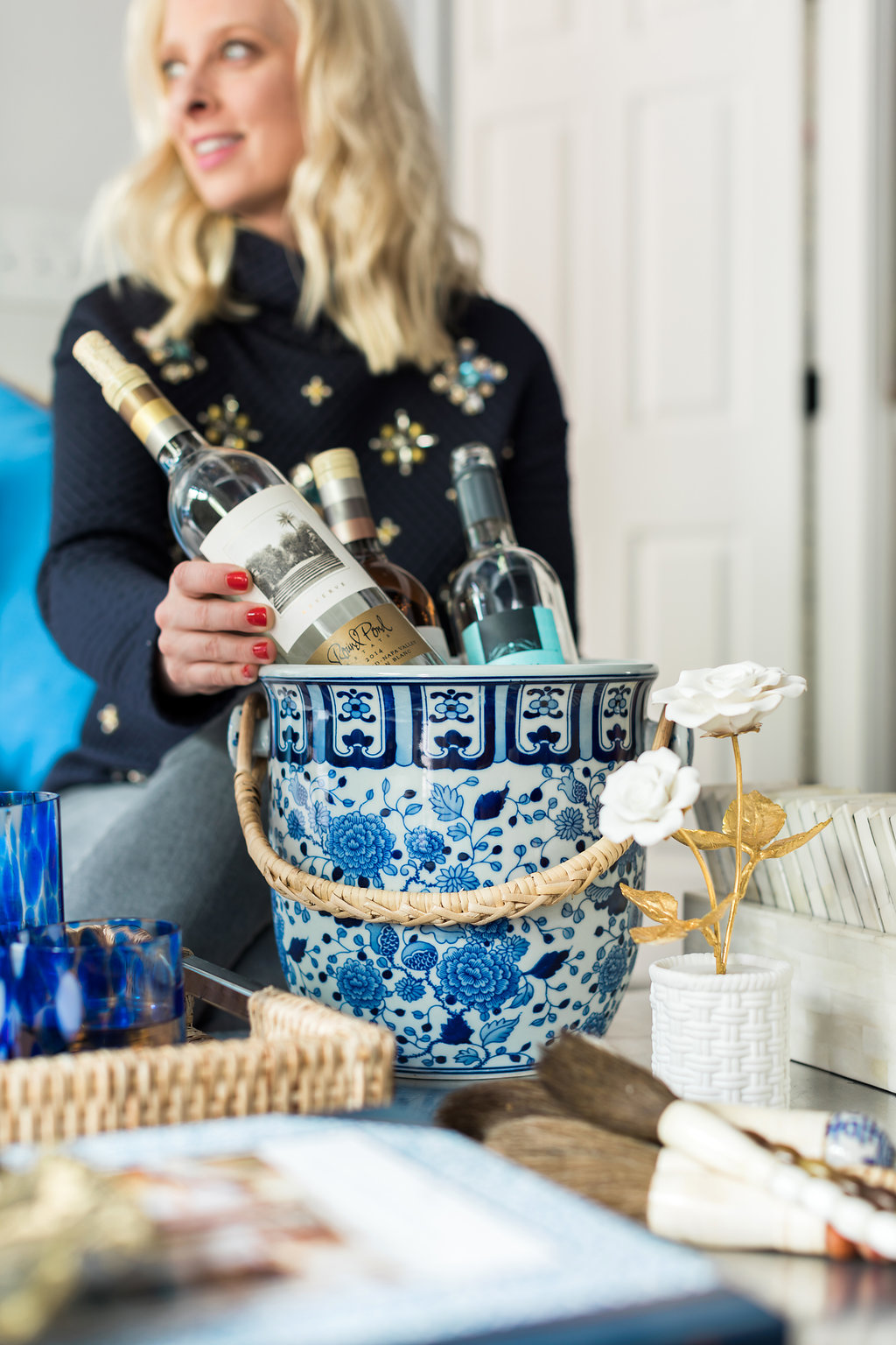
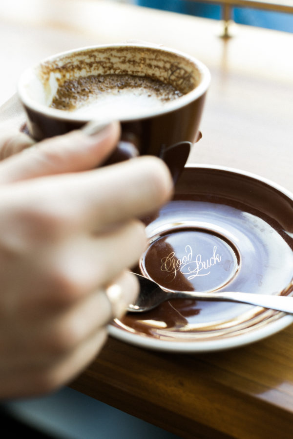

I’m sure you’ve heard the news; Pantone has officially announced its 2016 color(s) of the year and the marriage between the two colors shows us quite a lovely and softer take on the usual annual selection.
Serenity, known to be a “cooler tranquil blue,” goes beyond just a run-of-the-mill pastel. Its incredibly versatile hue lends itself to a whole slew of possibilities in both the design and fashion worlds; we can already envision the sweeping interiors and stunning street style shots. Rose Quartz takes a “warmer embracing rose tone” that is sophisticated yet subtle. This shade lends itself to gentle femininity, and combined with Serenity marks a soothing connection. Almost as if you’re being enveloped by a warm breeze (or so we’d imagine).
According to Pantone: “Rose Quartz is a persuasive yet gentle tone that conveys compassion and a sense of composure. Serenity is weightless and airy, like the expanse of the blue sky above us, bringing feelings of respite and relaxation even in turbulent times.”
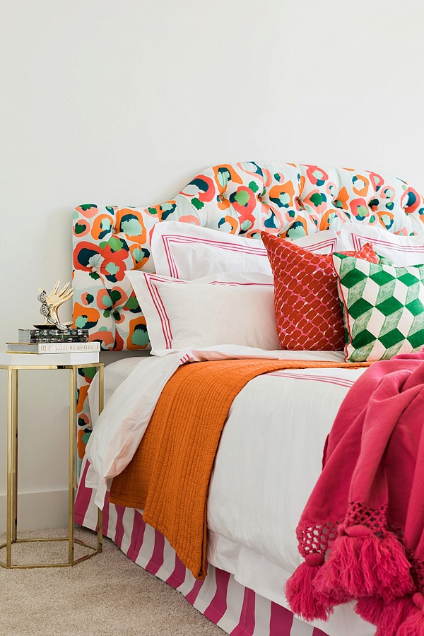
We quickly realized we’ve already loved these colors for years. Click through the slideshow to see ten times the colors have caught our eye. Cheers, Kat