
It’s really no surprise that blue is one of the most calming and healing paint colors you can choose. We’ve often seen it used to create a relaxing oasis in the bedroom, but it can also promote a cleansing, tranquil feel in the bathroom and a bold, fierce ambition in the home office. The versatility and wide range of beautiful blues is infinite; the color is a go-to when infusing depth into spaces all around the home (check out these nine different rooms that prove it!).
I, of course, have always gravitated towards blue when decorating my own home. I’ve learned how the endless shades can work perfectly together, whether that’s through throw pillows, accents or paint. Decorating with blue offers so many possibilities as it’s a lot like the ocean; a multitude of blues, constantly changing and effortlessly mixing. And unlike most colors, decorating with a myriad of multiple shades works no matter what.
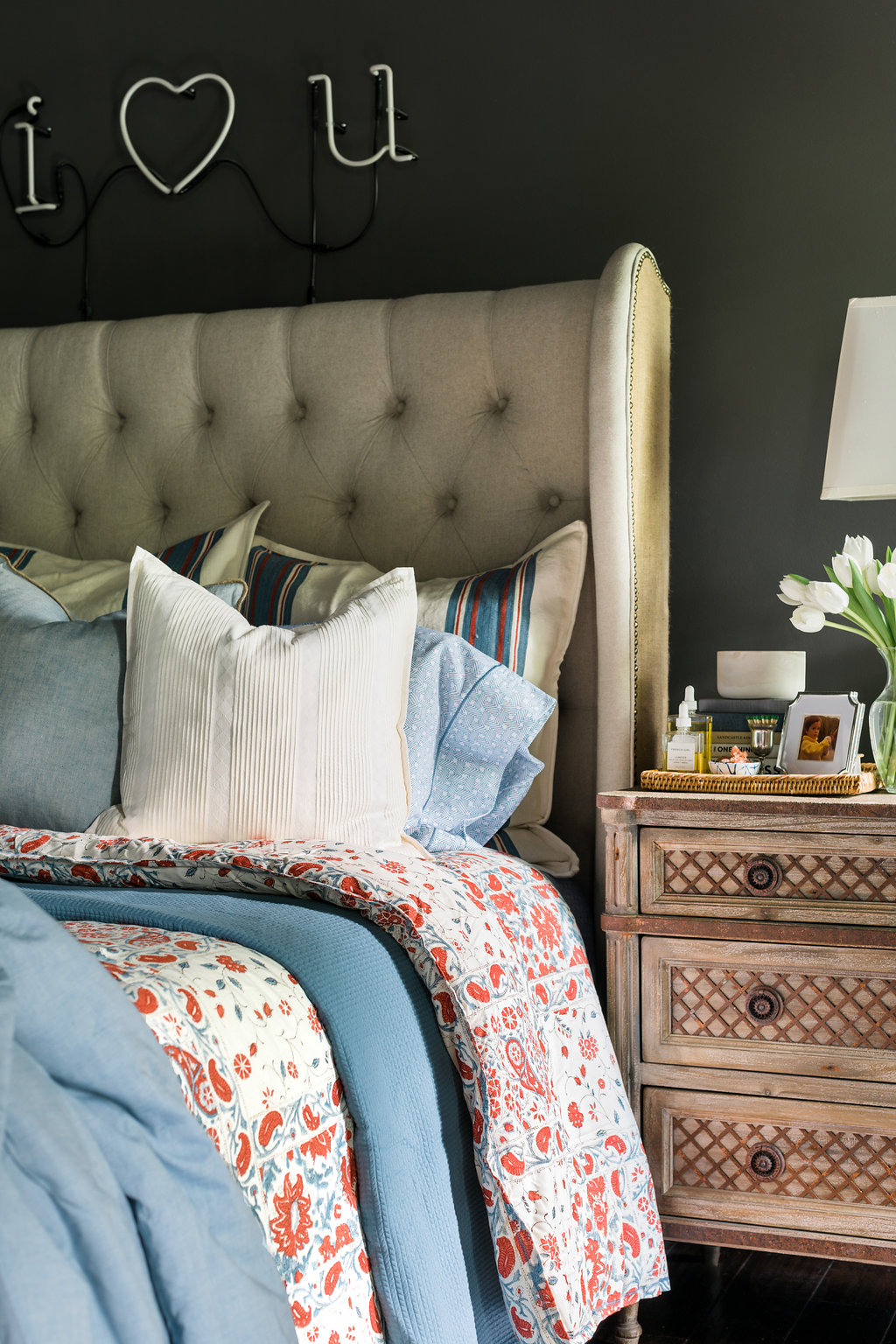
When settling on your own blue paint options, rest assured that this color family is probably one of the best ones for you—even if you’re a little hesitant to paint. It’s a classic, timeless color that both men and women can usually agree upon, and it can transcend redecorating for years to come. But as you decide on what exactly blue to paint with it’s good to remember a few things. Blues, much like greys, can take on a chameleon-like quality on your walls as light changes throughout the day so test swatching all over is a must. Dark blues can have some sneaky purple tones in them, and the darker the shade the more it will affect the amount of light you actually get in the room. So when going bold make sure you’re ready, and remember the paint on your walls usually reads darker than you planned. When painting with light blues keep in mind they can read very baby-ish so it’s best to keep them to nurseries, small powder rooms, and accents. And lastly, never forget about the ceilings and doors. I turned to a deep, almost-indigo blue on my ceilings, doors and island (rather than paint the entire downstairs) to keep things light and airy, while still giving a nod to my absolute favorite color around.
Below I’ve rounded up my favorite blues and provided some helpful insight as to how I’d use each shade. Let me know which shade is your favorite and I’d love to know if you’re as big of a blue fan as me? Truly, MKR


